Tag: drawing
-
We were watching a video of a conversation with British painter Rose Wylie and they were looking at a short series of hers in the style of retablos or ex votos — usually small paintings honouring a saint or showing a moral story. We have a few wonderful Mexican ex votos painted on tin and part of what I love about them is the tight text at the bottom of each image. That was true of Rose Wylie’s versions as well and it made me wonder about trying something in that format for myself. Gayla had brought out some cheap…
-
I did a Substack live video drawing and talking through the making of the most recent page in the Red Book. https://open.substack.com/pub/davinrisk/p/red-book-live-drawing
-
I made drawing 34 in the Red Book live on video tonight. It was an experiment in the format and to get a sense for whether I would want to try it again. I’ll do a few more tests at least. Watch the live video
-
Red Book drawing number 33. First use of enlarged thermal printer marks in a drawing.
-
More thermal printing adventures. The phone to printer to copier flow makes for some great ways to take previous artwork and also bits and pieces of my home environment and change their context. I gang up the small thermal prints on a quarter Letter page and then copy them at 100 and 200%. And then sometimes another 200% for good patches of texture. I also use any extra space on the paper to do quick mark making so that can also be copied/enlarged.
-
I have been picking away at this one over a few short sessions — while making coffee. The black structured forms follow the mostly hidden text that was on the page. I think I’ll be pulling some of the enlarged thermal print images into this so I am curious to see how that feels. I also bought another book from the thrift store that will become some form of project book like this. More on that soon.
-
Made some 200% enlarged copies of the thermal prints. Fun to make secondary drawings on the copied versions. I’ll try also making some 400% copies next just to really zoom in on the pure texture and move passed the frame of the original drawings.
-
We recently bought a few low cost and low quality ways to make thermal prints. It was an idea my partner Gayla and I both had for some time without either of us acting upon it. We both wanted a form of low committal analogue output to use in a variety of not fully discovered art projects. Both of us had been nudged back into thinking and action by recently seeing other artists incorporate thermal printing into their work. Gayla sourced a few different toy camera and printer options in the $20–40 range and placed some orders. Not knowing exactly…
-
Red Book drawing 32 This one is thick with paper and paint layers. At one point the yellow and orange paint was very dominant as it has been in previous drawings but I wanted to try pushing that back and so I brushed on and then scraped away some white gesso. It made things extra patchy and messy but it mostly did what I wanted by subduing some aspects and letting other parts come forward.
-
This mini orchard does exist. We have a row of three mature pear trees and an even older apple growing in the land where we live. But this sketch of the three pears is imagined in that I didn’t look at a reference or go out there and draw them from sight. I do want to try some plain air drawing out there this year though — something I’m not familiar with at all. I added a few leaves to these imagined versions of our pears but they don’t actually even have leaf buds at this time of the year.…
-
I was looking for something else in my insane camera roll and came across photos and a short video of this Land/Body piece from 2017. It was one of three that I made in this circular landscape format with these rough nervous system figures attached. It was a rare case where I submitted the three pieces to a show and two of them actually sold. I hadn’t documented all three so I now only have some vague memories of what they all looked like finished and some in-progress shots. Each had a different imagined landscape painting and unique carved balsa…
-
This is a pine tree sketched from memories of recently seen pine trees. Trees are so difficult to represent because they take up space and have a type of visual density that can be hard to articulate. I don’t mind this little sketch but it does feel more like a drawing of a scale model of a tree? I intentionally tried to place some of the imagined branches moving away from the front of the view but it still reads a bit flat like the tree only has one side. Nature is wonderful and hard to capture which is also…
-
A small sketch as I lay in bed with my leg elevated after knee surgery yesterday. This view has similarities to the woods at the back of the land we live on. The branches and forms made from quick scratchy pencil marks are imagined and don’t actually reference the true natural makeup of that space. Despite mostly making abstract artwork, when I actually set out to “sketch”, natural forms are usually what comes out. This is also the kind of mark making I give myself the most trouble with. As soon as a drawing attempts to represent something real, my…
-
This is the 30th drawing in the Red Book. I was both looking forward to drawing on this page and also had a certain level of anxiety. The photo at the top of Jesse Owens in mid jump is such a powerful image to react to that I knew I would want it to stay the focus of this drawing. That comes with anxiety because I don’t normally have anything preconceived or assumed before I start drawing. Not that I knew at all what I would do ahead of time but just simply that one aspect of the existing page…
-
I shared a number of my recent drawings with some friends and it was a nice reminder to keep how and when I share what I do a wide circle. For me at least, I do better at being kind to myself and making more things that feel good to me when I share aspects of that making and the feelings that come with it. One artist friend asked… “Are you just going with the flow when you work on these? Letting your hands make the decisions instead of your brain, like a creative game of Ouija board?” To which…
-
Because the book that forms the container/surface for the Red Book drawings is a 1976 Olympics commemorative book, it’s not surprising that some of the existing photos and illustrations are sports related. That aspect has nothing to do with why I chose this book to work in and in many contradictory ways I want to avoid those direct associations. This particular page I’m currently working on had a colour diagram of a stadium layout. I enjoyed the pop of green as something to react to but didn’t want the sports stadium aspect to feel like it was a focal point.…
-
Red Book 28 I wanted to be blocky and messy and I got messy for sure. There were more heavy black shapes initially but the impulse to make grids won out.
-
I have posted a new video with a casual progress report about my Red Book project. I talk through the first 25 drawings and demonstrate how I react to the active surface of the pages as I draw. https://youtu.be/hVGbgsYXDWc?si=_o9UuteJ5F45VgQf
-
Drawing 26 in the Red Book
-
Red Book 25
-
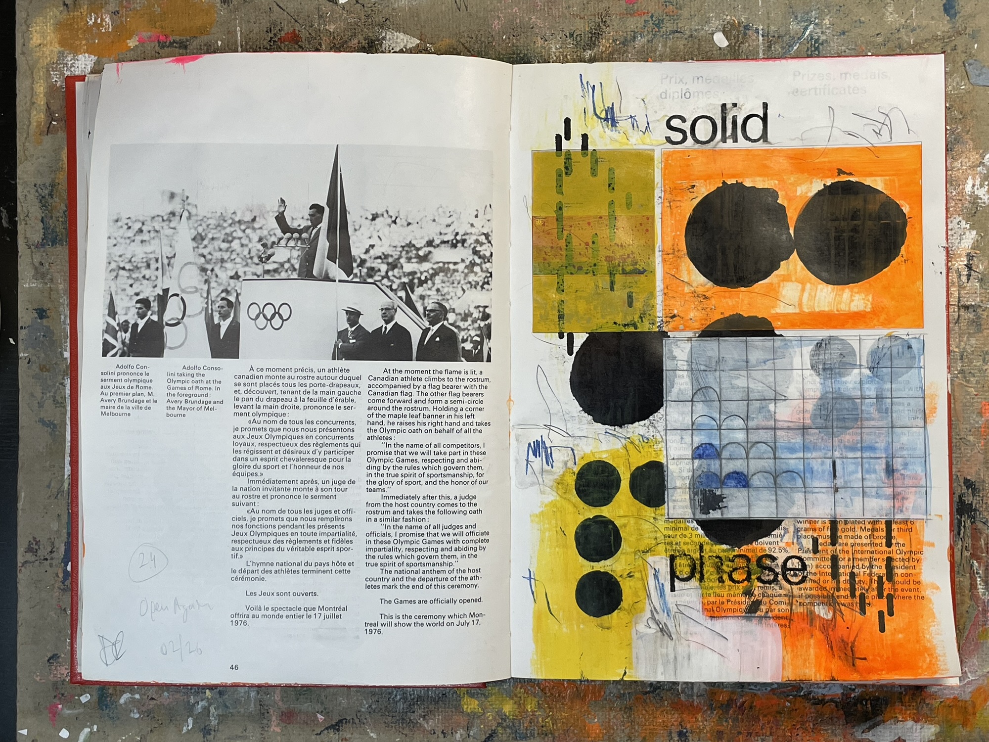
Open Again This is drawing number 24 in the Red Book, my current active surface drawing project. Some of the last marks I added to this as I finished it this morning were two lists of five words. Lists of words have been common in my drawings over the last 10 years. I enjoy the somewhat random poetry they can evoke and also the visual shape of words and words in sequence. Sometimes the words are pulled from a source text—like one of the 80+ year-old elementary school spelling books my partner and I collect—and other times they are just…
-
I think soon I will sit down at this table and spend more than two minutes making marks. But before then, it is good to still stand here for two minutes to draw grid lines and paste down paper towards something. Marks and motion towards something are better than receding away from things.
-
Other than some work-related sketching, I hadn’t engaged in making anything visual since the beginning of January. My last time sitting at my work table was literally on January 1st. There have been things that felt like barriers — most of them of my own creation. There has been grief and frustration with myself and a variety of external circumstances both mundane and cultural. Art making comes from an emotional place for me and while it can be an “unblocker” it can also be one of the first things to become blocked. Last night I spent two minutes doing this.…
-
Sometimes I just end up smearing things around for a while to see what sticks. Nothing sticking on this one yet.
-
The original page’s text in red, Citius Altius Fortius means Faster Higher Stronger in Latin. Not exactly a credo I would put much stock in. Which is probably why my reaction was the downer We Fade text. Sorry, Olympians.
-
After finishing my previous drawing, Truly, in the Red Book last night, I went directly to the next page to start a new drawing. The underlying pages are quite different with the new page being mostly white space with stronger header text. I am only making drawings on the right hand pages in this book so I don’t generally consider the context of the left to right page spread but there are still elements that can’t help catch my eye and contribute something. In this case, the left page has a photo of the 1976 Olympic Stadium. I decided to…
-
I’m part way through this drawing in the Red Book. I think the stripes up top are too dominant in this case so I’ll likely either tone them down or cover them completely.
-
Initial mark making for a new drawing in the Red Book. Orange is one of my favourite colours to work with. The existing book page didn’t have much to respond to but I still quickly read through the text to see if words or phrases spark something. That’s part of what I like about starting from an “active” surface like a designed book page — the book can act like a passive collaborator.
-
Latest drawing in the Red Book.
-
This is the 16th drawing in the Red Book. I started this page with some loose “blackout poetry” that provided the main phrase that I later added with some vintage white Letraset. I found a thick roll of heavy striped wrapping paper at the thrift store and I love the high-contrast punch it adds. I tend to work between blends of colour and texture up against bits of higher contrast. I like to use black in my drawings especially but mostly try to balance it or ground it within other structures like grids. So far the drawings in the Red…
-
This page in the Red Book was interesting not only because it was mostly blank but because the part that was printed had such a strong piece of text to react to. As I’ve said before, my primary reason for working in a printed book like this is the “active ground” of each page. There’s always something there that provokes a response. The response might be erasure or highlight depending on the page. I was also trying some new materials here and some infrequent techniques. My partner Gayla tipped me to using oil sticks on vellum as a transfer paper.…
-
I finished this drawing in a second sitting this morning. In part, it was a good test of some new materials. It was also a nice chance to work with what was on the page. There are only two collage fragments added since the two pre-existing photos are like readymade collage in this case. This page is also a bit more “painterly” and has more colour play since I was trying the new materials that came with their own palettes.
-
This page has two strong photos that already have colour palettes in line with colours I tend to work with. That’s part of the excitement of working with an active base like this. There are both frictions and possible harmonies in how I might react to the surface. Watch me working on this drawing here: https://youtu.be/3cB6vtPYyd8?si=T4H5ZK4p53JdyA8v
-
Life, sovereignty, and dignity for Palestinian people. Every day another 100 or more bodies. People and families murdered to erase and eradicate by bullet, bomb, and empty belly. A vengeance taken out tens of thousands of times over. A genocide we are all signed up for as our governments send “strongly worded” letters and promises that they might tsk tsk more sternly next time unless people are given access to the absolute sub-basics for survival. But nothing further happens and the handshakes and polite official meetings continue. There’s nothing complex about all of these ended families and those degraded daily.…
-
I thought I would post a video showing the first pass at a drawing in this project book. The video is unedited and real time. I don’t talk in the video but there’s some scratchy and thunky mark making ASMR sounds in there. Watch on YouTube.
-
Because of some materials choices, this drawing ended up a bit weirder and maybe muddier than I might have hoped. But it has its own charms. I did want to do something with the applied grid that counter-balanced the cathedral photo from the original page and I like it in that respect. I also like the words that popped into my head that are broken up in the lower grid cells. I’ve read a few of things recently about the use of words in artwork—how they can be a distraction and lead a viewer towards an interpretation. I think of…
-
Trying out a few thrift store art supplies on this drawing. The collage items are older junk shop papers a bunch of which were from a watchmaker’s archives: blueprints, receipts, and manuals. I have regrets from that time years ago because the shop had binders full of materials I didn’t buy. Ah well… The newer materials are somewhat decaying pigment ink stamp pads and also a mounted stamp that just has a square of halftone-ish texture. The inks are a bit annoying because they don’t dry well but the colours are good. This page has this dominant image of the…
-
Each page in the Red Book (it’s a repurposed commemorative book from the 1976 Montreal Olympics) has something different to react to when I draw. That’s the core of working in a book that already had a purpose before becoming a substrate for something else. Some pages won’t give much in terms of prompting and others have text and images that might form key aspects of a final drawing. So far in the Red Book, I have been equally, if differently, sparked by sparse almost blank pages and also those with a dominant image. “Blank” is relative in this case.…
-
The sixth drawing in the Red Book came together in one sitting. I started this book project with the loose goal of taking more time with each drawing. But I purposely didn’t make it a rule because I didn’t think that would be a healthy constraint. Because this page had a strong photographic image and baseline grid there was a lot to work with. I was conscious of partially erasing the colonial statue in the centre of the photo but liked the architecture and the mixture of walking and seated people. The text was spontaneous but I do find that…
-
Drawing five in the Red Book. This one started with very little on the original printed page. I left the word “City” while applying gesso to the rest of the page and then drew a grid over the whole of the page. The title Sampler comes from the broken series of letters and numbers I drew in the lower squares but also conceptually relates to the “acquisition” of visual sensations — me thinking about photography while drawing.
-
The spreads will often be weird/interesting in this project book since I am leaving the left hand pages as they are. So there’s a little play with the original form of this book and my drawings on each right hand page. The text, “life is made of smallest fragments” is from one of the vintage elementary school spelling texts in our collection. I’m not sure where it’s originally from. I often look to those books for strings of unrelated words to prompt my drawings but occasionally longer passages stand out. I also started adding letters and numbers somewhat like a…