With a prompt in a recent creative Zoom call to share a magazine from our youth that we still thought about today, I shared a memory of my friends Vince, Mark, and I typing in code for the Commodore VIC-20 from an issue of Computes! Gazette from February 1984. I was 15 at the time and the program was Multicolor Character Generator.
We spent ages reading out the many many lines of machine code while Vince typed it in to the VIC-20. We got it wrong at least once. Sorry Vince!
The program, written by some guy named Bill Gates, was a way of making simple 8-bit symbols that could be used in making games or other software.
It was one of my earliest experiences with making anything visual on a computer.
Here are PDFs of that issue—the ads are incredible! Computes! Gazette issues (and loss of other commodore ephemera) are archived by the commodore.ca website.
In a recent creative Zoom call, I read aloud from the first chapter of a story/book/? I have been picking away at over the last few years. It’s a story that is piecing itself together based on drawings I have also been doing for years.
Vagabond, 2018
Reading the story was difficult first because I don’t do well with that sort of performative reading but second because I don’t really know where the story is going yet. I suppose three because the craft of fiction writing feels like a dark art. My friend Mark is adept at plotting out stories and having arcs that lead to new arcs worked out. Like making visual art, writing for me is more like I type the words and see what happens next.
…
Let me back up a bit and talk about the drawings that prompted this story and the film that prompted the drawings.
Vagabond (Sans toit ni loi), Agnès Varda, 1985
The film is Agnès Varda’s bleak and beautiful film Vagabond. The film is a uniquely told story of a woman living on the fringes of society in rural France. I won’t talk too much about the plot, it can be a tough watch but it’s also one of my favourite films. The original French title of the film is Sans toit ni loi — without roof or law. I highly recommend it.
…
Since I first saw the film in the mid-90s, it has come back into my thoughts many times. Occasionally that has been in the form of spontaneous drawings. Sometimes I do not realize the origin of the drawings until after they are made and other times I have drawn with the intention of making something that connects to Varda’s narrative or at least its tone.
Vagabond, phone drawing, 2017
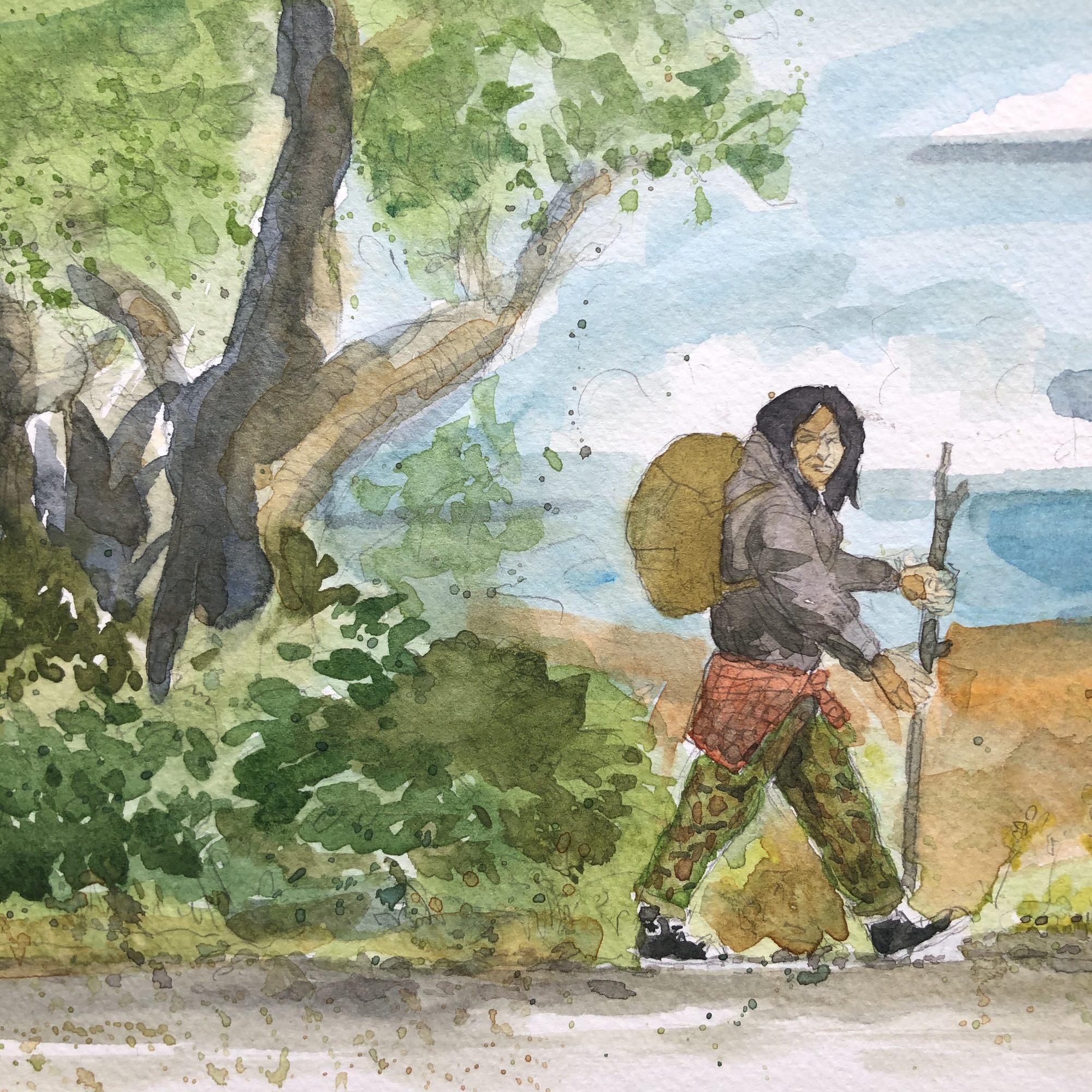
Primarily I have come back to drawing a character that sometimes looks a bit like Sandrine Bonnaire in Varda’s Vagabond. The character will often share similar clothing but then be a completely different person under the dirty, worn, and patched transient garments.
Vagabond, 2018Vagabond, 2020Vagabond, 2020
The figure can be a woman or a man, young or old, of various seeming ethnicity—but always in a similar set of jeans, military castoffs, boots, often with a heavy pack. They can have a variety of tattoos. They can be mid-travel or at some weary stop along their way.
In drawing these figures, I didn’t begin with the thought that I wanted to tell their story. The drawings are all from my imagination and are more about expressing humanity and emotion.
Two vagabonds at rest, 2020
Along the way, in thinking about these people that came out of my head, I couldn’t help but wonder what their story could be. I wondered if I could write their stories but also felt unworthy of expressing the life of someone truly “living rough”.
But one day in 2020 I began with a few words describing a person waking up in a forest. That became the first short chapter in a story that since then has taken more form.
I began to think of these various vagabonds as one being. Or maybe a series of beings in a single form. The thought of possibly eternal transience, a person that lives between other more mundane lives and is alternately seen in different physical forms.
I’m not as interested in this premise from a sci-fi or fantasy standpoint. My interest in the story is more about following a longer story of transient travel through different viewpoints.
I honestly don’t know if I can actually write anything well enough to match the type of story I would like to read. But it’s inside me so I might as well try to externalize it and see where it goes.
I have also thought that maybe this story would be best as a graphic novel but that is also another huge undertaking on top of even writing a compelling story. But it does make sense because when I think of these people and settings I can’t help but want to draw them.
The other day when I read out that first short chapter, I had the thought that part of what makes this harder for me is that the story only lives in my head and in a folder of notes and chapters on my phone.
With visual art, I have realized that sharing work as I make it can further the process of making more. Not in terms of receiving praise or recognition but simply because I kind of let the tension out of holding onto artwork for too long. There’s a freeing sense I can get from sharing something in progress. Even something Im not sure about. Maybe even more so in those cases.
There’s a type of enigmatic “magic” throughout the vagabond drawings. A sense of power despite a life of deep struggle. I will sometimes draw that as fields of energy or fire coming from the vagabond. I’m not sure what it means but that’s also part of the interest for me. Will my imagination reveal this story to me?
That’s where I am with this right now. I am thinking of releasing the few chapters of this story I have so far—serializing them without any fixed schedule. I want to free them from just being here on my phone and see it that prompts me to go further.
It’s not a promise that a whole novel will spill out of me but I believe in shared open experiences so I’m going to give it try with writing.
I finished Golden Bone from the Red Book tonight. Got to a point where ai felt like I made a few marks too many but with this kind of work, there’s not really any going back. I still like the colours, the general structure, and the text.
I read the first chapter from a story/book/? I have been poking away at for a few years now on @Seth Werkheiser’s Zoom call today. It’s something I have in my notes files and poke at now and then but it made me wonder if I should treat it more like my other creative work and work on it more in public.
What’s held me back from doing that previously is that I don’t know if I will ever actually finish this piece of writing or why I am even writing it. But in visual art I have been actively trying to get better about not trying to over validate what I make.
So I might just use my mailing list and website as a way to place this story as it goes out into the air and see if that makes me see it differently.
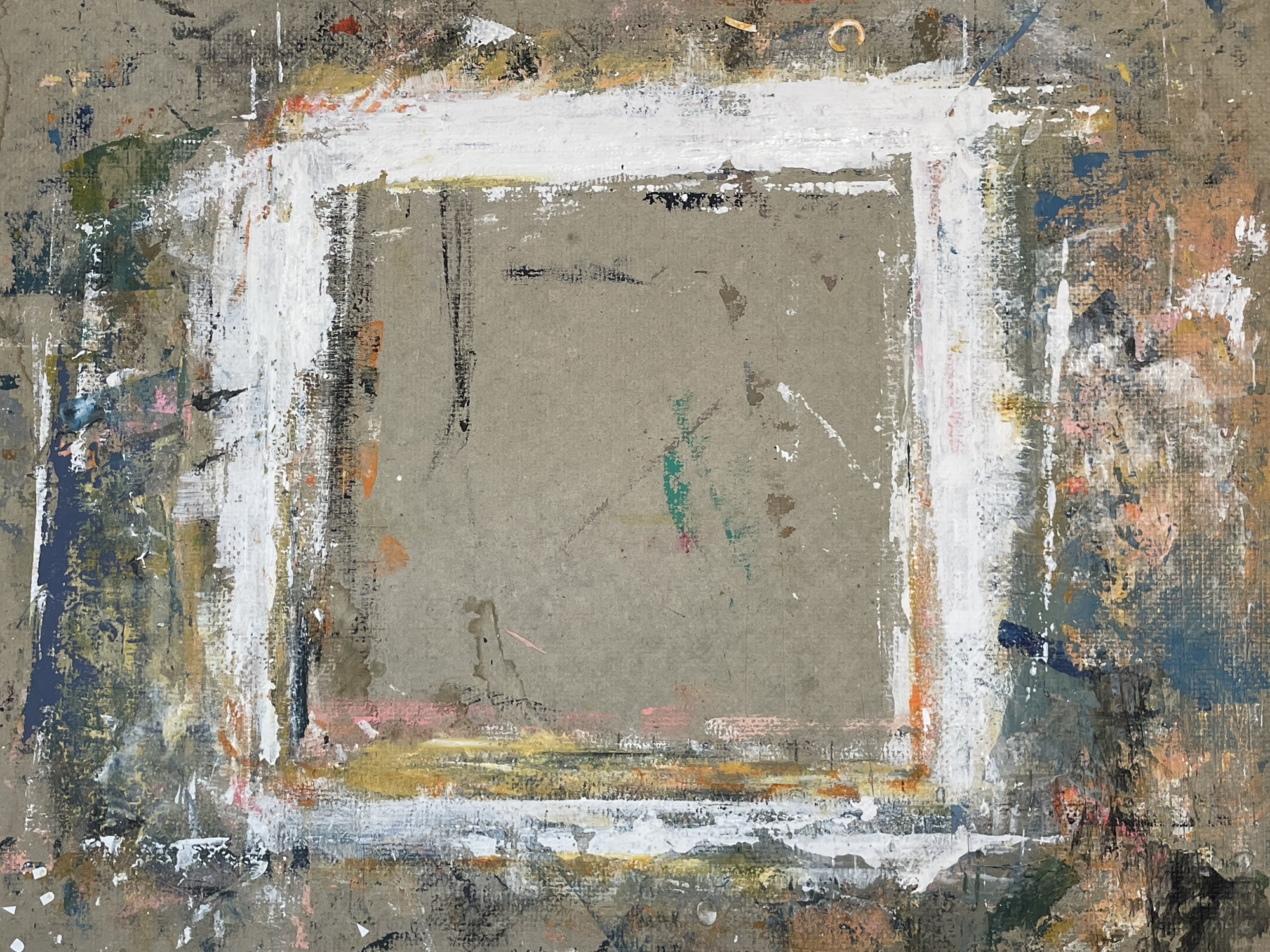
Continued work on this third drawing in the Red Book. I used more extremely crumbling ancient Letraset on this one. I sprayed it with a casein-based non-aerosol fixative to prevent the letters from entirely flaking off over time. I like the look of the instantly distressed type.
Started on a third drawing in the Red Book and it’s the first one to have a dominant image in the background to react to.
Because the photo is a portrait of a person (Lord Killanin head of the IOC at the time) it makes reacting a bit more intentional. I don’t know or think anything about him but I didn’t want my drawing to come with an assumption that I am saying something particular about this person.
But I also don’t want to just cover the photo completely since a large part of working in this existing book is to respond to what’s on the page.
I’m going to create a links page on my website—what used to be called a “blogroll” back in the web days. I want a place where I can compile links to other people’s sites, publications, and projects. I want it for my own use but I also want to be part of a personal network that prioritizes people and making.
It won’t be anything fancy, just links with a bit of contextual text but it’s good to be a simple link in a chain sometimes.
I’ll post more about the page when I have it started.
Here’s the second completed drawing in the Red Book. I’m learning what’s it’s like to draw on this somewhat glossy paper. I’m also beginning to make choices about what elements from the book’s content I cover and which I incorporate.
Because this was the title page and this book has a modernist grid, there wasn’t much to cover. But the next page has an almost half-page portrait photo so that will be a new challenge/prompt.
The “save space” text in very very brittle Letraset are just words that popped into my head.
The other text, “there is an evening twilight of the heart” is something that jumped out at me while flipping through a super old book I had near my work desk. I looked it up and it’s the first line from a poem by Fitz-Greene Halleck who I know nothing about. I just liked the feeling of the words.
5+ years ago when we were living in Toronto I walked roughly 7km to work in the mornings and I had a habit of taking a self portrait in front of this alley garage mural of Yoda.
This is the first complete drawing in my Red Book project. I found it was harder to establish when/how to end given my self-assigned experiment to not complete these drawings in single sittings.
I’m also getting the feel for how the pages in this book will receive various media for better or for worse.
Here’s me drawing in the new Red Book art book project. As I say in the video, I’m trying something with this book where I don’t finish drawings in single sittings as I normally do. This is the third (I think) time I have come back to this particular drawing. It might be done? But I’ll come back again just to be sure.
A few more marks made on this first drawing in the Red Book. 📕 It’s already interesting to sit and then remove myself from a drawing without finishing it. Not exactly comfortable but it pushes me in an intriguing way.
I started a new drawing project book tonight. It’s a 1976 Olympics commemorative book but that topic isn’t meant to inform the drawings I do. I like having something besides a blank page to react to and I’m sure in some cases the underlying text grid and images will nudge my drawings in interesting directions.
I’ve posted a video to YouTube about getting started and showing me alter the cover and begin a drawing on the first page.
When I say document, I mean it less in the “recorded for historical reasons” sense and more in the “just hold on to this for a little bit longer” sense. Holding the firefly of memory in cupped hands but knowing that it must eventually be released.
I wanted to save my analogy and also clearly it is firefly season.
Determined that standing in the dark of our yard trying to take pictures of fireflies is far less rewarding than just standing in the dark of our yard experiencing fireflies.
The other day, Andy Adams asked folks on Substack about their photos that explored colour. While I don’t actively think of myself as a photographer these days, it made me think about self-initiated trends I would follow like seeking out pops of red.
10 years ago I started an online group art “zine” called Amateur Escapist. I meant it to be a series of themed issues but I got self conscious about it so there was only ever one issue.
But every once in a while, I open the website and think, hmm should I do this again?
This Masonite panel will be the surface for the last drawing in my Openwork series. There will be 30 drawings total and that number is somewhat arbitrarily set by how many of these dollar store panels I was able to find before they stopped stocking them.
I’m happy with the number of drawings regardless and feel like it’s time to shift away from that path at least temporarily anyway.
My drawings are almost never about one thing but this one definitely came from a place of deep frustration, anger, and sadness. People are being murdered daily and I am drawing. There’s a hard balance to be living a life of relative peace and be a distant witness to a diabolic genocide broadcast each day.
Yesterday I made bread. Today I sat in the shade of a pear tree and marvelled at this beautifully wispy sky. These acts aren’t connected other than being core moments of an undeniably good life.
I recorded this flip through of my book work project I nicknamed “the ledger”. I made 149 drawings in this 90+ year-old insurance ledger starting in 2020. In this video I talk in real time about the project, some of the drawings, and patterns in my work that have continued after finishing the book.
What sometimes gets missed when people talk about AI and visual art is that there is this assumption that mimicry of style can replace real artwork.
But despite the fact that many of us see artwork on screens these days, artwork still exists in physical forms and it’s hopeful point of connection is personal, tactile, and multifaceted.
Even a simple piece of paper with a sketch will always be better than a tool that primarily can only output to screens.
Of course systems can be devised that bridge AI output to physical forms but in its dominate consumer form, AI can only assemble pictures on a screen. Not that pictures on a screen don’t have power and emotion, but it’s just the shallow end of the depths that we can fully experience artwork.
It’s why zines, even in their most simple folded paper forms have so much power. Holding something in your hands and turning its pages, feeling the paper, seeing it in different lights, the sound of paper, the scent of paper. There is humanity in that.
I’m nearing the end of my Openwork series. I made this drawing tonight and I believe it’s number 27. I think it will be hard and somewhat freeing when this series finishes. I think it’s helpful to me create a somewhat arbitrary point where the series ends.
The Same Duet, 2025
In this case, the ending is based simply on the fact that I am about to run out of the dollar store Masonite panels these have been made on. I could continue and just shift the form but it feels better to end.
Ending forms this higher level space around what will be 30 drawings. It connects each drawing to each other.
I make most of my artwork in single sittings and it’s something I have occasionally held against myself. But I have the most comfort and connection with making when I just sit down to start making something and I am done within an hour or less.
I say hold it against myself because there are many artists that research, sketch, build maquettes and dummies, and more before then possibly committing to an approach. And then they may take hours, days, months, years to complete a single project.
I can rationally know that every person’s practice and each medium is different but there’s still that point of comparison that can come in that makes me ask myself, “Should I be slower?” “Would slowing down make me more intentional?”
I’ve been thinking about inconsistent art practice recently.
Consistency is something that receives a lot of attention in art making and it has obvious merits. The call to show up regularly for creative expression is valid. Prioritizing time for making in whatever form it might take is healthy.
There’s also a certain pressure for artists to be consistent in what we make. A pressure to develop a recognizable style and to reliably produce new work.
Even the well meaning consecutive 30, 100, 365 day art challenges place a value in repetition. These can be powerful in jumpstarting a creative pattern for many people or simply giving them a form of permission to make if something is holding them back. But they can also subtly tell us that more is better if we aren’t conscious to examine that.
Consistent art making can mean that some people are happier and more successful — whatever their measure of success might be — making art.
I don’t intend to make an argument that inconsistency is a better way to approach making art. But I think in some contexts it can have its own set of strengths.
I began thinking about inconsistency and its value because my own art making has been disparate recently. There are a variety of reasons for that and it has caused me to have a mixed set of intellectual and emotional responses.
To be very honest about this recent inconsistency, it came out of a conflict between two types of work of mine that I feel good about. That conflict was, in part, based on trying to balance the distinct differences in style, format, and response between the art work. It was also an inner conflict around how much is good enough?
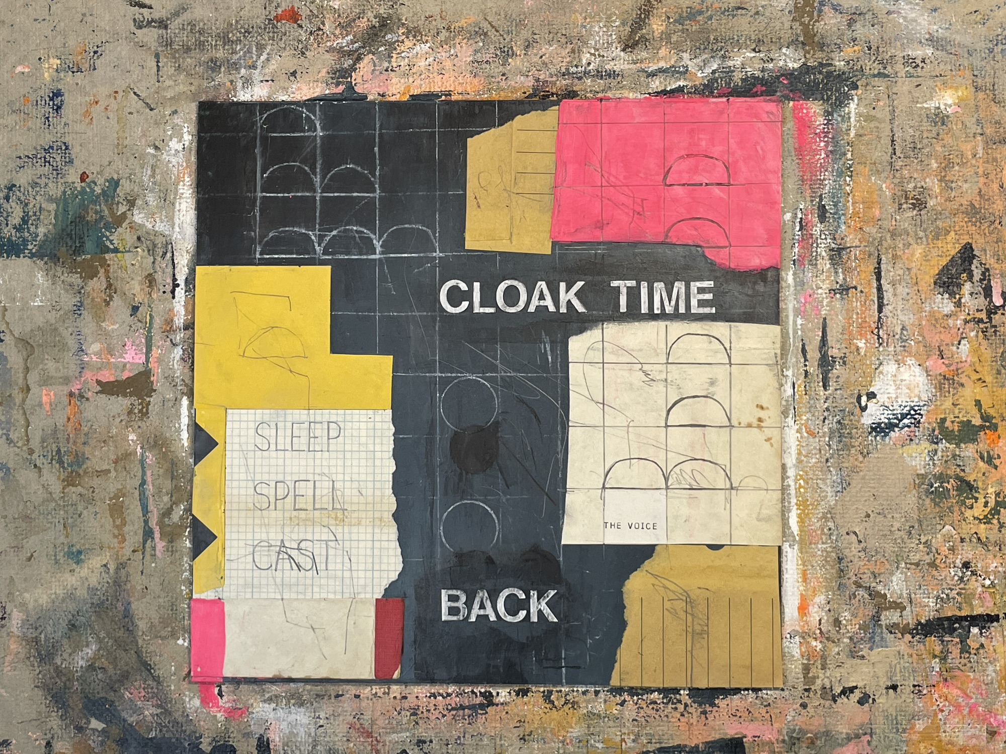
I have shared drawings from an on-going series called Openwork. Those drawings are abstract and intuitive mixed media pieces based on play with layered hand drawn and collaged grids.
Gold into Lead, 2025Automatic Motivations, 2025
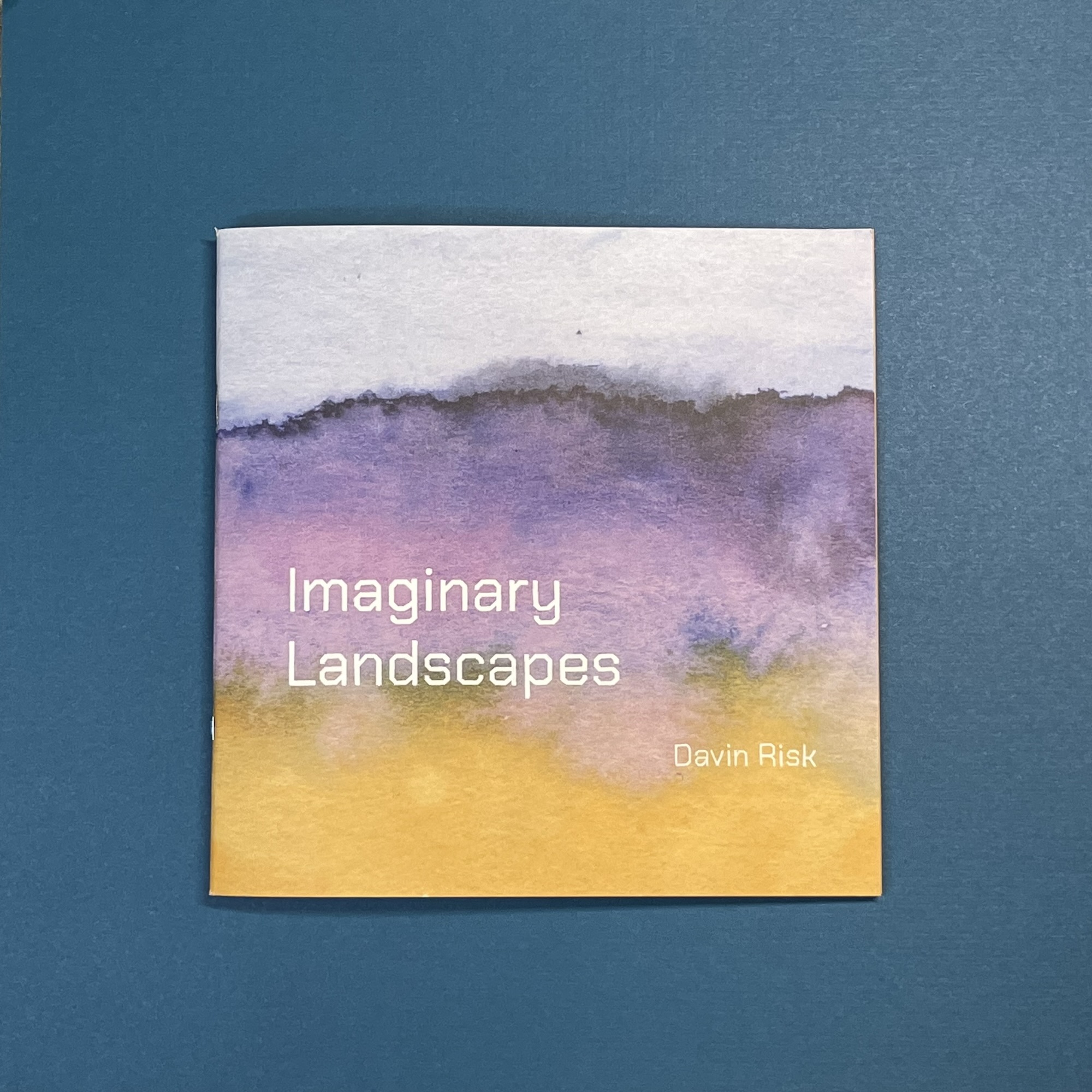
While working in those drawings, I also returned to work that I had made a few years ago. I designed and published a book called Imaginary Landscapes based on a series of intuitive watercolour paintings.
I feel strongly about both of these projects and yet producing one in the midst of the other caused me in some ways to assume I was doing something wrong.
It’s very unlikely that anyone would look at the two series and know that both were made by the same person. That shouldn’t have any bearing on how I feel about them. But that sense that successful artists have a rigour that results in work that is clearly theirs’ snuck in and made me start to doubt both series. That’s also just how my psychology works sometimes, it’s hard for me to hold on to pride for too long before some form of self doubt snakes its way around.
I published the book and sold a few copies and had some truly kind reactions from people I didn’t know. That’s a success even if I look at the small remaining stack of books and my lizard brain says, “hmm but they didn’t all sell did they?”
While making the book, the Openwork series had to pause and then that pause dragged on a bit too long. And then good old lizard brain started in on those drawings. “Were they something? I thought they were something.” Seriously… lizard brain is a jerk.
So that fun ouroboros of self doubt got me considering consistency.
I have always been someone to jump around between styles and mediums. When I’m kind to myself I think of that as being part of a healthy intermedia art practice. When I’m not kind, it feels unfocused and scattered.
When I look back at those variations in types of art making, there were often reasons for the switch and what I made was what I could and possibly should make at the time. The paintings from Imaginary Landscapes came out of a specific and stressful family health situation. Their format fit our circumstances at the time and their connection to landscape and place came from a desire for those spaces that could only be resolved in imagination.
So in part because I am trying to coax myself back into the Openwork series and partially because I am trying to push back at the lizard brain, I have started to think of inconsistency as a strength.
Space between when I make creative work and seeming divergent forms of art can free me to explore. Allowing myself to create in fits and starts forces me to confront what the work is for. It brings up questions of audience and expectations.
We have all contributed to an online social/commercial system that we assume scolds us for our lapses in attendance. If we aren’t present and productive, we feel a sense that we are not living up to social contract we don’t remember signing. It’s a perversion of the Fear Of Missing Out… a fear of failing as a creative person. Fear of Disappointing. But disappointing who exactly?
Coordinated Time, 2025
Again, I’m not pointing an accusatory internet finger at people who are finding value and comfort in showing up in a consistent way. If it’s healthy for them, then it works. I’m actually trying to avoid pointing that finger back at myself.
I want to establish within myself the permission to not make. To shore up the boundary that what I make and when isn’t a measure of success. The time spent creating has enormous value but trying to quantify and expedite it doesn’t increase that value.
Do you thrive in consistency or inconsistency or possibly some liminal space between the two?
Latest piece in my Openwork series. These have slowed down for me. Or art making as slowed down and these are just where I am right now.
Gold into Lead, 2025
The series will finish (at least in this incarnation) soon since I am almost out of the cheap Masonite panels these are made on.
Once the series is resolved, I need to document them properly and then I’ll put them up for sale. And then I might make a book with them, not sure yet.
This morning in the garden. We recently did some work on the bed in the foreground which will eventually be the backdrop for the pond we are digging. We planted a small Japanese Maple that will someday reflect in that future pond.
It is strangely life affirming to work at a pace that connects with years ahead of us.
Neighbours a few house away keep pigeons and we see them some days doing their fast racing loops. There seems to be a pace bird that flies in front and then drops back as they arc to guide the flock into their next loop.
In our previous home in the city, I would take a photo from the rear window most days of the garden behind the house. Those images showed the subtle changes day to day that became broader changes with time.
View from my work room window this morning.
In this home here in a small town, I haven’t kept up the practice mostly because our windows are scratched 1950’s tempered glass and don’t make for clear photos.
But I’ve taken it up again because I reminded myself that the practice wasn’t about the clarity or quality of the photos but the act of making a record.
I need to remind myself more often that even a “flawed” action can develop into a record or a voice that can ring true.
I like a certain degree of chaos in my art making space. I tend to thrive on some level of happenstance in reacting to what’s at hand.
But I haven’t been connecting with this work space as much as I would like over the last few months and so I took a few minutes this morning and bit a bit of basic tidying and sorting.
It’s enough that I can reset both the desire to make connections and also the facility with which I can make them without becoming overwhelmed.
Zine plotting continues. I made a couple of these mini dummies at half the size of the final zine. Handy for scrawling notes inside to get a sense of content and page sequencing.
This zine will be issue 1 in a series based on an idea I had a few years ago.
Trying to keep the production scrappy but special — handmade but not backbreaking.
At least this is how I made one. You should make one too!
I’m not usually someone that feels like the way I make things is of much direct value to other people. I feel the same about other artists’ work. I am interested in whyartists make what they make and how they connect to a process for making but not as much in the techniques they might use.
I know that I primarily learn and discover from direct experience and less so from following someone else’s patterns.
In making my art book Imaginary Landscapes recently, I did realize that while prior experience doesn’t remove all of the friction from a process like making a book, it sure helps.
Because I have years of experience with design software, printing process, and more specifically making other books, I could approach making this new book with fewer doubts and gaps in my knowledge.
So I thought I would share some details from my specific process creating this book with the hope that some of the nitty gritty details might help others if they feel stuck in wanting to do the same thing.
I’ll break down my process into a few broad steps. The order and specifics of these may not match someone else’s project needs but should still highlight some of the main parts of the process.
I am calling the following sections “steps” but they don’t actually need to be linear and I would assume that you’ll jump back and forth between them in practice.
Step 1: Source Materials
Books are primarily framing devices for the text and images within so it can be helpful to take stock, prepare, refine, and edit source materials before starting to make a book.
It may seem odd not to start with a question like, “what sort of book am I making?” but thinking about what elements will form the core of a book can be useful in informing the eventual “shape” of a book.
Images
In my case, I had made a series of small square watercolour paintings a few years ago and I knew they would be the sole focus of the book.
I was very thankful to past me for making scans of the original 48 paintings. All but one of the originals have been sold so I am grateful for my forethought at the time. I’m not always that great at documenting my own work!
To save time, I scanned groups of paintings all at once on the scanner bed.
I scanned the paintings at 600dpi as RGB TIFF files on an older Epson Perfection 4990 flatbed scanner. That mild technical info isn’t overly important but just try to get the best reproduction you can of whichever visual source materials you might be working with.
To break that info down a bit…
DPI stands for dots per inch which can mean different things these days with different forms of printing but it is essentially how much visual information is packed into each inch of an image.
RGB most people might know stands for Red, Green, and Blue and is the short form for a more detailed colour model that a digital image uses to render an image.
TIFF is an image file format (tagged image file format) which is often used for scanned image data. This isn’t all that important but a note that it’s best to avoid some file formats like JPEG since they can use “lossy” compression formats meaning each time they are resaved they might lose some image data/quality.
With the images scanned and on my computer, I could step back from them as individual images and see them as a series. I started to make choices about order, inclusion, pairings, and size.
One simple tool for doing that sort of work is to make a “contact sheet”. I printed out a grid of all of my possible images on our laser printer.
Contact sheets are for making quick editorial choices so they don’t need to be high quality.
I knew there would be both practical and aesthetic reasons that not all of the original images would make it into my book. So the contact sheet also helped me be less precious and make some cuts before any actual book work began.
Writing
My book has very little text and so I ended up doing all of that work during the design process.
But like source images, it can be helpful to have your text prepared before you think about design. There’s no single correct way of doing this.
Index cards can be a great way to think about the book format. You can write on them with anything and they have the benefit of being reordered to help think about the flow of a book.
Post-it notes are good too. Even better, the index card sized ones since you can grab a free patch of wall and work out your page order while standing back and getting a better holistic view of things.
The text data can be entered wherever you feel the least friction. Write in the simple notes app on your phone, use Google Docs, or use software like Scrivener. In the end, you just need formatted text that you can copy or import into whichever layout software you end up using.
I like to mix physical and digital processes so with both image and writing materials I think it’s best to not assume this as a linear process. You can go back to contact sheets and index cards even after a book is mid-design. I would recommend that actually. Physicality can snap you out of some of the boxes of digital.
Step 2: Setup
Okay, let’s start thinking about the shape of the book.
By that I mean the literal square or rectangular format of the book but also its size, the paper, how it’s bound, the printing, etc. This is where things can get daunting because the number of possibilities is vast.
It’s why I think starting with the source materials can help. For the Imaginary Landscapes book I knew I was working with square original paintings. The paintings were also very small at 3×3″. So those physical factors nudged me towards making a small and square book.
Some of these choices may be made for you. On-demand print companies like Blurb or Mixam, will have fixed formats they will print and the same is mostly true of traditional publishers that have styles and sizes of books for particular markets (and also simply how many books fit in predetermined shipping boxes). So if you aren’t making your book by hand, the physical shape of your book may fall into some of the standard formats most companies make available.
For my book, I ended up deciding to use Mixam. A note here that nothing in this post is sponsored and any services or tools I have used aren’t endorsements.
I’ve used a few other on-demand services in the past with a mixture of results. We are now in a time where many printing services are far more accessible than ever before because of the internet, software, and advances in digital printing. I won’t go into that stuff in any detail but it’s all much much easier than it ever has been.
I’m also not suggesting any particular means of making a book. But there are lots available.
On-demand printing has the primary benefit of making very small print runs possible. The cost per book is usually fairly high.
Traditional offset printing through dedicated print shops has the plus of attention to detail and quality. This option also allows for colour range, paper selection, and custom binding, tipping, and trim options that on-demand is unlikely to ever offer. Books will usually need to be printed in larger runs (250+ books at one time) but the cost per book may be lower.
Indie/Small presses can give you both personal access to people that care deeply about making handmade books and may include unique processes like RISOgraphic printing. Shorter print runs are the norm and the cost per book is relatively high.
Pure DIY book making means it’s all literally in your hands and the process is opened up to loads of interesting flexibility and variation. Because it’s all on you and the materials and processes you choose, it’s harder to determine the cost per book. Be guaranteed that a LOT of sweat equity will go into making your own books but the rewards can be very high!
I chose on-demand printing for my book because I knew I couldn’t make what I wanted on my own given the time, materials, and equipment I have access to. I also didn’t have the money to pay for the upfront costs of a larger print run through an offset or indie printer — though those are the options I would choose if I had the money.
Alright so let’s dig into print setup.
One of the reasons I chose Mixam over other on-demand printing options was their wide range of book sizes. Even the fact that they have multiple square format options was good for what I wanted.
I chose to make a 7″ square book.
Mixam (and most other on-demand services) has their own bespoke layout software and also allows for custom designs made with a variety of tools that allow PDF output.
Because I have the prior experience with it and access to the software, I chose to design my book in Adobe InDesign. Page layout software has always had a smaller of options but it is starting to expand somewhat. Here are a few other options but I won’t pretend this is an exhaustive list…
Affinity Publisher
Quark XPress
Microsoft Publisher
Canva
Google Docs
Pages
Spectrolite
It really depends on what your needs are and what your budget for software is. The learning curve and cost on something like InDesign might not be worth the hassle if you just want to experiment with print layout.
Whichever tool you choose there will be a few basic things you’ll want to consider before you can get down to the fun part of designing the book.
Colour Model
I mentioned earlier that the scanned images of my paintings were RGB files.
While it is dependent on which printing method/service you choose, the norm for most printing is to use a CMYK colour model for all printed assets.
CMYK stands for Cyan, Magenta, Yellow, and Black and layers of these colours are used to create full-colour images in the majority of printing you see day to day.
There are exceptions of course and by using offset or RISO printing services you can add fewer or more printed colours but I won’t dive down that rabbit hole here.
Working with Mixam required CMYK source files so I needed to convert my RGB scans to CMYK. This is easy enough in lots of programs — I used Photoshop. Switching colour models can cause images to change tone or contrast so make the shift on copies of any images you have.
The colour model your print service requests will also affect things like how text colours are set in the software you choose. If you get serious about making full colour books there are resources like Pantone matching guides which show high quality printed swatches with colour model data.
Working with printed halftones and colour matching between screens and paper can be both an art and a science unto itself. Depending on your project and what method you choose for printing there can be distinct quality shifts and also changes in access to print professionals.
On-demand printing has come a long way now and you are often being matched up with a print shop semi-local to you when placing an on-demand print order. Most of them seem to be using some flavour of HP Indigo digital press these days so the quality differences between on-demand services shouldn’t be huge.
Trim Size
Much commercial printing is done on large sheets or rolls of paper. When we make a book of a certain size, like my 7×7″ book, its pages are often ganged up for printing on the larger paper size and then trimmed to the bound size afterwards.
Because of this there are a few lightly technical things you might want to know about how those pages are cut and bound. Many services will tell you to allow for a certain amount of “bleed” and they may also talk about “trim-safe” margins.
Most services will also have downloadable template files in one or more formats to help with file setup.
Both of these terms refer to the outer edges of a book page and the tolerance or variability in where cuts happen.
The Document Setup panel for my book in InDesign.
Bleed refers to printed elements that you want to go right to the edges of a page. That could be a “full bleed” photograph that fills an entire page or even a single flat colour that fills the trimmed page. Because print trimming can have subtle variation, you need to extend those printed elements into a range requested by your print service. What this can mean is that for something like a photo filling a page, a small fraction of the image will be lost.
One of the facing page spreads from my book shown in InDesign with margins and bleed guides visible.
The other layout aspect similarly affected by trim tolerance are things like page numbers in corners or any text that comes close to the printed or folded page edge. There are lots of other visual reasons to have clear margins for text blocks in books but trim-safe margins just make sure that everything that should be in the page is there.
Binding
Books can take a variety of forms and a large part of that is how the pages are bound together. You’ll see terms like saddle-stitched, perfect, or case binding. Or others like spiral, coil, and comb binding.
Some publications may be self bound like single-sheet folded or accordion folded zines or mini-books.
My small book like many larger page count zines, chapbooks, or pamphlets was saddle-stitched. Saddle-stitching mostly refers to small publications that are a single stack of folded pages with staples at the fold holding the book together. This is a nice simple method that is very achievable at home with a normal or long arm stapler.
There are a few functional limits to saddle-stitch bound books.
Page counts of saddle-stitched books must be in multiples of four since each sheet of folded paper makes up four pages.
Because the pages are folded over themselves, there is a natural page limit due to all that paper being wedged into a single thin attachment point. The “danger” of saddle-stitched books with too many pages is they never really close well and tend too have a kind a bulge in the middle. “Too many” pages in the case of saddle-stitched is some somewhere between 32 and 64 depending on interior and cover paper weight (thickness).
Folding of pieces of paper over on themselves also causes them to fan out at the non-bound side and that side is often trimmed off to flattery that edge. This is easy for commercial printers to do with large cutters but a bit more of a hassle at home. It also means that any pages at closer to the centre fold will have subtly thinner outer margins because of the relative amount trimmed off.
I chose to make my book 32 interior pages plus a heavier weight cover for a total of 36 pages. I chose a fairly heavy matte paper stock for the interior pages as well so I knew any higher page count and my book would always kind of flop open.
One of the spreads from my book shown in InDesign with the Pages panel open showing the facing pages view.
Perfect binding is the other most common choice. Most softcover books and many magazines are perfect bound. In this type of binding, the pages are cut at the centre fold and glued into a flat flexible spine. It means page counts can be much higher and there isn’t the “creep” of pages like saddle-stitching so the outer edge has a uniform trim.
Case binding is what most hardcover books use. In case binding, pages are grouped into folded “signatures” which are 8, 16, or 32 pages. These are a bit like the fold of a saddle-stitched book but in multiples that are sewn together and mounted to the hard cover board.
I’ve made a few case bound books by hand myself and they are labour intensive but the result is wonderful. Because of the materials and labour involved, case bound books are more expensive to produce no matter which printing service you choose.
Step 3: Design
It may seem strange that I have design listed after talking about printing but like I said earlier, you need to know the “shape” of your book before many interior design choices can be made.
Because I chose to use the square format of my original paintings as my book’s ratio, some design decisions felt fairly straightforward to me.
When placing images of paintings at their original 3×3″ size, they felt good to my eye in the centre of pages with titles below them.
InDesign spread view showing 100% image scans placed in the centre of the page margins.
For a bunch of the spreads, I made editorial choices to pair images in left and right pages that have a connection in terms of tone, colour, and/or location.
Because I love the textures and almost fractal nature of how watercolour paint can react with paper, I also chose to scale some paintings so that they were full bleed. I tried to keep these to a minimum and many of the paintings I chose to scale up were the more abstract ambient landscapes.
For most of the paintings I prefer the original miniature sizing. Something about that size viewed at arm’s length feels right to me. They’re all fairly distant views so I like that relative visual distance.
Spread with coloured frame.
I wanted to keep these overall design elements very simple with the focus remaining on the paintings. But for a few of the spreads I “eye-droppered” (selects a single pixel’s colour data) single colours from the left page image to use as tinted frames for the right page image.
That’s part of the benefit of working with artwork in book form — there can be play with spacing and colour outside of the original work. I didn’t want the book to feel white box gallery stagnant. I’ve always appreciated exhibitions that displayed work on non neutral backgrounds. A book, like a good gallery exhibit, should have its own set of narratives and character.
Some of the images get transformed to me based on their framing colour.
A short note about the typeface I chose. Other than a short introduction, most of the text in my book are the painting titles.
While I have numerous more traditional typefaces I could have used, I wanted something a bit quirky. I was looking around and liked the blocky nature of the typeface Chakra Petch, designed by Carson Demak for Google Fonts.
For the cover, I drew a rendition of the interior typeface in Procreate and overlaid it on the cover painting.
The typeface has an almost sci-fi meets Wim Crouwel (Dutch graphic and type designer) feel to it. What you wouldn’t guess is that while I’m only using the Latin character set for my book, Chakra Petch is a Thai-language font designed by a Thai design studio. I almost wish I could have used some Thai in my book because it’s a beautiful language and it looks amazing in this font.
Side note on this side note… Google Fonts gets a bad wrap, but they have some very well made font families in the mix.
Step 4: Printing
When I felt good about what I was seeing in InDesign, I browsed to the Mixam site and started the order process.
Here’s the breakdown of my initial order:
20 copies
saddle-stitched binding
CMYK printing
32 interior pages on 80lb uncoated paper
120lb uncoated cover with outer and interior printing
I exported my book design from InDesign as a PDF. Mixam has a few options for file types they will accept but their PDF process seemed the most straightforward.
Mixam’s document import system.
I did run into an issue initially since I had made a single 36-page InDesign file including the four pages for the cover. Mixam wants three files: front cover, interior, and back cover. This was easy enough for me to do by duplicating my InDesign file and removing pages but I do wish their tool could just be told that a file contained the cover layout.
Because Mixam’s tool is visual and labels each page it imports, it’s easy to make sure everything is correct. They also have a quick preview mode that shows the uploaded book pages in an onscreen flippable form.
Flip book preview.
They also have per-page previews and a full downloadable digital proof that gave me enough confidence that all of the bleeds and positioning looked correct.
Preview that clearly shows the trim and bleed options for a single page.
This is one of the possible negatives of on-demand printing there aren’t the options to see physical printed proofs or to do in-person press checks. Having worked on other projects that allowed me to go in person to a print shop and work directly with a very seasoned print tech, I missed that level of confidence.
But I live in a small town now and so a print shop visit wasn’t in the cards. Plus as you’ll note from my Mixam order list above I only had 20 copies of my book made in the initial print run — most print shops won’t really deal in tiny numbers like that.
Once I double and triple checked Mixam’s digital proofs, I plonked down my credit card and waited.
I was quite happy with the turnaround time but do be prepared to wait for up to two weeks or so if you go this route.
Happy box of books!
Almost nothing is more exciting than opening a box of freshly printed books you have made.
Okay! That is how I made my book. I hope the details of my process give you some insight into what was involved and some pathways you can take if this is something you would like to try.
I honestly recommend this to any artist. There’s something special about editing, shaping, and eventually holding in your hands a book of your own.
Poem I love by Gayla Trail from the Grow Curious second edition.
Painting and design by me.
Both editions of Grow Curious had watercolour and gouache paintings by me but the second edition was full colour and meant I could play a bit more with how the artwork was used.
My connection to art making recently took a more curatorial turn. As I’ve showed in my last post, I was drawn back to work I had made in 2020 and made a small book from that work that I published.
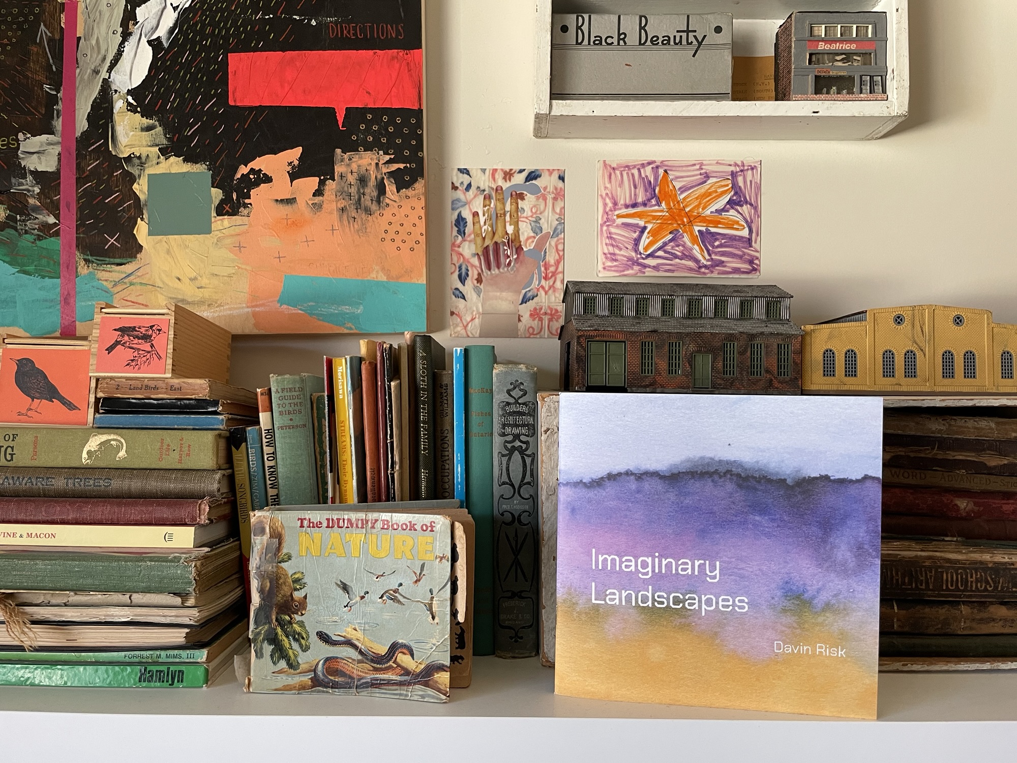
My book Imaginary Landscapes
I feel very proud of the book and the revisiting this watercolour work in such a positive way has been helpful to me. My association with past work hasn’t always been a good one. Looking back on things I have made can sometimes be clouded by unwarranted self doubt.
But I saw my own sense of beauty in the small spaces I painted back then and it was heartening to find that they were meaningful to others as well.
The process of making this book was partially like being my own curator but also a new creative design project. I was able to view all of the images from the 2020 series, define a smaller set that I wanted to work with, and think of them in the context of this book — which to enlarge and how to set them as complementary pairs.
…
But what I’m thinking about more today is what I was doing before I looked backward and made this book. Im thinking about the artwork I have been making over the last year, an on-going series I have called Openwork.
Blame Loop, 2025
It’s been almost a full month since I made one of these drawings. The image above is the last one made.
Shifting my energy towards making the Imaginary Landscapes book meant that there wasn’t as much time to devote to new art making but it was also the mental and emotional shift in looking back at a very different kind of work.
This balance between these different modes possibly oddly made me think about Alexander Graham Bell and kites.
I know… the brain does what it does but there is some sense to it.
1904 image of Alexander Graham Bell with tetrahedral kite
Graham Bell is of course known for his role in the history of the telephone but like many polymath inventors, he and his collaborators had many other projects and focuses.
Many years ago I encountered a few surprising images of Graham Bell and the complex tetrahedral structures he and his collaborators were testing.
1905 E. H. Cunningham photo of Graham Bell’s Frost King kite.
This fascinating story of these early attempts at facilitating manned flight is for someone else to tell in more detail but here’s a link to start that rabbit hole for you: Public Domain Review
What I want to think about is that balance between radically different kinds of work. While Graham Bell’s work was primarily that of mathematics, geometry, engineering, aerodynamics, and more, it is also a demonstration of a mind not satisfied with a single focused path.
To be clear, I’m not making a comparison between myself and Graham Bell. What I’m examining in my work is how I can alternate between interests and forms and what could be perceived as “styles”.
The balance is both natural and also fraught with friction. There is an expectation that artists have consistent style and form that is mostly market driven. But in practice most artists have a broader web of interests and experimentation that they draw from. Even those artists that seem to be consistent visually are likely making discoveries behind the scenes that could radically change what they make at any point.
Repeated Gap, 2025
I have been (am) a designer, photographer, musician, painter, illustrator, etc. All of these labels and timelines are just pathways through a broader map of what I have done and what I might still do.
And I want those pathways to feel like they have easy connection points but honestly they sometimes feel more like dead ends. There are ways between the paths but it requires a kind of aerial view to find them.
Snapshot from a trip years ago because I couldn’t resist following through with literal aerial view. That’s somewhere near Phoenix Arizona which was a stopover during a flight to San Francisco in 2006.
The hard thing for me is that, unless I have a work context for it, I’m not great at stepping back and examining. Or maybe I am fine at it but I would rather just be into something and see where it goes.
My guess is that Graham Bell had clearer pathways between his interests and investigations. But that may just be me applying the outsider’s view to the working habits of people that have reached levels of wider public knowledge. We kind of assume that well known people that have had “success” have their shit together and work in organized and purposeful ways.
But in many cases that’s likely wrong. Maybe Graham Bell was mired by being interested in too many things and maybe his methods were sloppy and disjointed. I can’t say.
It may just be a projection on my part, but there does seem to be a playfulness in Graham Bell’s work. Like that of a historically later but practically connected inventor, Buckminster Fuller, there is the sense that invention comes from play and improvisation as much as it relies on rigour and structure.
1903 photo of Alexander Graham Bell kissing his wife Mabel Hubbard Gardiner Bell standing inside a tetrahedral kite structure.
As I now mean to turn my head, heart, and hands back to my Openwork drawing project I want to approach it with both playfulness and intention. I want to recognize the many ways in which this art making differs from the Imaginary Landscapes paintings while also feeling that both came from me and that is all the connection they need.
…
I want to say thanks to the folks that have purchased Imaginary Landscapes. Most of the orders are on their way and I am excited to think about those images in new hands again.
This book has 34 paintings of natural spaces created purely from imagination and the properties of pigments in water. These small paintings, originally made in 2020 at 3×3″, have been sequenced and set as new complimentary pairs.
Spread from Imaginary Landscapes showing two paintings at their original size.
Many of the paintings are presented at their original size as I quite love that scale as handheld portals into each of the natural worlds I painted. But part of my interest in pulling them together in this book was to find the connections between the images. Connections of colour, texture, and place.
Some paintings in the book are shown larger, filling full lefthand pages.I’ve used solid colour framing around some images, pulling those colours from the paired paintings to create interesting graphic pairs.Other pairings connect with each other based on their imagined locations.While the book is almost entirely light and open with whitespace, I framed this painting of a half-remembered view of rolling hills at twilight in a rich black.Other images like this simple view of a local escarpment tree-line from the flatness of an agricultural field I framed in a more vivid warm pink. Sometimes colours have associations that work but are hard to place why.The front and back covers both use full paintings from the series. I wanted the whole book to feel wrapped in this exploration of emotion and place.
Some backstory about these images…
In 2020, I made this series of small watercolour landscape paintings, intuitively and softly abstracting representations of places that were entirely imaginary.
When I made these images, it was at a very difficult time in our lives with my partner’s health at a terrible low and our lives in upheaval from eviction.
I worked on these paintings a few at a time, taped to the back of a sketchbook sitting on a small side table at our bedside so I could stay close to partner as she was bed bound.
Last month, I was revisiting the scans I have of those paintings, maybe hoping to bring some of their organic forms and colours into those cold February days.
I only have one of the original paintings left. This imagined crimson-toned flat landscape with a heavy muted sky is a picture of a prairie I have never visited. This painting is taped to the wall beside the door coming out of my home office so I see it often.
Autumn Prairie, 2020
I’ve written before about how I can’t form mental imagery, so the process of making these tiny 3×3 inch paintings didn’t involve any specific pictures in my head or any direct or photographic reference.
I put paint and water down and responded, often to the balance between land and sky as it formed on the paper. My response would lead some of the paintings to feel more like loose hints of a natural place — an ambience or an atmosphere.
Atmosphere No. 4, 2020
Other responses became more literal with forest forms, loose but recognizable banks of clouds, and waves and reflection in bodies of water.
Cloud Lake, 2020
While looking through the paintings again, I realized that I wanted to take them further. Other than the single painting on my office wall, the other 47 paintings in this series live in other people’s homes. I sold them all to raise extra funds while we were moving in 2020.
I love to imagine where those images might now be. Some may be framed on walls, some more casually displayed, and some could simply be tucked into books to be revisited occasionally.
I like to think that each person that purchased one of the originals had their own intimate connection to these imagined spaces. I know where they can take me in my memory. Some have specific connections for me and others are just vague but meaningful clusters of memory and emotion.
So, when I thought out loud on the internet in February that these images might make a good zine or chapbook, that thought was borne from not wanting my own sense of these paintings to dim but to also the possibility of sharing them in a new way with more people.
Part of what I like about sharing artwork online is the practice of letting visuals escape a bit and find their way into other people’s lives.
I also have a great love for artist books and artist publishing in general. Books can be artworks on their own but they are also a lovely vehicle for presentation and documentation especially of artworks that are part of a series.
I posted on Substack at the time about this unreleased book of photos of mine from a research trip to Dominica where my partner’s maternal grandmother was born.
Art books and zines can also have this somewhat democratizing aspect where art becomes more approachable, casual, and literally handheld. Screens can do this too but there is unquestionably something special about having artwork in your hands.
Because I already had the design knowledge from making multiple commercially published books and print knowledge from a variety of personal and client projects over the years it was simple enough for me to approach pulling the watercolour paintings from 2020 into a new form.
Photos taken of my computer screen as I worked on the book. The cover text was digitally drawn to match the chosen typeface used inside the book’s interior design.
I was overjoyed to open the box containing the 20 copies of the book that I had printed through a short run service. The book is printed on heavy and smooth paper and for someone that loves holding a good book in their hands, it feels so good — even a bit luxurious.
I wouldn’t really call this a “zine” in the end. I think that zines can take all sorts of forms and being commercially printed doesn’t cancel out zine-ness. But I think I feel like zines are more expressive of a one-time burst of energy published.
This book is more of a reflection or a re-experiencing of my own work. With physical and temporal distance and changed circumstances, I can see these imagined landscapes again and live in them a bit more calmly.