• Imaginary Landscapes

    I’ve published a new art book!

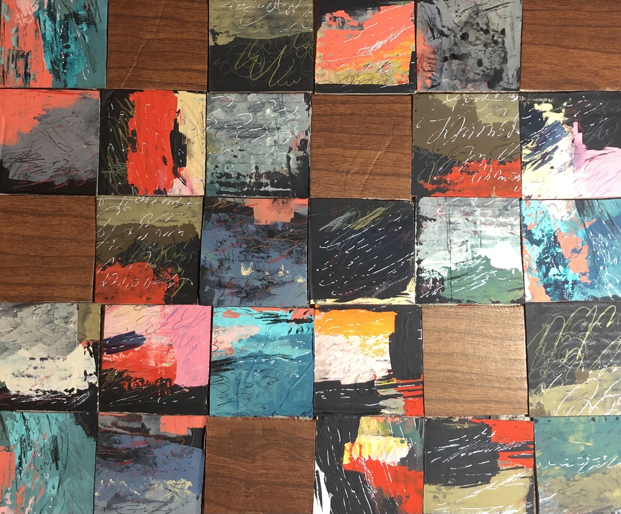
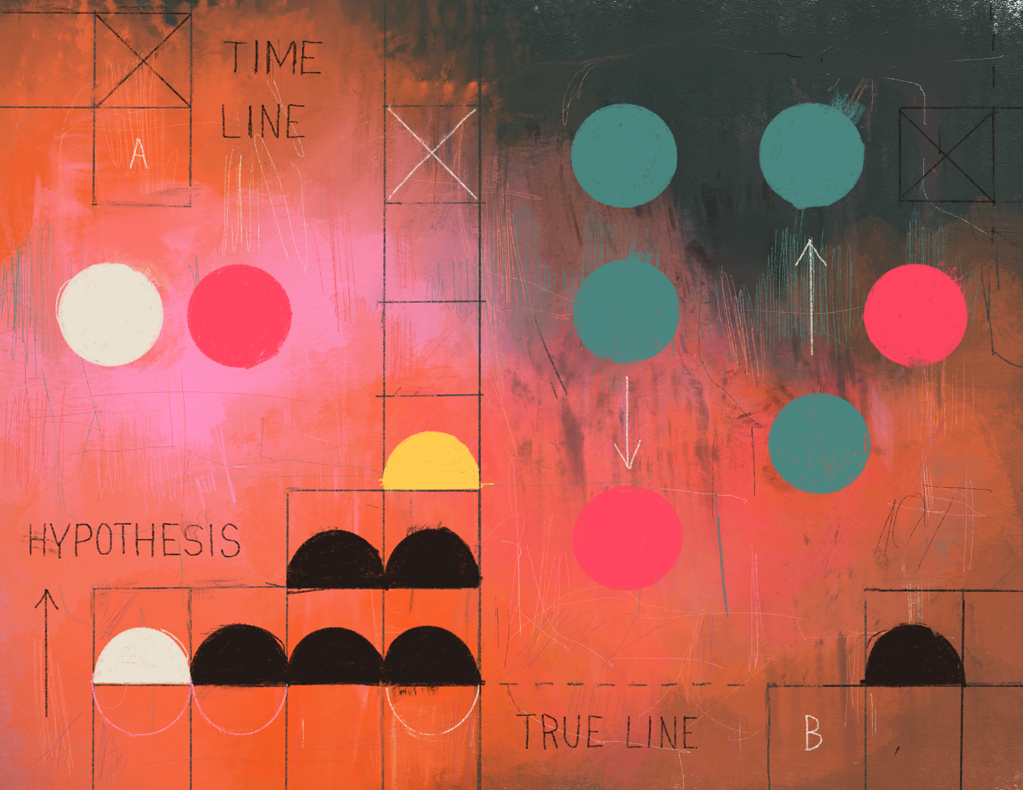
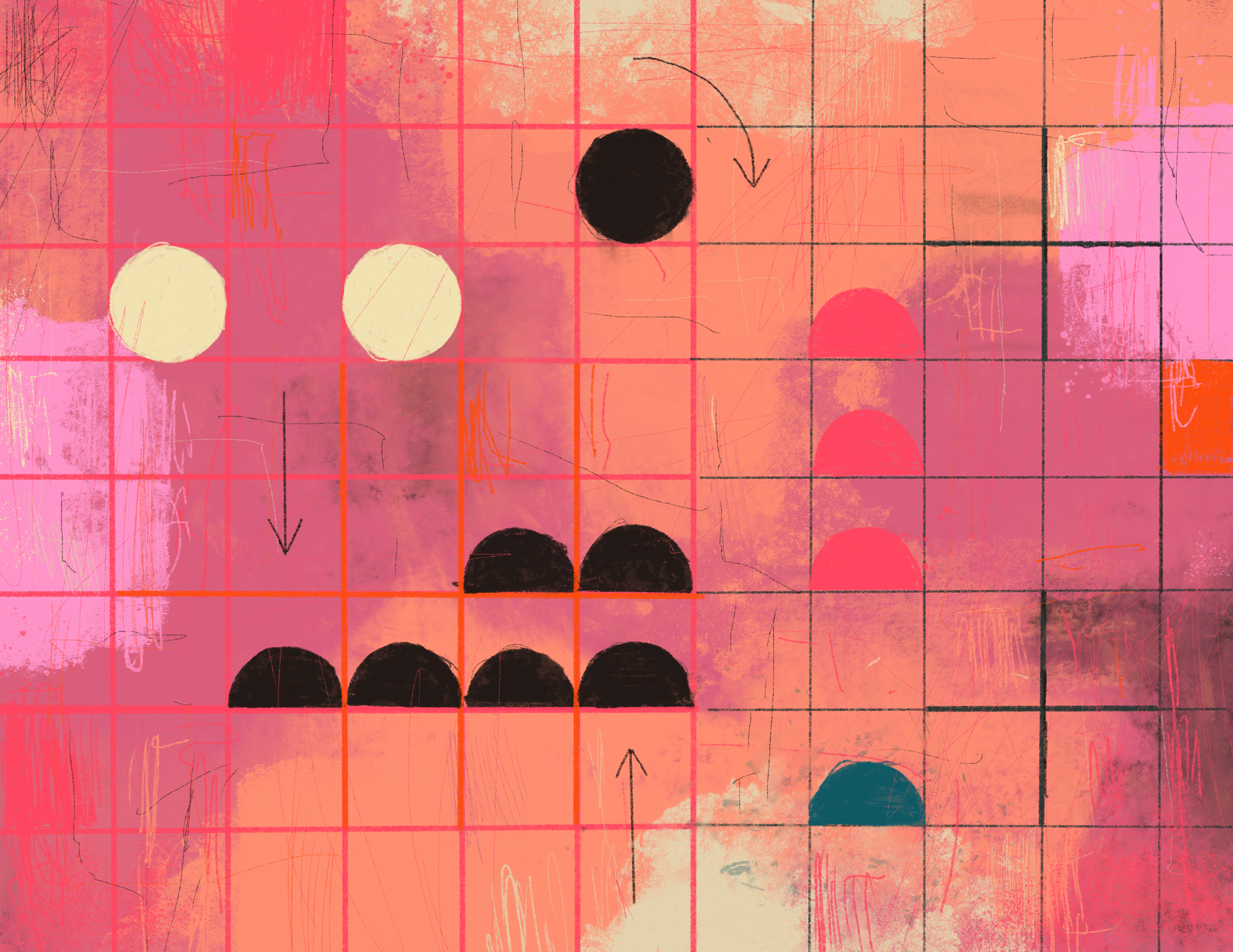
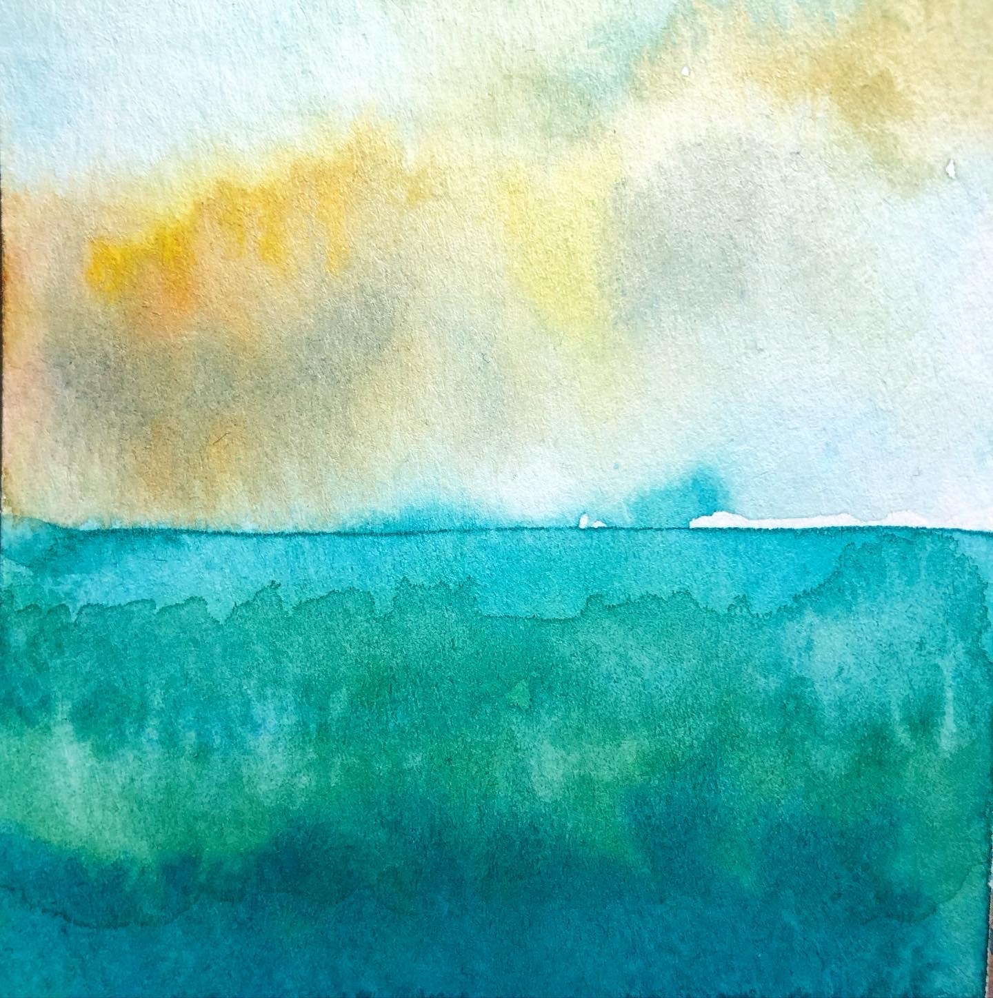
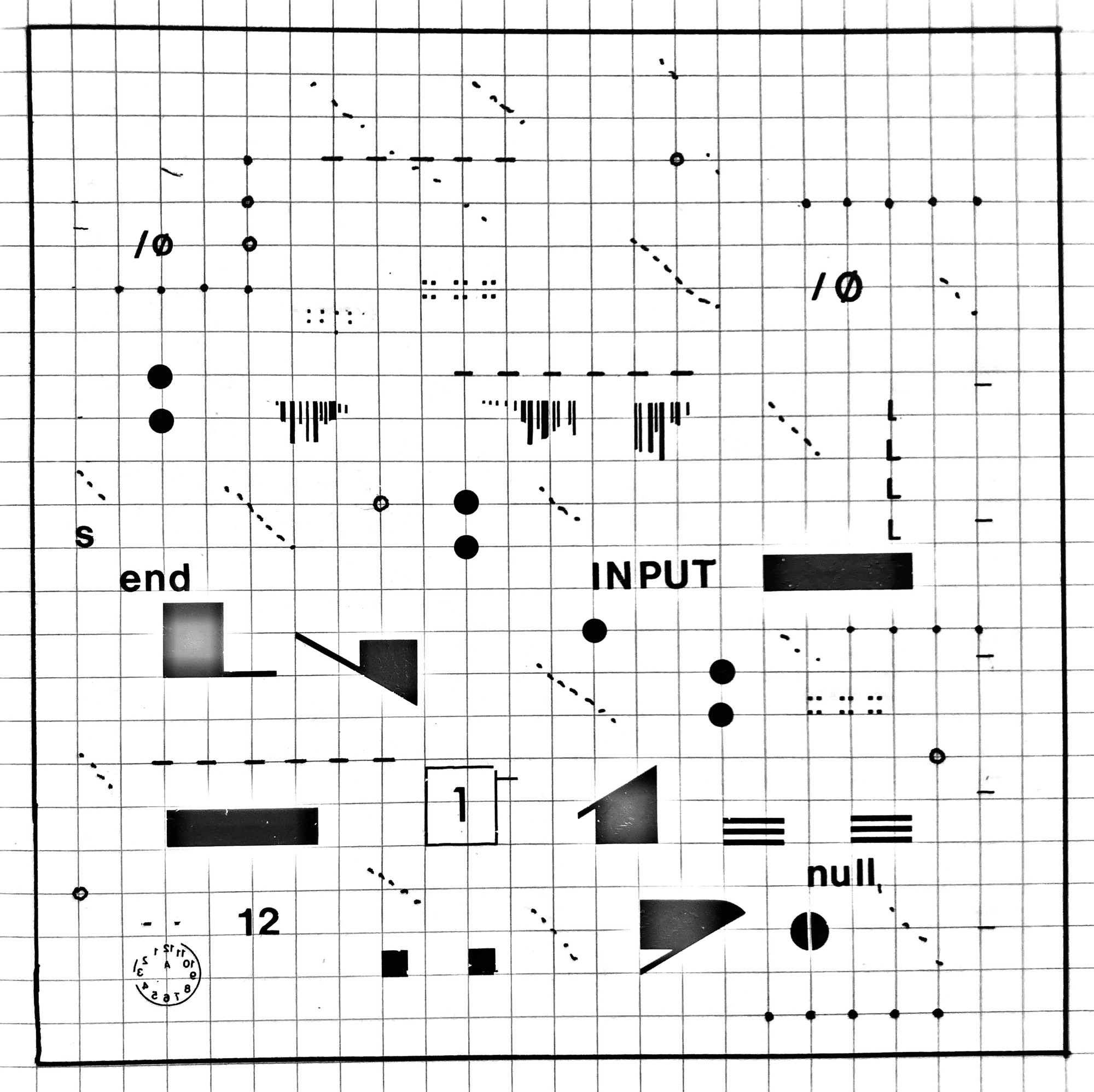
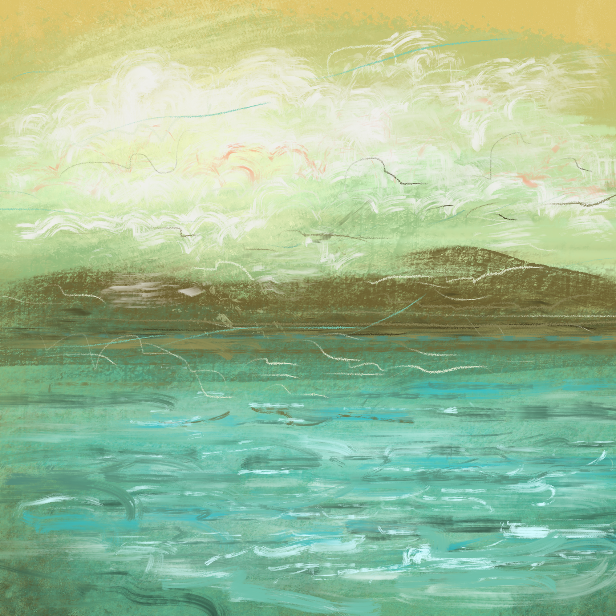
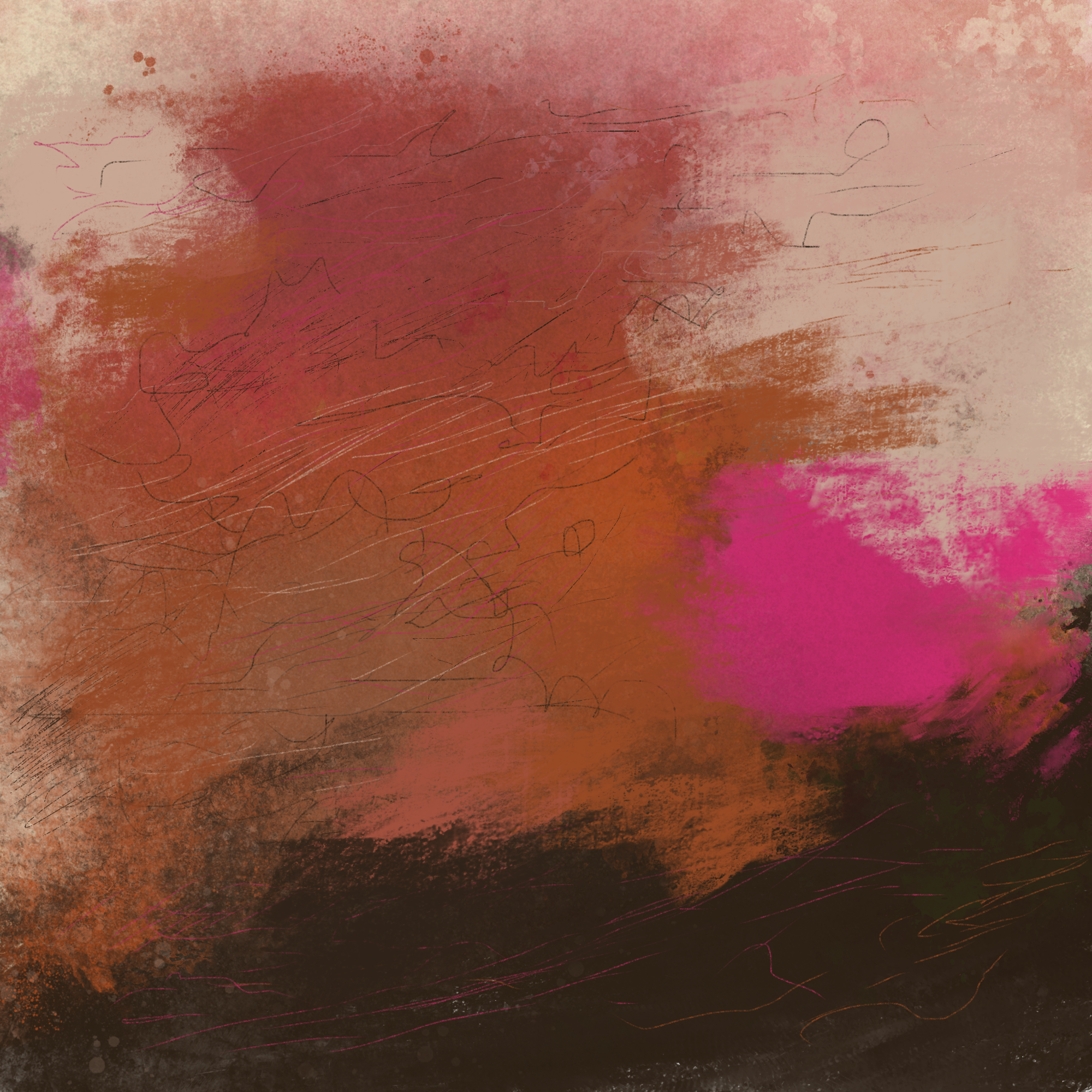
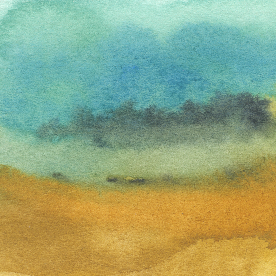
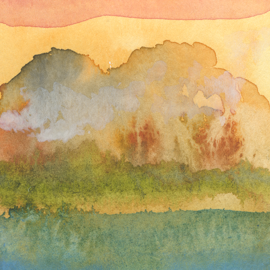
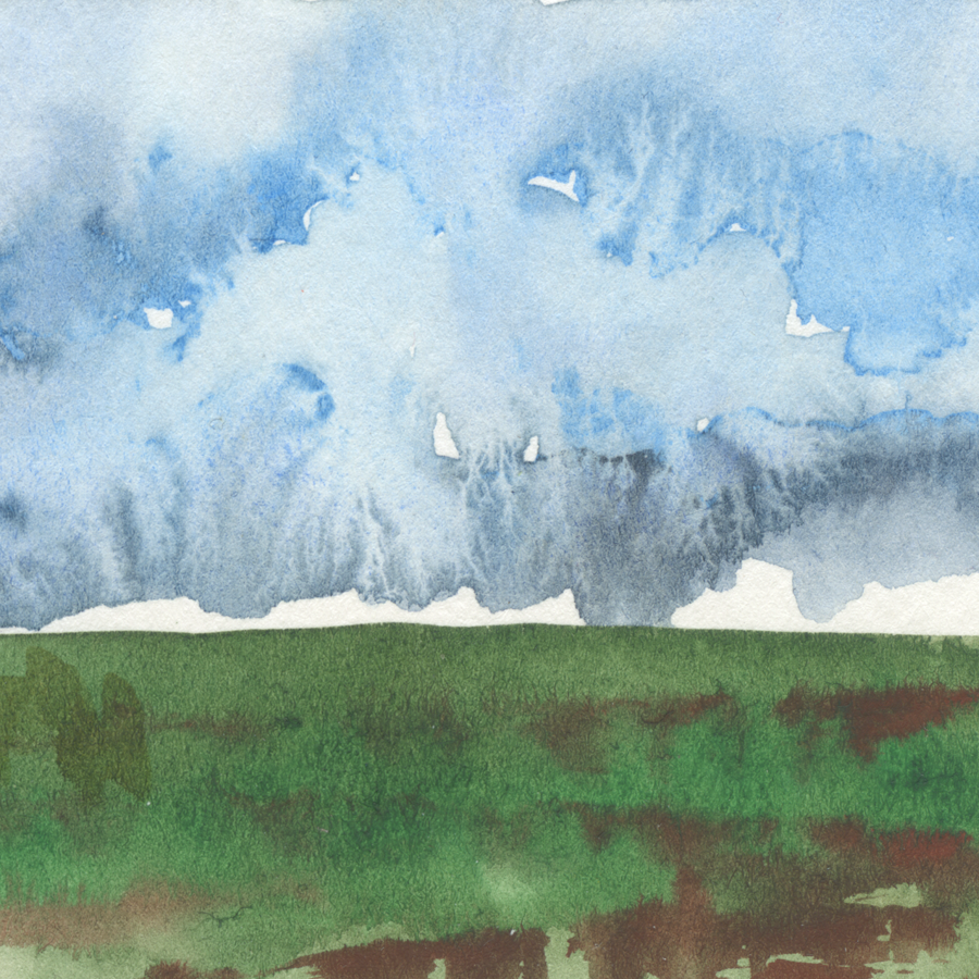
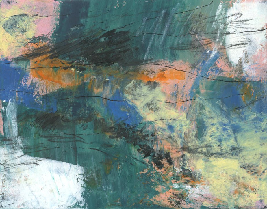
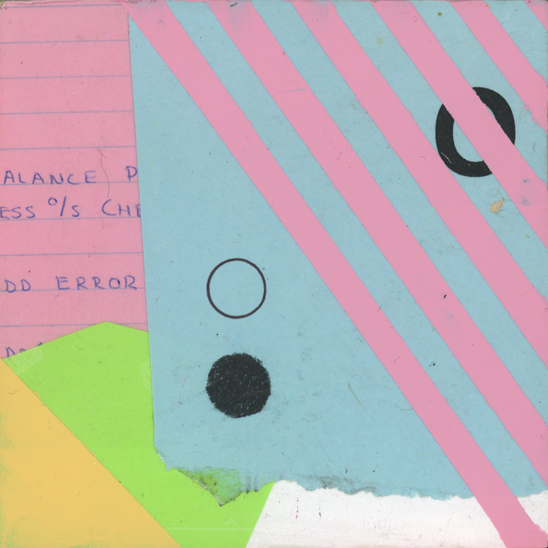
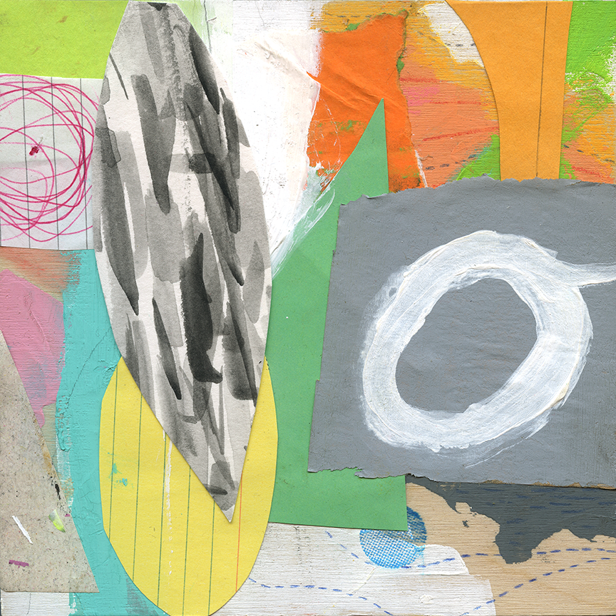
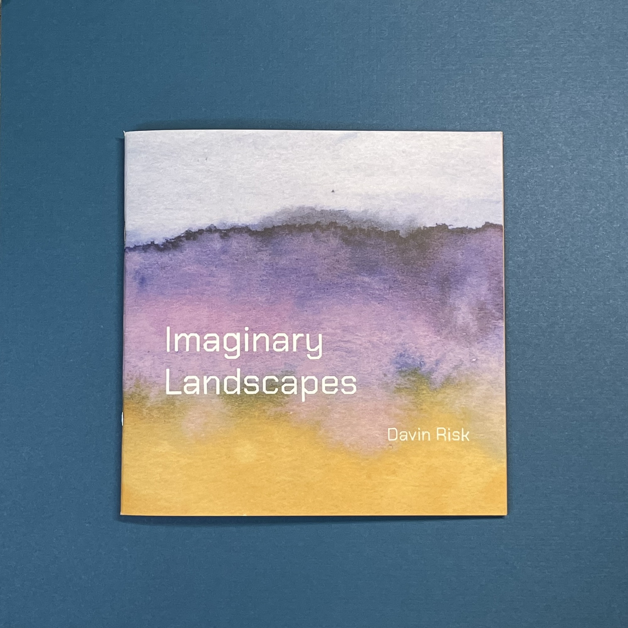
    Imaginary Landscapes is a 7×7″ 32-page artist designed and published compilation of a series of my intuitive abstracted watercolour landscapes.

    This book has 34 paintings of natural spaces created purely from imagination and the properties of pigments in water. These small paintings, originally made in 2020 at 3×3″, have been sequenced and set as new complimentary pairs.

    Spread from Imaginary Landscapes showing two paintings at their original size.

    Many of the paintings are presented at their original size as I quite love that scale as handheld portals into each of the natural worlds I painted. But part of my interest in pulling them together in this book was to find the connections between the images. Connections of colour, texture, and place.

    Some paintings in the book are shown larger, filling full lefthand pages.
    I’ve used solid colour framing around some images, pulling those colours from the paired paintings to create interesting graphic pairs.
    Other pairings connect with each other based on their imagined locations.
    While the book is almost entirely light and open with whitespace, I framed this painting of a half-remembered view of rolling hills at twilight in a rich black.
    Other images like this simple view of a local escarpment tree-line from the flatness of an agricultural field I framed in a more vivid warm pink. Sometimes colours have associations that work but are hard to place why.
    The front and back covers both use full paintings from the series. I wanted the whole book to feel wrapped in this exploration of emotion and place.


    Some backstory about these images…

    In 2020, I made this series of small watercolour landscape paintings, intuitively and softly abstracting representations of places that were entirely imaginary.

    When I made these images, it was at a very difficult time in our lives with my partner’s health at a terrible low and our lives in upheaval from eviction.

    I worked on these paintings a few at a time, taped to the back of a sketchbook sitting on a small side table at our bedside so I could stay close to partner as she was bed bound.

    Last month, I was revisiting the scans I have of those paintings, maybe hoping to bring some of their organic forms and colours into those cold February days.

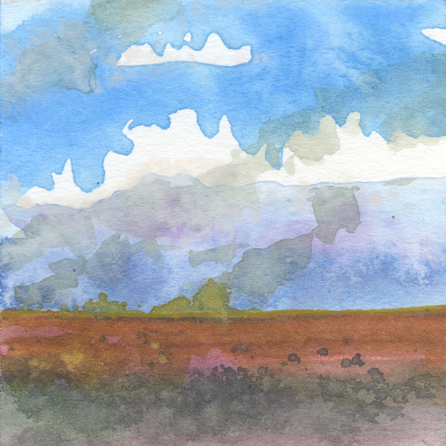
    I only have one of the original paintings left. This imagined crimson-toned flat landscape with a heavy muted sky is a picture of a prairie I have never visited. This painting is taped to the wall beside the door coming out of my home office so I see it often.

    Autumn Prairie, 2020

    I’ve written before about how I can’t form mental imagery, so the process of making these tiny 3×3 inch paintings didn’t involve any specific pictures in my head or any direct or photographic reference.

    I put paint and water down and responded, often to the balance between land and sky as it formed on the paper. My response would lead some of the paintings to feel more like loose hints of a natural place — an ambience or an atmosphere.

    Atmosphere No. 4, 2020

    Other responses became more literal with forest forms, loose but recognizable banks of clouds, and waves and reflection in bodies of water.

    Cloud Lake, 2020

    While looking through the paintings again, I realized that I wanted to take them further. Other than the single painting on my office wall, the other 47 paintings in this series live in other people’s homes. I sold them all to raise extra funds while we were moving in 2020.

    I love to imagine where those images might now be. Some may be framed on walls, some more casually displayed, and some could simply be tucked into books to be revisited occasionally.

    I like to think that each person that purchased one of the originals had their own intimate connection to these imagined spaces. I know where they can take me in my memory. Some have specific connections for me and others are just vague but meaningful clusters of memory and emotion.

    So, when I thought out loud on the internet in February that these images might make a good zine or chapbook, that thought was borne from not wanting my own sense of these paintings to dim but to also the possibility of sharing them in a new way with more people.

    Part of what I like about sharing artwork online is the practice of letting visuals escape a bit and find their way into other people’s lives.

    I also have a great love for artist books and artist publishing in general. Books can be artworks on their own but they are also a lovely vehicle for presentation and documentation especially of artworks that are part of a series.

    I posted on Substack at the time about this unreleased book of photos of mine from a research trip to Dominica where my partner’s maternal grandmother was born.

    Art books and zines can also have this somewhat democratizing aspect where art becomes more approachable, casual, and literally handheld. Screens can do this too but there is unquestionably something special about having artwork in your hands.

    Because I already had the design knowledge from making multiple commercially published books and print knowledge from a variety of personal and client projects over the years it was simple enough for me to approach pulling the watercolour paintings from 2020 into a new form.

    Photos taken of my computer screen as I worked on the book. The cover text was digitally drawn to match the chosen typeface used inside the book’s interior design.

    I was overjoyed to open the box containing the 20 copies of the book that I had printed through a short run service. The book is printed on heavy and smooth paper and for someone that loves holding a good book in their hands, it feels so good — even a bit luxurious.

    I wouldn’t really call this a “zine” in the end. I think that zines can take all sorts of forms and being commercially printed doesn’t cancel out zine-ness. But I think I feel like zines are more expressive of a one-time burst of energy published.

    This book is more of a reflection or a re-experiencing of my own work. With physical and temporal distance and changed circumstances, I can see these imagined landscapes again and live in them a bit more calmly.

    I’m excited for more people to take a look.

    Get your copy of Imaginary Landscapes here.

  • Hearts on Water

    A recent post I made to Substack’s notes has been my only experience there of what is, for me at least, a “viral” post.

    I posted five images from a series of small watercolour “imaginary landscapes” that I made in 2020 and wondered whether they might make for an interesting zine.

    I think this is the most likes I have ever had on any social media post.

    While I try not to pay too much attention to the number of likes and shares I get for things I post, it was hard to ignore getting roughly 500% more likes than one of my usual notes.

    The feelings I’ve had so far around those images getting far more attention than anything else I have posted are complex.

    Atmosphere No. 2, Davin Risk, 2020

    I do feel very good about the images and I’m glad that people connect with them. Each 3×3 inch image in the series of 48 images was a confluence of memory, imagination, and the flow pigment in water as it bleeds into and adheres to paper.

    I wrote back in 2020…

    These images are formed from memory, imagination, and the emotional connection I have from direct experience of environment, season, land, water, and weather.

    Brush Site, Davin Risk, 2020
    Atmosphere No. 1, Davin Risk, 2020

    The complexity of my current feelings about these paintings has more to do with how, as an artist, I might want my work to be seen. As part of that, there is a subtle friction in having older work — that doesn’t entirely represent where I am now — strike such a stronger chord in people than my current work.

    But I do understand why these images connect better with more people and even more so right now given the dire circumstances so many people find themselves in physically and emotionally.

    Defocused Land, Davin Risk, 2020
    Electric Valley, Davin Risk, 2020

    These images can more easily activate eyes and memory and our shared connection to places we have been or long to experience. They are also abstract enough that they work purely as colour and texture play. The organic branching forms that watercolour technique can contain drawn us humans into spaces that are inside us that we may not have a direct conscious awareness of.

    It’s not a bad thing that images like these can be “easier” and more readily available for people.

    Facing East, Davin Risk, 2020
    Fallow and Flush, Davin Risk, 2020

    There is no assumed meaning to discern in images that suggest natural spaces. We are all going to have some set of sense and emotional memories tied to landscape.

    In my mini-viral moment, it has been fun to shout out, “136 likes!” “267 likes!” “500 likes!!” to my partner throughout the day. It feels good that people find beauty in these paintings and maybe even some small solace in some very difficult times.

    Cold Fires, Davin Risk, 2020
    Mount Nothing, Davin Risk, 2020

    These small paintings were made at a difficult time and they were also a balm for me to create.

    At the time, my partner was especially ill, in a darker time of chronic illness and often confined to bed. I made these paintings on a small folding table from my side of the bed so that we could spend more of our time together.

    We were also being evicted from our home of ten years at that time and were trying to rapidly reduce our lives to be shifted out of a city we could no longer afford.

    Choose Your Direction, Davin Risk, 2020
    Lichen and Strata, Davin Risk, 2020

    These paintings just came into being.

    I had no plan for them and my intention was to test out working with watercolour paints after not using them for a long time. I wanted those vibrant liquid colours flowing into each other, branching and that sparked these simple but deep natural sky and ground vignettes into being.

    …

    So these paintings were powerful for me at the time and they remain important to me.

    That was part of what prompted me to think back to them when I have recently wondered about making a zine. But it was kind of a thought in passing without any shape to it.

    Farmhouse, Davin Risk, 2020

    With the compliments and ideas I have received from people responding to that note, I do feel compelled to make something. My thought is to produce a small square zine that will feature some of the original images plus some new writing to complement them.

    So, thank you to everyone for the kind reaction to these paintings and stay tuned for news about the possible zine.

  • Read a post where an artist said that they weren’t a perfectionist because they weren’t high achieving, were impatient, and not competitive.

    I don’t want to police anyone else’s view of themselves but can say from personal experience that perfectionism doesn’t need to have any of the things above to be true.

    Perfectionism can be messy and mid-performing. It can be fraught with impatience. It can be a purely solo competition.

  • Are hobbies where our heart is found?

    The other day a friend referred to something they devote a lot of time, energy, skill, and heart to as a hobby. I didn’t say anything in the moment but it struck me as wrong. This is something they are passionate about and have spent years working on but it isn’t how they earn an income.

    I felt that if that’s the measure of a hobby then many of the things that make up what I consider to be the best moments of my life and experience would qualify.

    A place where some “hobbies” happen

    Hobby feels like a diminishing term that tucks a vast set of actions, curiosities, learning, and creation into a metaphorical shoebox. We are told that they aren’t necessarily something we should be ashamed of but also not something that allows much room for pride.

    In my life, there have been many things I have given my attention to that don’t connect to income in any way. Things that I was interested in and even dedicated to but that lacked a certain type of legitimacy.

    Hobbies are the realm of the untrained and the self-taught where someone with 10,000 hours of experience might always be seen as an amateur.

    The word “amateur” is one I have tried to reclaim. I learned years ago that the etymology of the word amateur is to be a “lover” of something. That something that profound has become the designation for a lower class of skill, performance, or value seems extremely twisted. Similarly, the word dilettante refers to love and delight while being used as a fancy way of saying someone is a hack.

    I have a job that I have done for many years now and feel quite skilled at. I have no formal training for that job but most would consider me a professional.

    My education is in fine arts. I have a university degree in the thing that by some false measure is a hobby. I make art primarily for the love, struggle, release, and discovery that it can bring.

    I have taken thousands of photos, I draw and collage, I make music, and write. But that’s not my job. I have sold artwork over the years but not at a pace that would financially support much more than the continued making of more art.

    So I wonder if these things that get called hobbies are actually parts of what form and map our hearts? The things we do outside a job may often have more to do with who we are and what we want and need in life.

    We can be amateurs in the capitalist gaze and still lovers when seen with human eyes. And human eyes have to be more important than how the digits on a paystub find their way there.

    And I like to believe that being an amateur for life allows for a continual sense of beginner’s mind. To allow for new discovery however long we have been practicing something.

    So I wish we could purge the word hobby and talk about passion and delight and excitement. We can be proud life-long amateurs, always in love with finding, shaping, and forming whatever it is that sets some part apart of us alight.

    To my friend I want to say — as I want to say to myself — feel pride in that work. Feel the importance of something that touches your mind and heart. Don’t stuff your heart into a shoebox and turn your eyes down to the ground when you speak about your work that might never pay a bill.

    It’s not that passion might not lead to a career or a supportive income but that shouldn’t be how we set the value of what makes up our hearts.

    In the end, the very end, it will be the moments when our hearts were the most full that blaze in our memories.

  • I was thinking about these small watercolour imagined landscapes I made a few years ago and that they might make an interesting zine or chapbook.

    UPDATE: I made this book!

    Imaginary Landscapes

    https://ko-fi.com/s/e4e66e26a6

  • Regular Pace, Davin Risk 2025

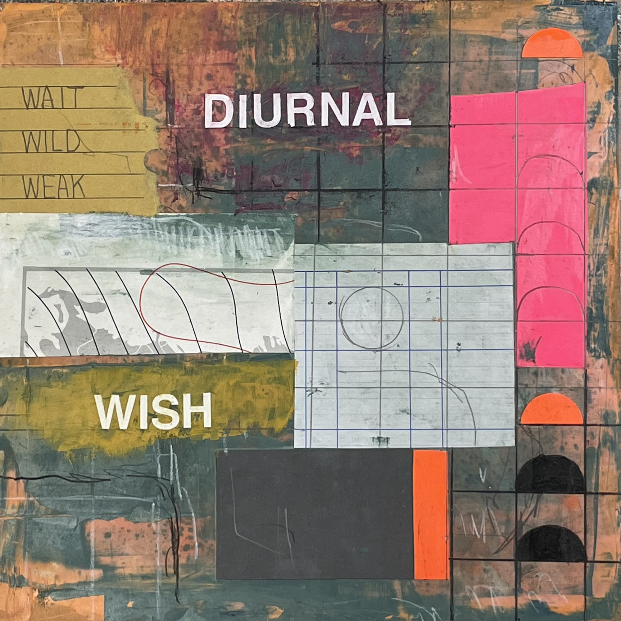
    This is the twentieth panel in my Openwork series. There is a rhythm and pattern in making these that feels good to me. Not that I don’t struggle when making them since there are points of discomfort in making each one. But discomfort in art making isn’t necessarily a sign of success or failure.

  • A Saturday morning drawing continuing my Openwork series. Most of my recent work is done on this slab of particle board that I got for free at a local art club sale. I enjoy the layers of pint that have accumulated around the square ratio of these Masonite panel drawings.

  • Many years ago, one of several art practices I had was placing these simple stickers around the city in a variety of locations. They were small and probably mostly got ignored given the layers upon layers of visual information encountered daily in a city life.

    But my intent was a simple one. That anyone who may have read this text was connected to me through the straightforward meaning of the words. That the words can also hold an alternative meaning, an assumption of shared human experience and understanding was part of my intent too. Not that I could understand each viewer/reader and what they had dealt with in life but that we all live and share space and have emotions.

    Small gestures can draw intangible lines between us all.

  • Thinking about the things we call “hobbies” and how that term is used to diminish what are in some cases those things that truly fill us and let us connect with ourselves.

    Where we find joy, play, discovery, and connection should be the core of our lives despite how it connects to success or money.

  • Thinking about zines and artist publishing in general so I pulled out this unreleased book of photography I made in 2013. This was based on a 2009 trip we took to Barbados and Dominica where my partner Gayla was exploring her heritage.

    I’m pretty proud of these photos and also how they came together in this form.

  • Artists’ lives are just plain human lives. Making breakfast and coffee. Caring for pets or children. Going to work. Watching TV and reading books. There’s nothing special.

    But there is a choice to see and hear and feel and to make something from that that is for ourselves but also for other people. There is a giving in that that is special. Not that all artists are somehow pure of heart — far from it — but it does take physical and emotional labour to expose our everyday and to seek the words, images, sounds, and ephemeral sensations through making and put them forward for other people to experience.

  • Bodies of Work

    Openwork. An ongoing series of drawings. Thoughts on the vulnerability of making and the further embodied sense of what making means in a body.

    The way we have been taught to think and talk about art is in the context of groups, series, collections, exhibitions. And artists, we are told, are defined by movements, periods, and ultimately oeuvres.

    But day to day, artists’ work is made in fits and starts and often without planning or forethought. That’s not to say that every artist works the same way and some people have far more structure around their work than others.

    I am definitely in the seat of the pants, sit down and see what comes, artistic camp. While it was become a bit of a buzz word, I do think about how I work as intuitive.

    I’m thinking about this recently because, while I am not a planner, I have been working on what is becoming a series or a sequence — a body of work.

    Incantation, 2025

    A single artwork is the artefact of any number of choices, accidents, thoughts, actions, reactions, emotions, and discoveries. Between each single artwork, a branching network flows. Bodies of work, like bodies of water connect and find each other based on the circumstances of topography, weather, and intervention — or in human terms process, temperament, and intention.

    As We May Think, 2024
    Loss Less, 2024

    The current series I am exploring draws from all of the creative, intellectual, and emotional work I have been doing over the last decade or so. My art in that time hasn’t been consistent. I have jumped around between styles, mediums, scales, tools, and motifs. But everything feels like it interconnects in some way.

    These recent drawings, on square Masonite panels from the dollar store, have themes and patterns that I have revisited many times but there is something new in them for me. A greater sense of intention than I would normally have.

    Or maybe it’s that they “just click” for me. That’s the way of art making and viewings much of the time. That mostly impossible post-liminal sensation of things snapping into being — crossing from a state of flux into the contextual finality of being a “piece of art”.

    We Discover, 2024
    Personal Archive, 2025
    Action / Reaction, 2025

    Last year I explored drawing digitally in a way that followed some of the currents from drawings I made on paper in previous years. I wanted to see what “translating” those drawings to digital processes would mean and how it might either suggest a different course or simply tell me something about where I was going.

    Those drawings led back to more drawings on paper and then, after a chance purchase of some vinyl transfer letters at a local thrift store, a fairly concrete (for me) set of forms started to emerge.

    Solids / Surfaces, 2024
    Busy Sigil, 2024

    These drawings are paintings / are collage / are design. They have structure and mess. They have abstraction and then the legibility and plainness of text.

    The words, applied in half-inch vinyl Helvetica, aren’t the first time I have used typography in my work. That has been something winding through my drawings for many years now. As a designer, type has always been both a tool and a means of expression.

    In these drawings, the type and the text are more purposeful and connect more with the grid and the space of the drawings than they have consistently before.

    Pages Marked, 2025
    Two Lists, 2024

    I haven’t changed how I work and I still approach each drawing without any plan. There is the same starting point of each blank square panel but beyond that and the repeated white type, I don’t have any secure sense of where they will go.

    Rust is My Birthstone, 2025
    Fact Checked Self Portrait, 2025

    Once I started seeing these drawings as a series there was both a pressure and a release. I can be more intentional in some ways but also have a structure to play within.

    I recently started thinking of these drawings with the working title “Openwork.” I’m borrowing the term from another form of art-making that usually refers to architectural, ceramic, and metalworking motifs where matrices of holes and perforations allow light and air to flow through forms.

    Inter, 2024

    While this current series of drawings is not literally perforated, I think of the latticework of the grids I am using as establishing a clear structure — a way to move things to define an open visual space. The same is true of the words written with the vinyl lettering. The white letters are like light punching through the panel. The contrast and clarity of the letterforms sit apart from the torn and rough cut shapes of paper and the smeared, scribbled lines of pencil.

    Conditional Loop, 2024

    The text in each of these drawings is a primary element in holding them together as a series. But it is also just one intuitive collage element. It adds no more real meaning than the paper and paint around it.

    But I do realize that many people feel when they “read a painting” that they are being told something. It’s a danger in many ways because I don’t want to force anyone’s hand if there might be some other meaning in my art.

    I’m so self conscious sometimes that I find it hard to assume that anyone will feel anything connected to my art. It’s part of a struggle that makes me step away and question myself — which leads to me not making art which only hurts me in the end.

    Path Obscured, 2024

    Having the sense that a few drawings that become a few more drawings could “be something” shoves against that vulnerable part of me that lowers my head and tries to hide.

    The body of work. My body has to do the work to take feelings and inclinations from head, heart, and hand and translate them onto some square panels.

    Cold Sound, 2024

    So I want this to be openwork. Open work. Open to me and open to whoever might see something or hopefully feel something.

    I have no sense of where this will go. There are 17 drawings I think of as being in this series so far. And initially the number of cheap panels I bought at the dollar store felt like the limit. They don’t seem to have more in stock and I think I have 7 panels left. That could be it or maybe how many panels I have is a weird way of defining a body of work.

    Who knows how this works? It’s art. There aren’t supposed to be rules I guess.

    Okay, thanks for following along. Or if these words simply echo in my own chamber, that’s okay too.

  • Pages Marked, Davin Risk, 2025

    I received some of my mother’s high school sketches and early design work tonight that she didn’t have space to store anymore. I’m sentimental in my way and I said I would store them and would enjoy looking back at them. Some of them were from before my birth and others from my early teens.

    There were also a few pieces of my own childhood and teenage art in the mix that were interesting to see again after so many years.

    After looking through it all I made this drawing and used some bits of envelope and paper that were mixed with the art.

  • Portrait of the Artist as a Wall

    During most weekdays I spend some portion of my day in video calls. I work remotely for my job and those calls are the way I attend meetings and have one-on-one check ins with the people I work with. I mention this mostly because, over the recent holidays, I spent a couple of days reorganizing my workroom here at home and one of the goals I had was finding better ways to find myself in a room that I spend a lot of paid time in but that beyond that is my room in our home.

    In the video calls from my much more functional workroom, my coworkers can see this wall behind me as we talk.

    Awkward view of me from my laptop’s camera. What my co-workers see each day.

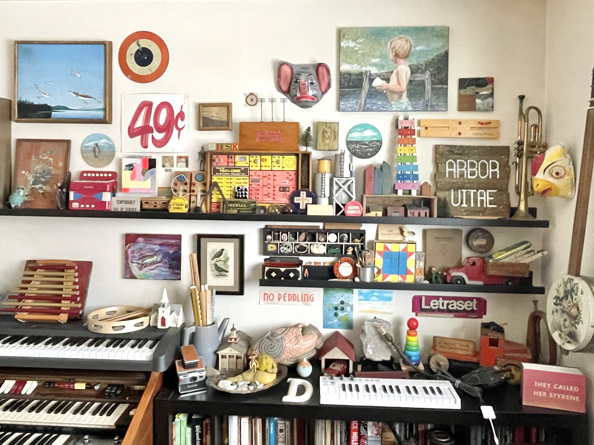
    This in-progress gallery wall represents aspects of me and self-assigned connections to me. A self portrait of sorts.

    A broader view showing most of the wall.

    I have art made by me, art made by my partner Gayla, art by friends, and art by strangers that means something to me.

    I have objects from various stages in my life many of which seem mundane but are charged with memory and meaning to me.

    The wall is me as child and adult, as designer and artist, as collector and sentimentalist.

    The wall is like a living version of one of those red-line TV evidence walls but, you know, without the murder. I could draw lines of connection between everything — a network of the nodes of me.

    On this left side of the wall, the painting centre top is what I call my “birth painting”. It’s a surrealist landscape by Canadian painter, John Leonard. My Mom got this painting from him in 1969 when I was born and it has been near me ever since. I’m not sure if I ever met Leonard but over the almost 56 years I have lived with this painting, the spark of life he charged these flying fishing lures has always caused a reciprocal charge in me.

    Below the painting, a framed very old print of blue jays that someone cut out of a book or a magazine. And in front of that an also very old flocked blue jay and a glass beaker with blue jay feathers connected from our land here. When we moved here, one of the first things I told Gayla after doing a drive out here from Toronto with a friend was that there were so many blue jays. We named this place “Blue Jay Haven” even while we were still renters.

    The circular painting is mine from a small series I made for a group show where all of the artists worked on the same round birch panels. I made four imagined landscapes and then mounted a carved human form with their nervous system exposed.

    Below right from that painting is one of the fifty collaborative pieces I made with my friend Aaron Leighton back in 2016–2018. More about those here.

    The hand painted 49¢ sign is one of a few we purchased when the landmark discount store Honest Ed’s in Toronto closed down. They had sign painters on staff that were still making new signs for the store up until they closed. It was a magical place.

    There are two small encaustic works by my partner Gayla Trail. One of her many creative practices is hot wax encaustic collage. I have several artworks by Gayla on this wall. Gayla is also connected to a number of the objects which only makes sense since we have been part of each other’s lives for almost 32 years now.

    The “150 in One Electronic Project Kit” is a late 70’s Radio Shack product that I had as a kid and then repurchased as an adult. Not only is it a beautiful example of a certain style of science ephemera but it also exemplified the playful connection I had to science and computers at that time in my life. The kit was the perfect kind of directive and open-ended learning tool. I spent many hours with it mostly not following the instructions for the 150 sample projects but learning how to make one thing and then adapting that to experiment and make something else. In university, when I was most into industrial and noise music, I made the kit that’s on my wall into a light-controlled noise machine that I played live on the campus radio station.

    I’m front of that kit are three things I’ll note…

    • A small punch needle drawing by Gayla that I love.
    • The geometry set tin that was scratched into by its original kid owner. It has their name and the the words, “Mine. Put it back!”
    • There are two fishing net floats that came from my grandfather. I believe he got them in Greece and I have memories of them in my Grandparents’ apartment amongst his other collected nautical items.

    Further along the wall, there is a handmade elephant mask we bought many years ago in a market in Oaxaca City, Mexico. I’ve always loved its sad also cartoon hobo-clown aspect.

    Below that a crumbling painting by a friend Craig Marshall that once lived outside on the rooftop deck of the apartments where we all lived. I’ve always thought it had the feeling of a raw Willem de Kooning portrait but it’s mostly just a pull back to a specific time and place.

    Above the portrait of a child at a lake was purchased by my late aunt. She said she saw it and felt it looked just like me as a child and it’s true I can see myself. The artist is Ken Kelly (who I know nothing about despite trying to research him) and the title “My Sun” is written on the back of the canvas.

    Below that painting is another circular imagined landscape I made a bunch of years back.

    And then a vintage kids xylophone that connects to the work I do at my day job designing digital toys but which I also simply find to be a beautiful object.

    Here Jabba the Hut cradles his “court jester” Salacious B. Crumb while lounging in a silver-plated tray filled with various gathered beach stones. Sometimes the connections are layered and nuanced and other times it’s just me being silly which is a truthful portrait of who I can be.

    Here there is also a detailed anatomical model of a cow’s digestive system that I found at a thrift store over thirty years ago. It’s one of the more divisive items visible in my work video calls but it is also quite beautiful in its way with hand painted coloured details and labelling.

    There’s a postcard sized letterpress landscape I bought from a storefront printshop called Typique on Haarlemmerstraat in Amsterdam. The artist is René Treumann and he was in the shop printing at the time I stopped in years and year ago. Checking online it looks like the shop is still there with a line of the ubiquitous Dutch bicycles out front and a nice little cafe nearby.

    I’ll end with two last things…

    The front logo flap from a 70s box of Letraset. We still have many sheets of this now very brittle ancient commercial art transfer lettering downstairs in our basement studio space. I have used in my drawings occasionally but it’s mostly so fragile that it crumbles when used without the most delicate touch. But it reminds me of my first exposure to graphic design as a kid of 8 or 9 years old in the 70s visiting my Mom in the print shop she worked doing design work. I remember the clunky (but cutting edge for the time) typesetting computer, the machine which applied a thin layer of wax to paper printouts for paste-up, the sheets of razor cut rubylith masking film, and the aluminum printing plates wrapped around the print drum.

    And finally, there’s a very very old junk shop purchased novelty eraser sitting on the back of a wooden toy truck. The half-foot slab of rubber is so old that it feels more like a piece of stone. It has the words, “I NEVER MAKE BIG MISTEAKS!” printed on it. It’s a treasured possession more so than if it were a slab of precious metal.

    …

    There is clearly much more on the wall and each object with its story that it can’t possibly tell in its own. The wall is my story or at least some parts of it. It is an active form of assemblage that isn’t meant as an artwork exactly but functions as one regardless. A bit Joseph Cornell, a bit Rauschenberg maybe… but mostly just me and my life before and with Gayla brought together on this wall with me as its primary audience.

    I’m not overly materialistic but I do find resonance and attachment with and between objects. I’m not concerned with extrinsic value but more the personal, emotional, intrinsic value some things have for me.

    Do you find yourself depicted or represented by objects or collections that you keep with you?

  • A Garden of Niches

    I refer to myself as a generalist.

    The main aspect of this for me is simply having an interest in following a variety of creative and intellectual threads. I’m curious about where one thing connects with another and either forms a delicate lacework or becomes tied into impenetrable knots.

    …

    I recently ran into the phrase “niche down”.

    I mostly saw the phrase in reference to the successful building of an individualized career and audience. The idea being that by finding a self-defining niche, you can gather interested people to you more readily. I don’t know where this first came from but it’s clearly not a new idea — I’m just relatively good at avoiding jargon.

    My generalist inclination also rejects the idea that I should narrow focus and specialize. I would rather tend to a garden of interconnected niches. To mix my metaphors from the threads I said I followed a few sentences ago, generalist creative practice can be like working within a diverse garden with its multitudes of life forms, cycles, seasons, and connections.

    Untitled drawing in an accounting ledger, 2021

    There are many niches to inhabit and they have pathways between them. Some pathways are uniform and predictable and others wind and diverge in unexpected ways.

    Niches can also have a variety of scales and scopes. Within a garden, growing flowers or growing vegetables are vast niches of knowledge, experience, and phenomena that also have a dense set of interconnections between them. And of course there are sub-niches all the way down as gardeners cultivate their interest in specific forms, varieties, hybridizations, and methodologies.

    This is a spray paint with cut branch resist on paper made as a collage material.
    Battery, 2023

    …

    My creative exploration might start with broad niches like: drawing, photography, music, or design.

    These all have so much breadth of scope that they are packed with multiple lifetimes of sub-niches. It is exciting working within and between those niches and even finding those that interest, excite, or challenge me most.

    I don’t need to be a designer that draws or a musician that takes photos. I can slip between things, gathering and sewing along the way.

    I love that something I read might inform a drawing or that notes from a piano could connect me better to a moving image.

    Walter de Maria, The Lightning Field, 1977 from Land Art by Michael Lailach
    Border Lightning, digital drawing of an imagined landscape, 2024

    There is also the selectivity of a neurodivergent brain at play in all of this.

    My mind thrives on associations, connectivity, and curious acquisition but also quite easily bores and wants to skip steps, leap between things, or ignore more obvious connections. My long and short term memory and my present imaginative mind can be an interesting mix of vivid and blank.

    Path Obscured, 2024

    Niches are like rabbit holes. Some are new and shallow and others deep and branching.

    We enter rabbit holes unsure where we might end up — maybe even confident that the path will have unexpected turns and even dead ends. We want a niche to be more like a labyrinth than a walled garden.

    So… backing up to the concept of “niche down”.

    I don’t doubt that people can find forms of success by limiting what they produce or are known for. It is easier to develop word of mouth or network effect benefits if more people can know “what they are getting”. That just feels antithetical to why I want to make artwork.

    Art for me is not knowing what might come next. Predictably of form and content may build “brand” but my brain and heart don’t work that way.

    I’d rather noodle and be messy and fumble sometimes. It doesn’t always feel good but sometimes it can be joyous or at least like a release.

    Just me on a keyboard fumbling away as wet snow falls outside coating everything in what is likely a brief layer of white. Video is my phone sitting on top of an old wooden box which is sitting on top of a tambourine which is sitting on top of the keyboard’s speaker. You can see the wood box and a small piece of Devonian fossilized coral vibrating as I play.

    …

    Discover your niche and then the next niche and the next…

  • Sometimes the places where there has been an intention to create form their own unintentional creations.

  • I made this drawing yesterday and after “finishing” it I had a hunch and I rotated it upside down and then back and forth a few times until the upside down orientation became its true finished state.

    As We May Think, 2024

    That’s art sometimes. Our eyes and heads can need that false “done” moment to truly see something we have made.

  • Some improvised electric piano playing. Improv is all I know because I don’t know how to play the piano in at least a technical sense.

    Watch on YouTube

  • Words in Order

    We use words to know better how we might speak.

    We use images to know more how we might see.

    This is part of what art does for us. It weaves aspects of ourselves together to show us ourselves. Not all art does this with strong intention but the effect is the same regardless. Art is a window framing humanity — sometimes a mirror.

    This sounds grandiose and I don’t mean to say that that artists are some higher beings with a rarified viewpoint. Artists are just people with a curiosity for how words, images, sounds, and forms connect with each other and with us.

    How is reconciliation granted with so little truth spoken?, 2024

    The art I’ve been making recently puts words forward in a strong visual way. I’ve been writing on my drawings for years now but these new drawings are meant to be read in a more overt way.

    That doesn’t mean that they are necessarily straightforward or clear in what they say. I’ve said before that I consider many of my drawings to be visual poems and while they can have meanings to me (sometimes) I don’t expect that meaning to be someone else’s.

    Switch Stance, 2024

    The words in my drawings are usually spontaneous like the rest of the marks. I almost never go into a drawing knowing what it will look like and certainly not what it might mean. I might come to a drawing with a phrase in my head but more of the time, words “suddenly appear”.

    Surface Ground, 2024

    I found a few cheap packs of vinyl lettering at the thrift store. They’re the kind often used for making signs on the glass of a storefront window. They were something like a dollar or two for each sheet. I try not to spend much money on art supplies in general. But I have already ordered another sheet of half-inch white Helvetica since I ran out of some frequently used letters.

    A Line at Fault, 2024

    From a simply functional standpoint, the letters interest me because I can paint and draw below and on top of them. They are vinyl but matte enough that they don’t feel too unlike the paper or Masonite I’ve been using.

    Visually, I like that they have the plainclothes design neutrality of Helvetica but because the are plastic and thin always apply with a bit of a wobble. Well, at least with my shaky hands.

    When Waking, 2024

    Because I have also continued to pursue working with dominant grids in my drawings, the relative rigidity of premade text feels right. But I can, and do, make the letters pretty messy as I have been painting over them and then using a utility blade to scrape most of the paint back off. It has this nice feeling of dropping the stark white of the letters back into my drawing — like they are floating in a substrate.

    Busy Sigil, 2024

    For the words themselves and their placement, I already have a creative pattern of using words in lists and clusters that allow for multiple readings or associations. Like concrete poetry, I want the letters and the words to do their job as elements in language and to also act as visual blocks. This is especially true with the use of grids where the words feel even more connected as parts of a page grid.

    Inter, 2024

    As I am making these drawings I’m obviously looking for readings that can happen left to right but also hopefully there are visual and linguistic diagonals and vectors to be followed. I don’t follow any rules for how I want to guide a viewer’s eye. I have enough trouble even taming my own eyes as I draw — they jump here and there as does my mark making.

    Loss Less, 2024

    The space between words is where the eye finds meaning and forms connections. The liminality of a pause, a leap between interpretations, the threshold before a new understanding is found in those gaps.

    Two Lists, 2024

    Part of what’s interesting to me about both making and experiencing artwork is seeing where it finds me. Making visual art isn’t like keeping a journal but it can have the effect of marking how an artist might be feeling or thinking at a particular time.

    Art making happens within a lived experience and, whatever its form, pulls at the edges of that life to complete its form.

    It’s in the words I use in my drawings that I can be most easily pulled back to where my mind was when one was made. The words don’t tell the story but they make a connection back through me to a feeling or a thought and further in back. I thrive in finding connections.

    This is part of the nature of art. A way to see ourselves to make a window back through ourselves.

  • Beach Ephemerals

    Yesterday my partner Gayla and I spent a bit of time at one of the small public beaches that is close enough to our place to be a quick drive away. We live in Canada near the northern shoreline of Lake Erie. From that beach we can look across the relatively small and shallow waters of Erie and, on clear days, see the shoreline of New York, a small wedge of Pennsylvania, and possibly a bit of Ohio.

    A calm day at Lake Erie

    This beach has a small lightly tended woody park between the thin cottage service road and the water. Tall oaks, shag bark hickory, massive-leaved sycamore, and old wind swept cedar form a dark canopy that always feels like an inviting tunnel of life with the lake’s horizon at its end.

    Scratch and sniff the photo above for the warm and sweet scent of fallen leaves.

    At the beach, we are slow wanders, observers, foragers, and collectors. Having the privilege of a shoreline we can connect with throughout the year shows us the multitudinous faces of place and time. The beach is never the same place. One day deep with drifts of small to medium rocks and fossils, another almost barren with just sand reaching far out into the water. Lakes have subtle tides but more so they have winds and currents and churn that push and pull at the shore and both reveal and remove each day.

    I enjoy the purely ephemeral nature of the beach and of Nature in general. As my own small part of that big-N system, I have sometimes made marks or assembled forms at the beach knowing that their time was limited both by the elements and by other visitors to the same spaces.

    Finding Balance, 2022
    Beach Lens, 2022
    Ceasefire, 2023
    Arrow, 2022
    Beach Portal, 2022

    Like my drawings, these “beach ephemerals” are a form of mark making. I want to make a mark that sits in the space and time of that set of moments and reacts to what is there and the phenomena of the day.

    Feather Portal, 2023
    Flower, 2023
    Satellite of Love, 2023
    This ephemeral had stayed in place for quite a while and had actually been somewhat altered by another beach visitor which made me happy.

    Occasionally I enjoy the feeling of making a mark in the wind.

    Or at least to be part of the experience of shaping the course of the wind for a moment and even the mild ego in challenging the wind in a kinetic dance for balance.

    This play with the elements and the bits and pieces left behind by both natural processes and human influence is a way for me to connect with myself and the place. It also helps me recognize play as a feeling in my body and not just as a concept. It’s a powerful thing.

    It always feels good but sometimes it’s more analytical than other times. On the best days it’s just truthfully free and it’s just about my hands and eyes being active and my mind, body, and emotions playing along.

    …

    Yesterday on the beach I didn’t make anything. I just observed and picked up a few small fossils. The light was cool and alive and the water not placid or rough. The leafy scent of autumn mingled with the tang of the lake.

    And in the low golden autumn light, I saw the oak leaf above making its own drawing in the sand.

    Maybe the best ephemerals are those mostly never seen or recognized. Wind-drawn scribbles and arcs with a blade of grass as the wind’s tool.

    Not that I feel any need to compare what I make with what Nature makes on its own. But I suppose I am. Nature’s unintended marks have that thing that we as people chase. Unburdened by criticism, need, or shame, Nature makes marks and patterns, adds and removes, without intent or thought.

    …

    Try it!

    Go into a natural space and react to it. Make marks or forms as long as nothing is harmed. Don’t worry about permanence or any time beyond the time spent at all. Just try to move in a space and connect with what you find around you and what your body and eyes respond to.

  • Squaring the Circle

    In graphic design, grids are often used as the scaffolding that gives page elements a structure to align to. The underlying grid of a book page might supply a set of ratios for how text sizes relate to each other, how an image sits on a page, and even the subtleties of a where a page number hugs a corner.

    In many scientific and technical applications, grids become ways to translate measurements into a reliable visual form or they might form the cell structure for a matrix of data.

    Maps have a fundamental grid as latitude and longitude lines help flatten our planet and delineate scale.

    Found vintage kids air travel activity pack.

    I have used grids and matrices as visual elements in my artwork for a while now. This isn’t an uncommon thing in many art forms. Sometimes grids are a means of reproduction and other times like in design they are structures that facilitate order and balance.

    My use of grids came first from subtle alignments between elements in my drawings. My repeated use of dots in drawings lead me to often set them up in lines and groupings.

    Cartesian Childhood, 2016
    Tree of Life, 2016

    A common form these dot groupings still take in my work is as sets of nine dots.

    Drawing in progress, 2017
    Digital drawing, 2016

    This grouping of nine dots is a longstanding visual puzzle that is said to have been the origin of the phrase “think outside the box”. But for me, these aligned dots are more of a grounding device — a way to stabilize the movement around them. They are also the smallest number of points that form what I would think of as a grid between them.

    Other than those groupings of dots, my artwork in general doesn’t have the hallmarks of an underlying structural grid. Grids and structure where they appear are more often applied later in a drawing process when I have already made many layered often relative chaotic marks across a substrate.

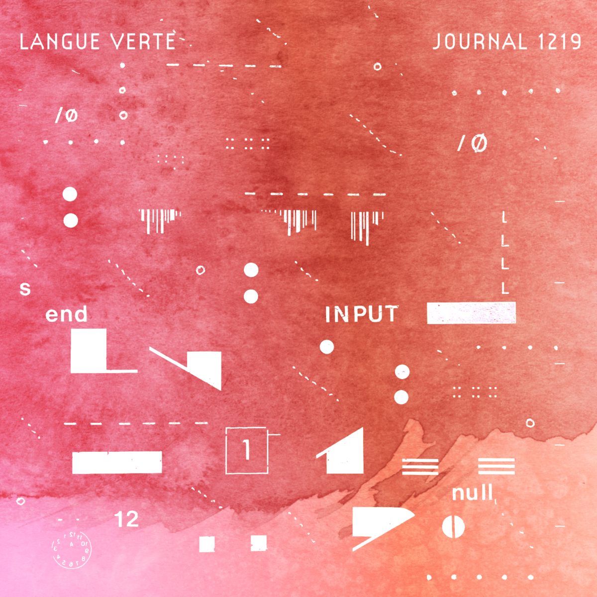
    When I was working on the series of monthly musical releases I made between January 2019 and March 2020, some of the covers began as simple drawings on graph paper. Knowing the end result would be the square form we still apply to digital music, starting from a grid made sense to me.

    Langue Verte, Journal 1219, process and final cover art.

    Just after those albums, I began drawing in a large vintage insurance ledger. My first drawing in that book is below.

    Kestrel, 2020

    One aspect of drawing in the ledger, similar to the album covers, was reacting to the strong presence of its underlying ruled lattice of columns and rows. The majority of my mark making in the book ignored that uneven grid but I still found myself connecting some elements to the page structure. Part of what drew me to drawing on a pre-formatted page was that there was already something visual to react to.

    Compendium, 2020

    In other smaller ledgers I have done collage and drawing work that more specifically used the page grid as a scaffold. Paper shapes cut to run along lines or sized to the ratio of multiple rows and columns.

    Collage works, 2021

    Eventually some of the grid-informed elements from the ledger books lead me to start drawing my own grids as visual elements.

    Two drawings made on top of offset prints of my own photos in 2022.

    Drawing a grid structure sometimes in reaction to a printed grid and sometimes in the absence of any other consistent visual structure has lead me to experiment with them more often.

    The Beautiful Ones, 2023
    Centre of Rotation, 2023

    In some cases, the grids I draw sit more in the background. I think of them as holding other drawn elements together and sometimes like the bounds of a coordinate space marking the proximity of elements from each other.

    In other drawings, the grids sit more in the forefront and can feel like graphed data.

    Real Virtual Monster, 2023
    Not a Number, 2023

    These more foreground grids also coincided with me starting to incorporate semi-circular forms in my drawings. At first more loose and scale-like but then connected to the grid cells and more rigid.

    Rush Toward, 2023
    Balance Paid, 2023
    Meaning and Result, 2024
    Many Birds and Animals, 2024

    And then, as I have shown, more recently I started experimenting with digital and physical drawings with the intention of having each process learn from the other. In making these drawings O have both drawn grids and also used on-screen alignment grids in the case of the digital drawings.

    The effect has been interesting. Sometimes I fill a page with a grid before any other marks and other times it’s the grid that reacts to an unstructured ground.

    A Diagram of a Thought, 2024
    Small Lake, 2024
    Program, 2024
    A Door, an Order, 2024

    I have found a certain type of freedom in working with grids that is surprising.

    In design work, I often eschewed use of grids in favour of what I felt to be more organic layouts. I was drawn to designers whose work was “outside the box”.

    In designing a number of books, I gained more understanding of how grids can guide without needing to dictate.

    Open, 2024

    By allow ourselves to explore structure, we can brace ourselves with it and also leap from it.

  • Work at Play

    I have worked for many years now as a Play Designer. Explaining what this means is never a simple thing but I’ll try here as it may inform the rest of what I write which is still bubbling up for me as I type this.

    My work day sketches are filled with small worlds, characters, and objects.

    I work for a company that makes digital play and learning products for very young children. I design open playful and playable digital toys with a cast of cute characters that primarily end up on phones and tablets and are mostly played with by preschool-age kids.

    The job is empathy balanced with function and it requires me to keep kids and how they play at the forefront of my thinking.

    I keep this photo of little me from about 50 years ago (!) beside my desk as a way to remind myself to connect with that child that was once me.

    I wanted to preface this post by mentioning my job because I wanted to talk about play as an adult. I’ve mentioned play as a part of art making a few times in passing but it’s worth dedicating a whole post to how it manifests for me.

    For little kids, play is a powerful tool that helps them acquire mental and physical facility and understanding. Play is a way to use all of their senses to collect new experiences and test current knowledge — a continual call and response, action and reaction. It extends and builds new mental models by applying labels and contexts to objects and testing the boundaries of what their minds and bodies can do while also discovering core things like “oh! I exist as something called a person!” Just the basic forming buds for all future blooming existential joys and crises.

    So… my work is to understand those frenzied childhood developmental years in my present adult state and to work with artists, developers and technical artists, sound designers, researchers, and more folks to design for play.

    I have been designing professionally for over 30 years now and at least half of that time has had some focus in design for kids media. My education was in neither child development or even design. I have a Bachelor of Fine Arts degree but my true education has always been in following tangents and interests to see where they lead me and how things connect and associate with each other.

    …

    Art making for me begins from this place of play and discovery. But first, like most adults, there is an unlearning.

    We move through childhood education and then on to adult work and responsibilities and what gets taken from us at each stage by increments is an openness to experience. As adults, we are meant to maintain a distance and to come into things with plans and purpose. Not the open eyes and hands of a child.

    Blind drawings can sometimes have the visual feeling of a child’s drawing but the process often feels fraught with discomfort for an adult. We struggle with the loss of control.

    I don’t count myself as free of those adult constraints. Each time I approach a blank sheet of paper or the refined surface of a birch panel it takes mental effort to make the first mark. But I have tried over the last decade or so especially to re-teach myself that the first marks are freeing — they cut through preciousness and remove the tunnel vision that can come from the blank surface.

    The first scribbled lines I make may not have the unburdened nature of a child’s marks but they establish the beginning of a path, a connection that can lead to a network of other marks.

    I don’t sketch. Or I don’t sketch in the sense that I don’t make marks to prepare for greater more substantial marks. It’s all a sketch or alternately, it’s all artwork in its own form, scale, time, and place.

    …

    When a child draws they aren’t without goals either. They are looking to capture, through one of the means of expression provided to them, things they have discovered, things from their current world, and things they maybe hope to discover still.

    My drawings are an attempt to discover the space between my mind and my hand and to use the tools of play to make and see something that wouldn’t have form without that play.

    I say this simply as a thought for others that feel held back by what we are told are adult concerns but are actually just a set of false structures built around us. Letting yourself play in even the most subtle way can reveal our internal and external worlds to us in interesting ways.

    I’ll end with some recent drawings where the play has been with accident and intention. There’s a recurring grid that lets a range of looser marks and washes connect with spontaneously applied text.

    Fire Fate Form, 2024
    Bonus Moon, 2024
    Triple W, 2024
    Names Softly Said, 2024

    Where do you let yourself play?

  • A Figure Emerges

    This is a bit of an origin story for one of the ways an image can mark a moment of change. It’s about how a titan of dust let me know I could trust myself more as an artist.

    …

    While most of my art making is connected to abstraction and intuitive mark making, I do occasionally make a more straightforward landscape or figure drawing. But I was thinking back tonight to one particular drawing that sat a bit between those two modes.

    In 2015 I had started making abstract drawings that I ended up calling Dots Series 1 & 2. They were new for me and woke something up that had blocked me in previous art making. The drawings were raw with swipes of paint, many marks with pen and pencil, spontaneous text, and recurring circular forms.

    Multum en Parvo, 2016
    Power + Roots, 2016

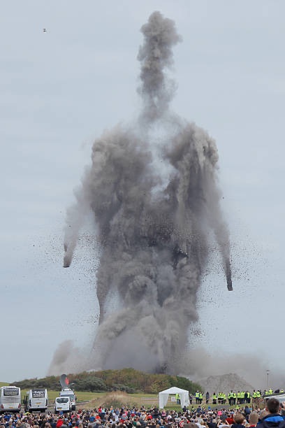
    Then one day in January 2016, I happened upon an image online that struck me. It was a photo from the demolition of two Scottish power station smokestacks. The vaguely out of time image showed the collision of the two stacks forming a spectral brimstone figure for a few seconds before the towers were no more.

    Cockenzie station in East Lothian, Scotland was a coal-fired power station until its closure and then demolition in late 2015. Thousands had gathered to see the stacks come down not expecting this chance image like the cinder afterimage from the burning of a harvest wicker man.

    Seen from the crowd’s point of view, it seems more commonplace. Just a spectacle for the curious around the ending of a local era.

    I’m not actually a believer in otherworldly spectres so the image was just a fascinating visual anomaly. But it struck and stayed with me nevertheless.

    A few days went by and as I set a new panel on the easel, this rapidly came out.

    Something starts emerging January 22, 2016

    It was just the start of something but the clear form of that Scottish smoke titan stood centrally, its fragmented body darker than the image in the original photos — a frenzied series of palette knife swipes in jet black.

    I almost covered it up at first. My rational mind scolding, “that’s not the kind of art you are making!” But “why not?” Another part of my mind answered back. It was just play after all. Just moving paint and making marks to see where that took me.

    So I continued with the figure intact.

    I even added somewhat cartoon billowing smoke cloud layers drawn with thin pencil lines and explosive layers of bright coloured dots, lines, and scribbles.

    And then words appeared. That’s how it feels sometimes. The words come to mind and I commit them often simply and directly to the surface.

    And then from the centre of the figure’s chest, where in the photos of the dusty titan there was a space, I place a deep red circle. It’s like a power heart like some raw and elemental Iron Man.

    I flash back briefly to this early childhood drawing of Iron Man done on some scrap Phillips paper from my grandfather’s work.

    No, I’m not sure why he has a sword.

    And then finally the figure stands burning with energy. And even in the drawing’s completion I don’t know what compelled it but I name it Emergent as that feels like what happened.

    The subsequent drawings from that year didn’t go back to this raw figurative form. If anything they deepened in their abstraction but also feel more confident to me in hindsight. Like by allowing this figure to emerge, I allowed myself to say,

    “It’s okay, you can let go. You can let aspects of yourself topple and collide with each other to form something new even if it lasts for just a few seconds and maybe defies your understanding in many ways.”

    …

    A note that the Cockenzie power station demolition photos above are copyright their respective creators. I tried to track down original sources for the images but couldn’t.

  • Where is Art?

    Does art lay in wait in an artist’s materials? Is there a drawing inside every pencil, a painting in every tube?

    Do the artist’s hands contain the art or does it travel from the head, electric and formless, commanding the hand to make tangible from mental?

    In my conscious mind, there is never any fully formed art. There can be concepts, modes, structures, tools, and patterns that I choose from towards the idea of making art. But there is no plan or precognition of a final state or even its process in my head.

    I make choices in the moment that might lead to art coming into being in all of it’s myriad banal yet possibly evocative forms.

    Before the first mark occurs, I choose a surface to work from and that can suggest something of what might be the final form of the art. That surface is sometimes a blank page from a book of paper specifically for art-making but it could be paper that has already had another purpose — a ledger, graph paper, a printed book page, cardboard packaging. Other times the surface is more precious like a store bought framed birch panel with its smooth light but uniquely grained front. Or it could be garbage like a series of rough wood offcuts gathered on the street.

    Each of these surface choices direct the type of marks that might be made in some way but only subtly. A rectangle, square, or even a circle will cause the eye and the mind to react but they don’t determine the content or context of the art.

    The art is still somewhere in between the surface and the hand like a static charge crackling finding a path.

    Or the art is formed from the light bouncing back from the surface to the eyes, another dance of energy that our minds contextualize as colours, and shapes, volumes, and objects.

    The tools with their metals, woods, plastics, and silicone structures either made to accommodate art making or commandeered into a new purpose from a previous utility. They shape the marks under the control of the hand, their form altering what the hand can produce when empty. The tools can only be elements in that electric circuit between the mind and the hand.

    The same for the various visual media with their colours and textures, the structure and the viscosity of their creation. The pencil with its densely packed minerals, waxes, oils, and pigments reactive against the friction of the surface. The paints thick and thin, opaque and transparent, their intense pigments so finely bound into something so specifically manufactured for art making. A whole set of industries to create the means to apply colour.

    And then in a rush, or so it seems, these come together and there is art.

    But then is this piece of paper with its applied pigments, shapes, lines, smudges the art? Or does the art happen between the page with its colours and marks and subsequent sets of eyes and minds that give it their own contexts? The aphorism says that art (if we count it as a form of beauty) is in the eye of the beholder.

    Richard Long’s A Line Made by Walking has a surface, mark making tools, a process, an artist but is the art the line made or the process of making it? Is the art the photograph of the marked line or the ephemeral experience of seeing the line in person. Did the art reside inside Richard Long while walking that line across the field in England? Is it still there in him now?

    Maybe we only find art when we aren’t looking for it? Maybe it waits in us dormant and becomes radiant briefly when the circumstances align.

  • As much as digital creation comes with some facility and convenience I still prefer working with physical media. Digital has that kind of “anything is possible” promise but actually often feels like there are more limitations than what can be done with a bunch of drawing, painting, gluing, layering, blending.

    And my mind and body feel differently when working physically. Not just the bodily sensations of making gestures with media on a variety of surfaces but there’s a change in how I engage with the actions and presence of making things “in person”.

  • Grow Curious

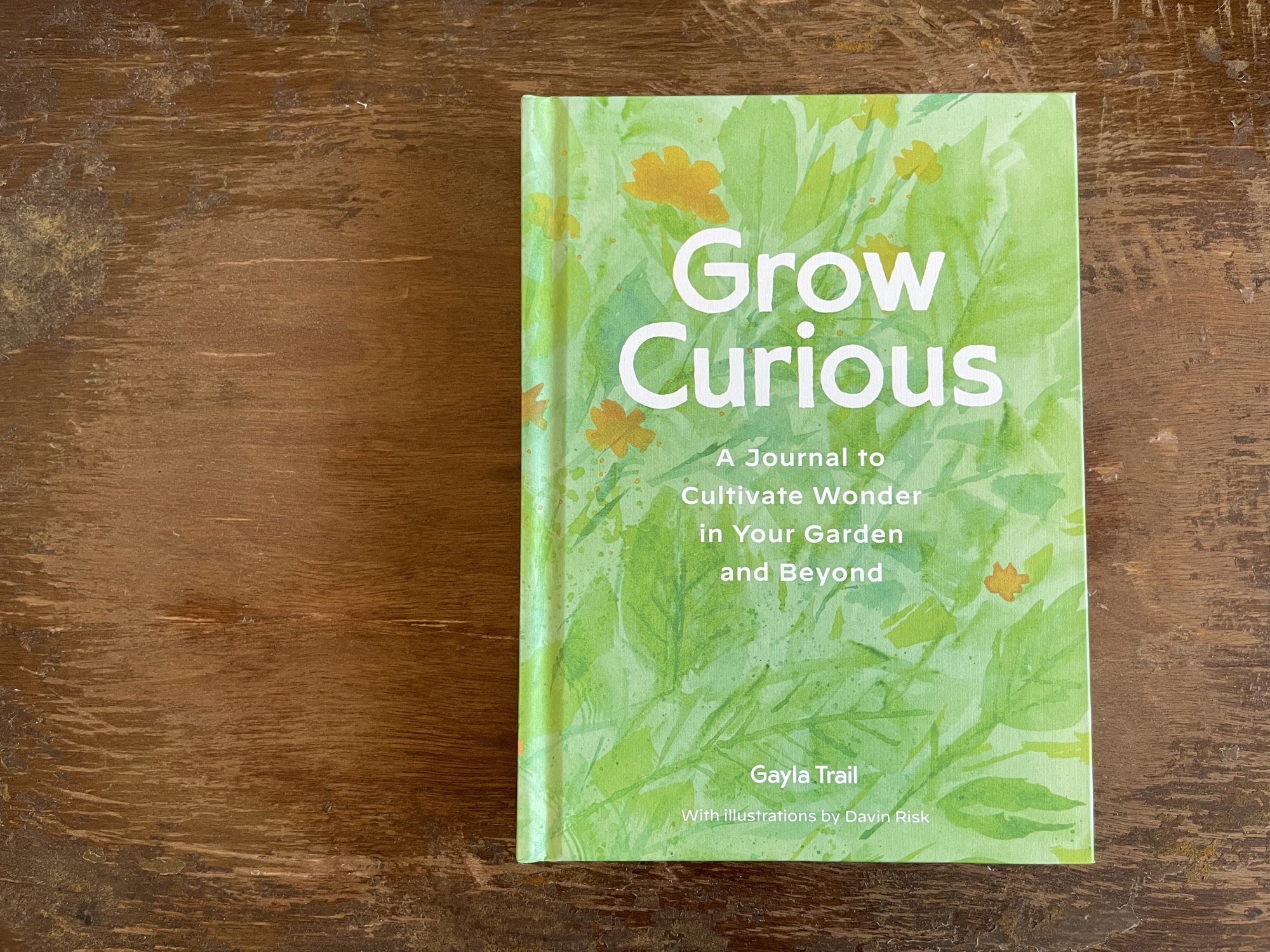
    Back in 2016, my partner Gayla Trail and I collaborated to self-publish her fifth book, Grow Curious. She was the author and I did the design and artwork. I don’t talk about my design work here as much but I have been working as a designer since 1994 across a variety of media and formats. My design and art practices heavily inform each other. Grow Curious was the fourth of Gayla’s books I designed.

    We used Kickstarter to successfully fund a two-colour offset print run of 1200 copies. It was a labour of love and each of us pushed ourselves to make something special. We spent hours looking at paper samples to get just the right feel for the cover and interior pages.

    Grow Curious: Creative Activities to Cultivate Joy, Wonder, and Discovery in Your Garden, Gayla Trail, 2016

    Grow Curious is unique gardening book as Gayla wrote it from the perspective of a gardener who has discovered over the years that working and connecting with plants and ecology can have the reciprocal effect of understanding ourselves better. The book is filled with prompts and exercises to support new and experienced gardeners in exploring their gardens and themselves.

    The design and artwork of Grow Curious was a combination of balancing skills I had confidence in with new ways of working and techniques that challenged what I knew. The book is filled with a mixture of representational illustration, textural accents, and hand-rendered text.

    While the book is printed in green and dark brown spot colours, all of the artwork was created with various black-tinted media and then digitally made into monochrome files for printing.

    I experimented with techniques like mono printing and augmented watercolour washes — like the introduction of salt to form crystalline blooms on paper. I wanted the artwork to feel raw and organic — for the whole book to feel of the garden.

    Monoprint with hand-rendered lettering. Quote from Bluebeard’s Egg by Margaret Atwood.

    In 2020, with the self-published run of Grow Curious sold out, we worked with Chronicle Books to create a new version of the book. Gayla rewrote and restructured the book and I redesigned and made mostly new art. This new edition of Grow Curious released in 2022 is a four-colour hardcover book with space within for it to work as a project book or journal.

    The premise is the same but we wanted to shape our original work into a truly new form while preserving the intimate feeling of the original book we had put our hearts into.

    Gayla’s original poem-manifesto ends each edition of Grow Curious.

    Because the new edition is four-colour offset printed, my approach to the artwork especially was altered. Some of the original black artwork was digitally toned to pull into colour washes but much of the art was recreated with colour media.

    I was still in an experimental mode as I explored how representational and how abstract we wanted this book to feel. Working with a publisher of course meant that there were another set of voices in that conversation as well.

    The book has a constrained palette overall with the colour work mostly staying within greens and blues with subtle orange, yellow, and occasional pink tones coming in. Some illustrations warranted more realistic colour work while with others I ran digital gradients across monochrome artwork.

    It is an interesting process working through the sets of design and aesthetic challenges that making any book will throw at you. Unlike my visual arts practice, every element of a book has to maintain a focus on the reader.

    The artwork has a set of jobs just like the content and the formatting of the text. Artwork in a book might provide visual context or instruction and it might also contribute to the overall tone and feel of the book.

    I’ve had the pleasure of doing this kind of work each time with a partner that I share so many other things with. We’ve been together for over 31 years now and so there is a trust and respect that goes both ways while we work. And while we do have our subtly different personal senses for things, most of the time we speak the same external and internal language.

    I hope you’ve found this look at these two book projects interesting. Looking back the few years since they were completed, there is a good distance for me to see my own work and in both cases, I find very few problem areas or perceived flaws. This is a rarity for me as my inner critic is often most harsh in retrospect.

    I’m distinctly proud of these books.

    …

    If you would like to get your own copy of the Chronicle Books version of Grow Curious, it is available from most booksellers but here are a few direct links:

  • Life Under Glass

    Since my last post I have continued drawing digitally in Procreate and testing how it feels to both pull from and challenge the habits and modes of drawing on paper.

    I’m finding myself distinctly enjoying drawing digitally. As I said in the last post, I am using an Apple Pencil on a ~10 inch iPad. I applied a Paperlike screen film which adds a very subtle “tooth” so that the Pencil feels less like hard plastic on smooth glass.

    Another Question of Density, 2024

    I’ve started using some digital brushes like simulated halftone patterns which I have used lightly in the past on paper usually in the form of collaged elements. But in their digital form they can be any colour and shape so they feel more like a loose screen printing than collage.

    Saved State, 2024

    I’ve continued using the same digital page size and format which is equivalent to a landscape 8.5 x 11” Letter page. Many of my drawings on paper are more tall than wide so this orientation has been interesting especially with the various grid forms I’ve been experimenting with.

    Part of maintaining a consistent page size has been the growing idea that I may take these images and create a zine/book from them. I don’t want to yet assume that’s what I will do because it’s not a primary goal at this point. I’m still drawing these to feel how it feels to draw them.

    Redacted, 2024

    I haven’t found a lack of emotional outlet in working this way. Despite the dense scribbled and layered nature of my work on paper, there has always been a balance or a boundary in place when I make them between emotion and a more rational connection to drawing.

    The same is true digitally. I can be feeling light or heavy things and I don’t feel less able to express them just because the medium might be assumed to be colder or more rational.

    I can draw from anger and the digital result doesn’t feel tempered to me. Any controls or limitations are mental and not a result of the format.

    Sigil, 2024

    I’ve had positive reactions from a few people to these recent drawings and a few people who know my work on paper have been surprised that these are digital. That says something about the current tools but is also obviously because I have been intentionally working digitally in a way that draws from and means to extend my “traditional” drawings.

    Program, 2024

    I think the main thing I miss in making these drawings is the physicality of my arm in motion. The scale of these drawings and the function of the Pencil as an input device limits what I can do with my arm. This does have an effect on the drawings because the forms and their motion within the frame are confined. But missing that aspect is fine since I’m not trying to replace one form of drawing with the other, just pull at the threads between them.

    I’m curious how other artists feel working between digital and physical. I know some people hold a bias that digital work is a lesser form — in part because the artifacts that remain of the work are always a copy or never truly exist. They can be printed to become physical but only as a facsimile or reproduction.

    I haven’t printed one of these drawings yet. I have a feeling that their nature will change without the benefit of the radiant nature of art on a screen.

    They may turn dull and lifeless in a physical form which is an interesting twist on the assumption that digital art is without some life force assumed to be inherent in physical art forms.

  • Another Question of Density

    One of the issues/interests I have with digital drawing is something I’m naming “tool blindness”.

    I can choose from so many simulated tools and then within those I can choose colour, size, opacity, and more. But the mode of drawing only shows those things as settings and it’s only in the mark that follows the Pencil that I see the shape of the tools. It’s not like grabbing a palette knife and knowing it’s width and feeling the reciprocal tension between the drawing surface, the tool, and my hand.

    The digital tools are ghosts of the original tool. Echoes of a single nameless mark repeated.

    Another Question of Density, 2024
  • React to the Ground

    A blank drawing surface stares back as a challenge. The smooth surface of a page says nothing about what it wants. A fresh sketchbook or canvas can stop many artists in their tracks.

    Often the way I will approach a blank page is to immediately make “random” marks and forms — scribble, smudge, glue, scrape, smear — to break up the space of the page.

    Because my approach to art making is intuitive, I rely on an interaction between the surface, the tools, and my hand to further the process. I react to the surface and then to my own mark making — action and then reaction repeating until something clicks.

    Another strategy I employ is to begin with a surface that already has reactive elements to it. This has been a variety of things over the years…

    • Framed birch panels come with grain and whorls that I don’t gesso preferring to work with that dynamic ground
    • Using printed book pages can work though I often find a page filled with text too dense a starting point
    • Lined or gridded paper is a favourite

    My long-term project “The Ledger” is a perfect example of the last mode. It’s a large antique insurance ledger with tight rows and columns plotted on its pages. Here’s an example image from that project.

    Retrace Steps, 2022

    You can see that some of the elements of the drawing are informed by the underlying lines of the page and some even align to them directly. I break from the grid as I feel fit but I enjoy reacting to it much of the time. It could be the designer in me. Though I’ve never been much of a strict grid adherent in my print or digital design work — I prefer organic flows between type and imagery where possible.

    Plan for Seeing, 2023

    My creative reaction to the lines and grids of pages have also lead me to draw further structural elements on top of them like coarse lattices of grids and repeated and aligned circular forms.

    So when I recently started making the series of digital drawings I showed some of in my last post, one of the things that was immediately different was that blankest of blank digital “page”. That cold backlit white rectangle gives up nothing.

    Dialect, 2024

    I have used the scribble and smudge technique to quickly remove the characterless nature of that white blank and that does give me something to engage with. But I found myself missing those pre-existing horizontal and vertical lines.

    I want these oddly technical but reliably un-precious surfaces…

    And yes, I can bring scans or photos of these pages into Procreate but something has held me back from that. While all sorts of elements of digital drawing are about sampling or synthesizing physical techniques, tools, and textures, I’m trying to make these drawings in a primarily digital fashion. My reference points are my own drawings on paper but I want to sample myself metaphorically and not literally I guess. We make up funny rules for ourselves while making art don’t we?

    I’m very much still learning to use Procreate but an early “discovery” was the mode that overlays a temporary grid on the current page. This was a minor revelation in my attempt to translate my work from page to screen.

    Wait For, 2024

    With the ghost grid in place, I can react to it or ignore it as I see fit. It isn’t the same as a grid that remains and becomes a part of the final drawing but it can play that role temporarily.

    Much of my drawing is a play between grounding and releasing the view. I work on creating motion and relation between marks, shapes, symbols, and words. Many of them are dense with a chaos of marks but I like to balance that with the aspects of the page itself.

    A Diagram of a Thought, 2024
  • How to draw a circle?

    The how of making art is a cottage industry. There are countless classes and tutorials about the right tools, techniques, and mindset for people that want to make art but feel for whatever reason that they don’t know how.

    More often than not, these same people are also looking for some form of permission to be creative. They want some structure, purpose, and maybe even a set of achievable goals before stepping into something that feels like it requires mastery. And belief in mastery implies that the majority of us are not masters.

    What a lot of people want out of art making is a form of personal expression — to be able to say something or release something that they have trouble getting at through other means.

    While techniques can be practiced and honed, mastery of making art is elusive to the point of possibly not existing. Art making is iterative and certainly not linear. Much of our lens for artistic mastery is historical and curated. The works of “masters” don’t show the high and low days and years in practice of making.

    Something from Nothing, 2024

    I recently got a new iPad through my job and also an Apple Pencil. My work as a designer often requires sketching but given the type of work I do (I work for a company that makes apps for preschool children) there is very little that connects that sketching with what I do when I sit down to make art.

    But because of these new digital tools, I have a chance to experiment with a different way of connecting with drawing.

    I’ve posted and written about the digital drawings I’ve made previously so this isn’t a brand new thing but that previous work was all made with my finger on the small screen of a phone. The larger tablet screen feels closer to the size of a sketchbook and the Pencil in hand is gesturally closer to “true” drawing.

    The differences between drawing digitally and drawing on paper are too many to list but I have been more interested in the translation of what I choose to draw than how I choose to draw it.

    Margin of Error, 2024

    I wanted to approach these new tools by intentionally trying to translate the colours, marks, forms, structures, and patterns that are common in my physical media artwork.

    Dots, scratches, smears, grids, words, arrows, more dots… are all frequent elements when I draw on paper. My drawings frequently use gouache and acrylic paint, paper collage, pens and pencils, palette knives, shape templates, rulers, stickers… whatever is at hand and triggers something for me — some action or reaction that takes a blank page to an often dense full one.

    Format System, 2024

    I knew from prior experience with digital drawing software that the options available in terms of reproducing the visual sense of many traditional art making tools were many. And that the software these days can often be quite adept at simulating things like blending, feathering, spatter, and texture.

    I also know that I am okay with seeing the artifacts that digital drawing still leaves behind. When you look, you can always see them. But I’m not trying to fool anyone into thinking I’m not drawing on an iPad. Though maybe it would be good if a viewer didn’t care one way or the other.

    So, it’s on-going but it has been interesting to see so far what happens when my dots and grids form on the screen. The funny aspect of how I draw those dots and grids is that it is functional harder to do it digitally. That’s not a fault of the software (Procreate) but more a friction of not being able to reach for the physical tools I am used to.

    When I draw a circle on paper, even with a template, my hand and the tool introduce difference — personality? The digital circles, despite the fidelity of simulation, feel a bit more static.

    But the tricky thing is assessing whether the feeling is true or whether I assign more inherent heart to the drawings on paper.

    Manual Practice, 2024

    I think what’s continually interesting to me is the way in which the how of making art facilitates the why. I don’t draw a dot on paper or a screen to get better at drawing circles or to eventually create some kind of revelatory circle. The circle to end all circles!

    But I draw dots, lines, grids, write words, cut and tear paper, and manipulate paint to pull at threads and see something form in front of me that breaks a connection or finds a new one.

    More on this soon as I continue to learn how to draw a circle.

  • Swimming in Brutalist Fountains

    I think of my six year-old self and my friend Steve.

    It is the first day of first grade.

    Summer’s tint is still glowing from our skins. We wear the defiance of hot days roaming between shadows and light. Peanut butter and jelly and soft brown bread remnants on our faces.

    We are walking, unhurried, along the sidewalk.

    We are stuck in the adventure, the freedom, of summer. Lost in the memory of wild ranging and wandering in what felt like a vast unmapped wilderness but was really just a few looping residential blocks.

    Atmosphere No.4, 2020

    We strip summer clothes off, down to our y-front briefs with their bright white lines across red or blue, and jump into the brutalist fountain in front of the new apartment tower where neither of us lived. The pool of concrete is is filled with sharply cold water that we ignore while we engage in the thrill of this swim on a September morning.

    Steve is splashing, leaping then twisting his body under the water. There is enough room in this odd concrete water feature that our young bodies feel even smaller and the water deep.

    After unkept time, Steve and I are dressed again, damp under t-shirts and wide-legged corduroys. Toes slipping around in humid socks.

    We walk through the shortcut between apartment towers now towards school, the agency of summer still strong in our steps. Moving abreast down the next street arms swinging. We are in sight of the school that will be mine for only two years — for Steve maybe longer but this is my last real memory of him.

    Atmosphere No. 1, 2020

    We run, echoing across the vacant asphalt school yard with its painted squares, rings, and hopscotch pathways. We leap up the stone stairs to the wide wooden doors opening for the first time.

    Inside, guts sinking, looking down empty halls for our new classroom. Hair still flat wet, dark rims of water around collars. We don’t look at each other. There is no shared adventurers bond remaining, just two small boys opening their first classroom door, drowned spirits iced by the look of the teacher, her high tight brown perm and severe gaze above a crisp white shirt tightly buttoned at her neck, the tendons stiff.

    Grassland, 2020

    There are the rows of other kids to be forgotten, faces unfamiliar in later viewings of this year’s class photo. But today they all see you and somehow Steve has blended into the class elusively as if his morning hadn’t been spent twisting in brutalist waters.

    All of those nameless faces looking back with smirks and giggles at your waterlogged entrance. No hero’s welcome for keeping summer alive for a few precious minutes longer.

    What became of this? There was some call or letter sent home, some first strike on an unremarkable record.

    All that lasts is the distant child shame of arriving ridiculous and damp at the front of that class and then somehow a full year in school leaving no mark, no image to memory.

    Emanuel will be killed on Yonge Street the next year and my Mother will take me away from Toronto in an act of caring and protection which I will nonetheless carry as the loss of life as this city boy, briefly golden in warm morning light, wet and free in a pool of opportune concrete.

    Steve and me, 1975
  • Music as a Sketchbook

    I’m going to revisit some older work again since it’s helping me to look back at a variety of work and see what it meant for me to make it when I did.

    Starting in 2018, I had begun working with sound as a medium — using the making of songs/soundscapes as a different form of connecting with a need I had to express that wasn’t fully coming out visually.

    Sugar Snake, 2018

    I had made snippets of music before this point. In the early ‘90s at university, I had a late night radio show with a friend and we often made odd and noisy layered audio experiments using tape loops and bits of electronics in between playing a mix of industrial and techno albums.

    I had even owned a variety of instruments that I had very little facility with like a beautiful jangly Gibson-copy hollow body guitar and a bunch of pedals. I sold the guitar to my oldest friend at one point when I needed cash and still think about it occasionally despite never really being able to play it “properly”.

    My on and off connection to music making has always been either hampered or fostered by the fact that I have fastidiously avoided learning music theory, how to read music, or becoming practiced at any instrument.

    Like my visual art making, I have always favoured intuition and a kind of call and response method for making audio art.

    Dark Day Bright Sun, 2018

    I make music like I draw. There’s never a plan and I certainly don’t have music already in my head. Most tracks are simple successive layers with very little editing or post processing. Like many of my drawings, most of my “songs” (I don’t feel comfortable with that word) were completed in one sitting.

    Falling Awake, 2018

    I made a scattershot set of tracks throughout 2018 and collected them together in an album release on Bandcamp. It is less cohesive album and more like closing the cover of an actively filled sketchbook.

    Listen on Bandcamp

    Langue Verte – 2018 Collected

    …

    I don’t really even remember what prompted the thought but leading into 2019, I had the idea to make an album every month as a way to capture the sketching or journaling feeling I had in exploring making the music.

    I had already been using Langue Verte as an online pseudonym so that carried over into being my “band” name. It is now trivial to digitally release audio so the only barrier or friction was whether I would stick with it.

    I won’t get into my “recording” process in any depth other than to say that most of the music was made digitally and almost all of it was made on my phone in Garage Band and other apps. Like my phone “finger paintings”, making music on the phone removed all sorts of barriers and frictions. Many of these tracks were made sitting on buses or in waiting rooms for appointments, or while propped up in bed.

    In the end, I made an album a month for 16 months in a row spanning into 2020.

    I created a simple system for titling each release by date, intentionally referring to them as “journals.” I also had some fun making a series of mixed analog/digital drawings for the covers.

    As a designer, album covers are always a touchstone and I would love to make art for other artist’s albums (get in touch!).

    The first album sets a recurring pattern of stylistic jumps. There are erratic beats, almost psychedelic keyboards, droning, arpeggiated rhythms, ambience. It’s audio collage and some of it still works for me while some tracks are rougher sketches than others.

    My favourite track is probably the last one, Fossil Memory. It has this synth organ layer with a bunch of bubbly arpeggios on top. It’s just fun to me.

    Listen on Bandcamp

    Langue Verte – Journal 0119

    The second album feels like it is ready made to be the soundtrack for some unmade sci-fi movie. Hit me up, indie filmmakers!

    I like the vaguely Wendy Carlos meets Merzbow calmness of the track Beach.

    Listen on Bandcamp

    Langue Verte – Journal 0219

    Okay, ha, maybe all of these albums end up sounding like indie sci-fi films…

    Interestingly if you read my previous post about digital abstracted landscape drawing, “Fingers Dipped in Water”, there are two tracks on this album, Desert Memory and Ocean Memory, that work like their visual equivalents for me, capturing something of remembered experiences of place in an impressionistic way.

    Listen on Bandcamp

    Langue Verte – Journal 0319

    This is a quiet and atmospheric album over all. I like the somewhat sinister feeling of the track Movie Cycle.

    Listen on Bandcamp

    Langue Verte – Journal 0419

    This album gets even more sparse. I like the long tripping tones and deeply backgrounded beats of Tracing Hero.

    Listen on Bandcamp

    Langue Verte – Journal 0519

    The soundtrack continues. More drones, glitches, blips, and gurgles. The track Sweet Mud makes me happy.

    Listen on Bandcamp

    Langue Verte – Journal 0619

    Some light musical structure comes into this album. It’s subtle but there is more distinct melody. The warped naive keyboards on Whelmed are a favourite. That title came out of a discussion with the artist David Lu about reaching the pleasant state between over- and under-whelmed. To feel “whelmed.”

    Listen on Bandcamp

    Langue Verte – Journal 0719

    The spacecraft from the unmade sci-fi film travels through some sort of portal for this album. Every track is atmosphere with some form of alien presence. I find myself enjoying the vibrating childlike kalimba tones of the track Handmade.

    Listen on Bandcamp

    Langue Verte – Journal 0819

    Maybe we’ve arrived at a new planet? Sorry I’m probably straining this sci-fi soundtrack comparison to its limits. Anyway, I like the track Mountain with its slightly Joy Division-esque guitar element.

    Listen on Bandcamp

    Langue Verte – Journal 0919

    The song Rites on the next album is one of the most “indie rock” of all of the tracks. There’s still a bunch of sparkling and undulating synth stuff going on but there’s a dominant guitar track again that sets the tone.

    Listen on Bandcamp

    Langue Verte – Journal 1019

    This album is one of the shortest and doesn’t have a clear standout track for me but Too Long to Wait has some interesting, if clumsy, passages.

    Listen on Bandcamp

    Langue Verte – Journal 1119

    The year didn’t end with a focused set of tracks but I do like the simple lounge-y Wings.

    Listen on Bandcamp

    Langue Verte – Journal 1219

    For the 2020 albums, I rebooted the cover design format, I designed a typeface and the visuals are a series of cardboard assemblages layered on a digital ground.

    Somewhat suddenly, 2020 began with what feels to me like a fairly cohesive 15-track album. Standouts to me are, Sweet Sectors, Tidal Timer, and Forests We Knew.

    Listen on Bandcamp

    Langue Verte – Journal 0120

    This album has the warped indie rock of Walking Stick and I’m proud of the bright piano of Thunder Green.

    Listen on Bandcamp

    Langue Verte – Journal 0220

    On this album, I jump around between styles a bit more and there are a couple of sort of glitch trip-hop tracks, Branches and Trick Deck. The latter is so drunk stumbling (no booze, just high on life) I find it funny to listen back to.

    Listen on Bandcamp

    Langue Verte – Journal 0320

    On my final album (well, final so far I guess) I like the very sparse First Storm and Renamed ticks that glitchy rock box again.

    Listen on Bandcamp

    Langue Verte – Journal 0420

    …

    The albums ended back in March 2020 and while I still do make music occasionally I don’t record it as often. These days I am far more likely to just stand in my office and play something on the electric piano that sits on top of a thrifted Farfisa organ while looking out at our garden.

    Things are more balanced in life now and the mental and physical spaces where I made the music for those 16 journal albums just aren’t the same.

    For now, I am happy to have an archive of that time in the form of these album artifacts.

  • Fingers Dipped in Water

    In the previous post, I showed a series of abstract drawings I made on my phone. Digital finger painting. Making those miniature images of line and colour in motion were a therapy for me at various times. A way to pull emotion out of me expressed as visual motion.

    As I described, working on my phone was a space between other spaces. A way to duck into a creative space when the circumstances of a time or place didn’t allow for other modes of expression.

    What began as pure abstraction and motion studies in those phone drawings lead somewhat unexpectedly to creating images of imagined landscapes — or more often seascapes.

    Oceans Inside, 2021

    The abstracted motion is still there and my tendency to have many frenetic drawn lines layered on each other remains. But from out of that — wisps of cloud, crashing waves, and plays of sunlight come through.

    Tidal Memory, 2020

    As I have talked about in previous posts. I have Aphantasia, which means that I am unable to “see” mental imagery.

    So while in a few drawings, I refer to memories of places, I can’t actually visualize a place of any sort in my head. So these are memories but they are also visual impressions formed from the feelings of places more than the specifics.

    Untitled , 2021
    Imagined Vantage Point, 2020

    Sometimes those memories solidify somewhat into scenes that feel like they have a direct reference point but they are still (at least consciously to me) imagined. I’ve never done anything like plein-air drawing but I’d like to try.

    River Memory, 2020

    But there were also scenes that, while they had a sense of place, were tinged with fantasy.

    Middle Distance, 2020
    Scratch the Sky, 2020

    Raging seas have been a common theme. I have a deep connection to bodies of water despite spending very little time on or in them. I’m a poor swimmer and haven’t been on that many boats.

    Sets, 2020
    Cresting, 2020
    Magnetic Sea, 2020
    Blue, 2020

    Land comes back into sight eventually and there can be relative stillness.

    Desert Memory, 2020
    Field Memory, 2020
    Desert Memory 2, 2020

    Even on land emotions can crash though.

    Lightning Memory, 2020
    Days of Heaven, 2020

    The drawings above were all made with fingers on my phone (in the Procreate Pocket app) between 2020 and 2021.

    As is usual for me, that particular way of making art happened in bursts over a few days and weeks and then mostly disappeared. Those two years were wild with turmoil, change, and loss. Art, where I could make space for it, was a way to cope through much of it.

    Into 2021, there was some semblance of stability and the chance to step away from the phone or the computer more often — to breathe a bit more and to even stand in person on shorelines looking out at unimagined waters.

    …

    This week, while looking at these old images, I thought I would venture back there and see what imagined space might come up for me. I have a new iPad from work and an Apple Pencil for the first time. Here’s what my mind and hand spontaneously came out with.

    Breakthrough Glitter, 2024

    To anyone reading, do you have creative places you go to or modes of working that help through difficult times?

  • Finger Paintings

    The glossy glass slabs most of us now have with us in pockets and bags — the ubiquitous relative supercomputers that we mostly take for granted — are not inherently the most expressive artistic tools. “Phones”, in a short number of years, have supplanted the regular tools or at least augmented the structure of many creative practices.

    I have no real urge to get into how technology has shaped art and the lives of artists over the last few decades. It’s a deep topic of discussion and study but my interest is more homely.

    I’ve always had an fascination in computers and technology and given my age I have seen the fairly radical transformation from the first rudimentary home computer I used to this boring glass miracle I am typing this on right now.

    I have been a working designer for over 30 years now so computers have been a necessary and powerful day-to-day part of that work.

    But over the last few years, when I finish a day of work, I have no real urge to sit back down at that same computer to make art. I would rather tear paper, scribble with pencils, and smear paint with a palette knife. The physical and the mental feel more connected for me that way and the forms and format of what I make can be fluid.

    But there is a “space” between sitting at the office desk and sitting at the studio table. It’s this dull magnificent phone.

    As much as my childhood sci-fi loving mind wants to rave about one of the only aspects of our lives that vaguely matches The Future — phones are just mundane. But because phones are so banally present, they also provide an input/output for creation and communication when admittedly better modes aren’t available or have too much friction attached to them.

    So… excuse the long preamble.

    Sometimes I “paint” on my phone.

    Morning Mind, 2020

    The obvious freedom of digital painting/drawing is the disconnection from the real world clashes of tools and media and also the chance to work in a scale-less way with a theoretically infinite canvas.

    The first of these is more true. Working digitally means instantly flipping between a pin-sharp graphite line, a viscous oil paint smudge, or a feathery watercolour blending brush. The screen canvas will take them all evenly and without the turf wars between oil and water or the tedium of drying times. Plus there are myriad stackable and sortable layers — a palimpsest where all marks are available to be resurfaced or removed.

    And then of course there is undo. To apply that stroke of colour or twist that line of contour and then a moment later think better of it and reverse like it was never there. It’s another of those things we live with now and generally think nothing of. The “power” to edit and re-edit in the moment. It’s a blessing and a curse.

    One of these little auto time-lapse videos most digital drawing software will spit out for you on command. The computer remembers all of those steps forward and backward of do and undo.

    But for all of this stacked functionality, my digital art tends towards the rudimentary. I mostly don’t use layers and while I certainly use undo, I also favour just rambling ahead making my marks without correction.

    Epic Space Battle, 2020
    Apparent, 2020
    Palimpsest, 2020

    These abstract views are drawn without much scale change so I am drawing to the size of the screen and not with a more vast canvas in mind. I have also always used my fingers on the screen and not a stylus.

    I should clarify that my way of working in this software (the images I’ve posted here were made in the Procreate Pocket app) eschewing layers and many of the more complex features isn’t a stance or a remark on how other artists use these tools. I’m just “digitally lazy” which is in line with how I work with physical media.

    Many of the phone drawings I make start and even end as colour and motion studies. This is true of my physical drawings as well. I like to just scribble and scrub and see where that dynamic goes.

    Morning Waves, 2020
    Morning Weather, 2020
    Waking Up, 2020
    Travellers, 2020

    Sometimes in making these motion abstractions, the sense of water or clouds comes through — occasionally the abstractions even reveal themselves as landscapes.

    Ghost, 2020
    Mimesis, 2020
    Oceans, 2020

    There is a series that came from these abstractions where I began to focus more intently on capturing water, waves, shorelines, wind through grass, in a more specific but still impressionist way — far more readily seen as landscape — but I’ll save those for another post.

    …

    One final note. You might notice that the titles of some of the drawings above have the word “morning” or hint at waking. For a short stretch, I tried out using this finger painting practice like a visual “morning pages” exercise. I think it would have been more valuable as a physical habit but one of the simple benefits of the phone studio is that it’s right there and requires no setup to engage with. So while a glowing screen isn’t what I would optimally choose for an expressive, therapeutic, or meditative tool, its simple presence allows me to make something when I might not otherwise.

    ✌️ – Davin

  • A Third Hand

    In 2016, my friend Aaron Leighton asked me one day at work if I would be interested in collaborating on some artwork. We were both at a point where we were wanting to explore new things creatively and Aaron had been intrigued by some new drawings I had started making. [Dots: Series 1]

    I enthusiastically said yes.

    Aaron didn’t have any specific goals in mind, just to start something and see where it went. He suggested we pick a simple but somewhat directive format. My work at the time were mixed-media drawings on birch wood panels and we agreed to choose 6×6″ panels as a common starting point.

    We both wanted something without a complicated set of rules or goals but also to be challenged and prompted by whatever we would do together.

    We ended up making over 50 pieces together that culminated in a successful gallery show. We jokingly called it a collaboration without any collaboration.

    Myself and Aaron at our gallery show with some of the final panels we made together.

    I’ll explain…

    The simple structure we started with was for each of us to take one of the 6×6″ panels and do something (anything) on it. We didn’t specify materials and style just to each react to the smooth light wood surface of the panel. We each collaged, painted, drew, etc. on the panels until we felt “done”.

    One of my starting layers.

    The next step (which is also the last step) was that we gave each other the panel we had “finished”. And that was the next surface we would react to.

    Crucially we agreed to the simplest set of guidelines:

    • We could cover any and even all aspects of each other’s artwork.
    • There was no permission required for any change.

    We each wanted to release any preciousness we felt about our work. As part of this, there was no passing back and forth just one layer each, trading our places as the first to make a mark in the panel.

    One of Aaron’s starting layers.

    We didn’t have a deadline since there was no goal in mind so our schedule for taking our turns was loose. We had periods where one of us might start a few panels and then drop them off for the other to be completed and there were also gaps of weeks where nothing happened.

    There were times, of course, when Aaron or I received a panel and it was daunting because it already felt visually resolved. But we agreed to look beyond that perception to take it further. We were excited by the ways in which this practice released authorship.

    Borne out of Aaron’s initial impulse to collaborate was a way of working that was solitary and mutual simultaneously. And the final artworks were both of ours and somehow also neither of ours. The feeling was like there was a third hand involved. We were collaborating in the ways we responded to each other’s layers but the final results sat somewhere between the two of us.

    In 2018, through a friend of Aaron’s, we were lucky to get a show at a new gallery in Toronto. We picked up the pace of panels going between us and even introduced smaller and larger panels which introduced some interesting new constraints and challenges.

    We let the gallery show work as a natural end to the collaboration and were deeply gratified that a lot of people connected with what we had made.

    Here’s our “artists’ statement” from the show:

    Fine Art can be so serious. This work began as a joyful game of visual tag, throwing the usual creative anxieties to the wind. Plus, staring at computers all day hurts our eyes.

    We ditch the idea of "authorship" and simply enjoy the creative process. We actively try to let go of preciousness, and adapt with each new piece giving each other the freedom to obscure any element in a previous layer.

    We embrace change, even if it appears destructive, eagerly awaiting each other's final pieces to see what weird evolution might have happened along the way. Will it be ruined? Or better? Or both?

    After finishing each other's pieces, there is a secondary game: guessing which of us has actually finished it. In the most successful pieces, this can be tricky with each piece technically finished only through our combined efforts.

    Is this the first time the buddy system has been used to create art? We’re going to assume it is.

    - Aaron Leighton & Davin Risk
    The nine 12×12″ pieces we made for the show.
    We displayed all of the pieces in the order they were created starting with thirty 6×6″ panels.
    Our first collab panel.
    Our last collab panel.

    Making this work with Aaron was an experience and an outcome neither of us predicted. There is a power in allowing a new process to push and pull at our creative patterns and habits. Finding another person you can trust to engage in something a bit creatively scary with you can be a revelation.

    Art making is often a solitary thing but I would urge anybody that has an existing creative practice of any sort to look for opportunities like the one Aaron presented to me. The results of that third hand have stayed with me since 2018, shaping my work and helping me even in solo practice to release authorship in a variety of ways, to experiment with process, technique, and materials, and to feel less precious about what I make.

    I still have struggles, roadblocks, and frictions come up all the time but I have this body of work and it’s shared experience to remind me of what release can foster.

    Leighton : Risk

    Six inch panels

    Four inch panels

    Twelve inch panels

  • Transient Sources

    In my last post I talked about one of the main spaces I work creatively these days and having the tools, supplies, and various points of inspiration and connection at hand while I work.

    I’ve always been interested in finding the lines that join to and run through things. As a kid, my encyclopedia set and the image rich Time-Life nature, science, and anthropology volumes on our home bookshelves were a world of connections in my hands. Those books felt like they contained the universe.

    As part of how I make art now, I practice at finding transient connections between the marks my hands make, my thoughts in real time, and often prompts and tangents pulled from source materials.

    These source materials are mostly paper ephemera of various sorts: books, found scraps, my own previous writing and artwork. Some of the materials find their way directly into drawings in the form of collage, some are just mental crossroads, and some supply words and phrases that get written into whatever set of connections make up the current drawing.

    I thought I would show a few of the sources from the stacks in the image above and talk about how I have or might use them.

    The Horolovar 400-Day Clock Repair Guide
    by Charles Terwilliger

    I bought this clock repair guide at a true junk shop in Toronto that was the discovery point for many bits of paper ephemera for years until we moved away and then it sadly closed down.

    It’s the kind of nearly destroyed book that feels like readymade art to me. “Just mount it in a frame.” Gayla or I might have said. “It’s done!” This can sometimes mean that it takes me longer to put a book like this to use because it already feels special. But in this case I got over myself and have collaged with pages from this book many times.

    The Purpose of Time, 2023

    Here’s another example of some rough and ready raw materials. This simply created book is mostly typewriter formatted pages but there are also some lovely hand-drawn diagrams and the faded red cover with its crusty ancient tape repair job are just perfect. Over the years, I’m sure much of this book will make its way into creative projects.

    A Text Book on Aviation, Lt. Leslie Thorpe

    Technical diagrams get pulled into my drawings frequently. And many of my drawings I have thought of as diagrams and sometimes machines themselves. Emotional technologies are a running theme for me.

    How Things Work: Volume 1, C. Van Amerongen

    This is a book I have drawn from many times but it stays intact because it’s really a fantastic encyclopedia of the technical/mechanical workings of a boggling array of things. Kid me would have treasured this book.

    The way I use it as source material is to open it randomly and quickly look at the opened spread for any words or phrases that “spark something”. Those words might make their way directly into the drawing or they might simply inform what I do next.

    Here are another couple of books that will likely stay in one piece.

    Childcraft Volume 7, How We Get Things
    Starting Points in Reading A

    These books are charged with a certain type of nostalgic excitement. The Childcraft volumes are super well designed and illustrated. And the section titles have this resonance that has lead to many drawings taking their cue from the words.

    Here are three drawings directly influenced by opening a Childcraft volume at random.

    Machines that, 2023
    When Rivers Fall Down, 2023
    The Part That Never Burns, 2023

    Here’s a very different source. This catalogue of CB radio tech has a great of its time design but it is also filled with advertising copy that, in isolation, gets filled with a kind of almost metaphysical importance.

    I mean, “Echo will fill your unit with crystals” just sounds ominous and profound like the 2001 stargate — filled with stars.

    Machine for Ending (Echo Will Fill), 2023

    Stuff like this informs the almost figurative machine drawings that I make occasionally. They’re drawings that don’t attempt to illustrate any clear function or real technology. When they come up for me I often identify them by adding rough framing and sometimes screw heads in the corners — they remind me of some of the bespoke modular synth and effects rigs people build.

    Machine for Broadcasting Dreams, 2021
    Machine for Removing Unwanted Conversations, 2021

    Here’s a little British driving manual that I have pulled loads of things from. It has lots of interesting phrases that have worked things for me and diagrams are beautifully printed in crisp black and red.

    Anti Dazzle Device, 2023
    Detail from Trees Rejected by the Forest, 2022

    Here are a couple of books in a similar vein. Sometimes I use diagrams outright as collage elements and other times I’ll roughly redraw them.

    Many of my recent drawings contain some intentionally raw grids that I fill with letters, numbers, or more often with chart or graph like forms. For someone that has never been very good at math and science I am very guided by its language and visuals.

    Rush Toward, 2023
    Before the End, 2023

    There’s a psychological term, Apophenia, that in its basic form refers to “the tendency to perceive meaningful connections between unrelated things.”

    I don’t have this pathology in a clinical sense but my mind does seek to draw lines between things — literally and figuratively.

  • Documents and Spaces

    I think most artists are remiss at documenting their work. Making careful records of finished art and process can often run counter to how we want to make the art itself. It can also be tedious if not impossible with some media to actually capture a document that represents it in any meaningful way — digital and interactive art, fibre arts, performance, conceptual work, and even collage and assemblage can be tricky to make records of.

    Basement art desks, September 2021

    When we moved to the house we currently live in, my partner Gayla and I had the first time luxury of having a creation space separate from an office/desk. This house, though in some ways smaller than our previous place, has a semi-finished basement that allowed us to dedicate a room as our shared studio. Both of us have a “controlled chaos” approach to much of the artwork we make so having even a relatively small space where things can be left in progress and a variety of tools and supplies that can be on hand is fantastic.

    I don’t make all of my art down in the basement but much of what I call my drawings have been made on one side of our shared desk surface over the last few years.

    Very professional “copy stand”

    One of the projects I had been working on over the last five years or so is a large format “vintage” ledger that’s around 90+ years old. I made drawings with a variety of media on every right hand page in the book. I’ll write in more detail about The Ledger in another post but one of the issues that came up as it filled with drawings was how to best document the drawings and even the whole of this odd bound set of mixed-media work.

    I was also really interested in documenting process. Honestly, documents of process often interest me more than my finished artwork.

    I tried a variety of jury-rigged setups with a tripod kind of leaning over my shoulder and then a tripod sitting right on the desk which took up a bunch of space but did give a fairly good bird’s eye view.

    I would use these tripods with my phone mounted in an adapter to take still shots of work in process and finished overhead shots that I would post to instagram.

    Depth of Field in The Ledger

    And at a certain point, I started taking time lapse videos of me making drawings. These were fun to watch and people liked them on social media but they felt more like a novelty than a true document.

    These videos at less than a minute in length show the making of drawings that took between 20 to 40 minutes to create. They are happy and peppy and I do love the frenetic action of my arms.

    They remind me a bit of the time lapse images that software like Procreate will spit out after the fact.

    One of my “finger painted” phone drawings

    I can pick out decision points in the time lapse videos when I watch them but I wanted something more real time and the tripod on the desk was getting a bit annoying.

    I got this modular set of armatures fairly inexpensively online and it allows a variety of heights and placements — a very good eye in the sky view while mostly getting out of my way while drawing.

    I’ve adapted the lighting I use a few times since I started using it — mostly using cheap LED lights. Most dollar stores now sell stuff like ring lights for a couple of bucks.

    I use this setup to take still shots but I also started shooting real-time video of full drawing process. These are mostly for me to refer back to but for a while I was posting them to YouTube with full “commentary” voiceover tracks that I recorded while watching the footage.

    I got a lot out of making these videos because in creating the voiceover I was challenged to really watch what I was doing in each case and wonder about decisions and reactions in my mark making. While drawing, I try not to think too much about what I am doing and just flow and react to myself. So the videos were a good way for me to examine how I work.

    Not many people watched them and those that did rarely stuck around for a full 45–60+ minutes of drawing but they were good for me.

    They were also a useful way of showing older work in a casual show-and-tell fashion.

    But after one really annoying technical battle one night, I got frustrated with myself and, filled with perfectionist self-doubt, I stopped making them. Maybe I’ll go back someday.

    But I have continued to take video while I draw because it is still an interesting document of process and helps me quickly look things up on my phone if I need a reference for something.

    Here’s a wide view of my purposeful chaos from a couple days ago that also shows the phone mount on the armature and the current lighting setup for anyone interested.

    View from the phone mount

    I’d recommend this kind of low impact way of documenting things in context. This setup can also work as a decent copy stand for people that need to make images or video of more dimensional work like assemblage or bookwork.

    Also just a general recommendation (I wish I could go back in time and take my own advice) to artists to find a low friction way of documenting the way you work and of course the artifacts of your work. Even just quick snaps on your phone mean you can easily look up what you were doing when.

    I’ll also recommend posting in-progress work online to social media or otherwise. This shouldn’t presume that you should care about likes, views, engagement while posting about process. That’s a road that leads to dark places most of the time. But posting work as we go can mean we capture things we may not remember after the flow/fog of process is over. Even things like titles can surface this way. I often tend to think of titles as I post work online and in those cases, that may be the only place the title is documented.

    So I try to think of documentation as part of creative process and not as a chore for some future self.

    Does anyone reading have any ways they include documentation as part of your process?

  • The moon is on TV

    Is this the first place I can find myself?

    Am I here watching unknowing as my grandfather sets up a tripod to take these photos tightly framing the screen of their Phillips TV?

    It’s July 1969 and I was born five months ago. People are walking on the moon.

    Is my round baby face in the room to see Walter Kronkite’s relief at those first deeply grainy but impossibly live images of those first steps on the lunar surface?

    No one is reflected back in these screens so attentively captured by my Grandfather’s camera. But I breathe, somewhere there in the city, unaware of this longest of human strides across the gulf of space. I am either there in my Grandparent’s cosmopolitan Don Mills penthouse apartment — that never quite fit with the rest of my life — or on Spadina Avenue, three floors up, with my Mother and Father in that short time that we would be would be together as a family.

    I wish now that Grandad had turned that camera around towards his family arranged on that velvet cushioned couch.

    Did I see the moon on TV?

    iPhone shot of the moon through a thrift store telescope, August 2023

    Drawing down the moon

    The moon is referenced in my artwork with some frequency. It’s either by intention or sometimes simply because my use of circles as a visual motif can suggest a variety of celestial bodies.

    As people our lives can’t help but be touched by our relationships with the sun and the moon as the bookends of our days.

    Moon 69, 2020

    My drawings also often touch on themes of machines, travel, time, and place and the motion and connections between them. Drawn arrows often suggest circular bodies in rotation.

    Asynchronous Orbit, 2022

    In some cases the moon is called down by name even if rendered only as a thin line of graphite.

    Detail, Guide Posts by Star Light, 2024
    Detail, Atmospheric Cost, 2023

    In other drawings, it’s more the sense of the moon’s presence in our lives.

    Centre of Rotation, 2023

    The moon is tied to our grasp of time and how we measure our humanity daily, monthly, and yearly by segments of orbital phases. Our ancient lunisolar systems of life and celebration.

    69 Orbit, 2020
    Slingshot Phase, 2023
    Phases, 2021

    Even more than the stars, the moon is our reminder that Earth exists within a system of greater and greater systems. We grow to think very little of the pock-marked 3475km wide stone that spins around us at staggering speeds. We don’t fear the moon. For most of our existence on Earth, human cultures have worshiped or revered the moon as far more than a chunk of debris thrown into orbit as part of a multi-billion year ago proto-planetary collision.

    The moon is like a mirror. It is hundreds of thousands of kilometres away from us but feels close and familiar. We look up to it and it seems as much a part of us as “our” Earth.

    Childhood Mirror, 2023

    …

    Below are images from a series of spontaneous watercolour drawings where land and sky are delineated but not assumed to be top and bottom.

    The flat pencil outlined stand-in for the moon seems to sit close to either plane — almost hovering within reach.

    Moon Sets, 2021

    I’m not a follower of astrology so I don’t think that solar and planetary movement says anything about us. It’s all part of the extended nature that we are a part of but humans are just a speck in the universal scheme. Our view outward, including the moon, says more about all of the things that aren’t us.

    But still, back in July of 1969, the moon was there on TV and my family and thousands of other families saw its surface. There were moments of relative proximity that felt like they drew the moon down closer to us.

  • There’s a Question in the Sky

    The large maple tree in our neighbours’ yard that looms over our garage — I call it “ghost tree.” It’s mostly because I have taken many night time photos of it and the starry skies around it over the past few years of living here. The “ghost” is simply because the long exposures that capture starlight also twist and smudge the tree into a spectral figure. Benign and without fear.

    Ghost tree, November 2023

    Since we moved here from the city, the relatively dark skies here on the edge of town have meant seeing more stars plainly visible than almost any other time in my life.

    There was one particularly long bus trip at night along the winding roads of Mexico from Oaxaca City to the Pacific coast — we were delirious from heat, travel, and hunger but the stars I saw in that sky with silhouettes of barrel cacti and spikes of agave have stayed with me.

    In the picture, above the mostly bare November branches of the ghost tree, hangs a question mark formed from starlight. That is what I first saw at least. A true rub your eyes and look again moment. The question mark cluster is the Pleiades, an asterism of hot blue stars that illuminate the interstellar gas and dust around them.

    I think about the age of star light whenever I look up at night. Each tiny pinhole of light in the velvet curtain of space travelling between a few and hundreds of years to our eyes. The star cluster Pleiades is roughly 444 light years from our solar system. So every twinkle of light we might see this year from the stars in that strange floating question left that system in 1580.

    A particularly moody ghost tree.
    September 2023.

    We name the stars
    to look at them
    and see something
    of ourselves.

    The stars are old
    light that looks
    towards us
    without recognition.

    We have no names
    to them.


    Old Light, February 2023

    September 2022

    I think of stars as an infinite archipelago — islands scattered in an impossibly vast ocean of space. It’s funny how from our vantage, the depth of space becomes a surface like Earth’s oceans seem from space not showing their own unexplored deep places.

    Ghosts at Sea, digital drawing, 2020
    Magnetic Sea, digital drawing, 2020
    Cresting, digital drawing, 2020

    The drawings above are “finger paintings” made on my phone.

    I have drawn and photographed oceans, seas, lakes, bodies of water in a variety of ways. Water, like the night and day sky, is infinitely watchable and indescribable.

    Storms at land and sea, brush fires and burning skies, mixed media on paper, 2020
    Ocean Redux, drawing on photo print, 2022

    It’s the motion even in the most placid water. That same infinity of space and life in a droplet — all the same forces swirling the surface of a dew drop with a microscopic ocean inside.

    It’s all so big and small. Beyond our lifetimes away and still visible for a moment looking up at night.

  • Permutations

    I wrote recently about language and words in my artwork and the form of visual poetry I can see in some of what I do.

    Detail from Feeder Receiver, 2023

    There’s an intention in the way I choose to work that favours a lack of intention. I know… stay with me for a bit here.

    I try to work in ways that don’t presume what the work will be. I try to not try. And of course that is a structure that pretends to be a freedom but it honestly does help me much of the time to just sit down and start to draw, assemble, make connections, react to myself and never be more than one step ahead of my hands in my mind — if not one step behind.

    …

    I was revisiting some poetry by Brion Gysin. Gysin was a collaborator of William Burroughs, an artist, writer, inventor, seeker of many things — to me more interesting than Burroughs in most ways. Gysin established the cut up practice that Burroughs became well known for.

    One of Gysin’s poetic practices was in using permutations of a key phrase to “generate” further poetry creating associations that didn’t come from himself. Some of his permutation poems are his own wordplay and some were actually generated by very early computer programming due to Gysin’s collaboration with Ian Sommerville — a technician and early computer programmer; Burroughs referred to Sommerville as his “systems adviser”.

    An example of a Gysin permutation poem about permutation…

    Come to free the words
    To free the words come
    Free the words to come
    The words come to free
    Words come to free thee!

    A “permutation” is any of the possible arrangements, orders, selections from a defined set of objects. Above Gysin has created five permutations of a five word phrase but intentionally broken from the phrase in the last line.

    Gysin wrote about this set of non-repeating permutations:

    The possible permutations are 5x4x3x2x1 = 120 lines. Therefore a 120-line poem without an author. Where is the poet Brion Gysin?

    With Sommerville programming a Honeywell Series 200 computer in 1960, Gysin created a repeating permutation text called “I am that I am”

    The text’s 2420 lines are every permutation of the words in the title phrase. Seen in full context, the streams of words lose a connection to language and certainly to a traditional sense of authorship and yet are still authored and intentional poetry.

    I was reminded again of bpNichol and this poem of his that contains all poems.

    I’ve always appreciated this kind of playful understanding of language.

    Here’s another Gysin permutation poem that I find even more moving in its pairing with one of his calligraphic drawings.

    It works with permutation again but with a more distinct humanity in my reading.

    …

    I thought I would try the same type of permutation poetry with the help of a “computer” (it was ChatGPT).

    12 Permutations of
    Wait for me at the end

    Which is a phrase that just popped into my head.

    My “program” asked for 12 of the 120 non-repeating permutations of five words.

    The end for wait at me.
    Me at the end for wait.
    For the end wait at me.
    Wait at for me the end.
    At the end for me wait.
    Me at for wait the end.
    For me wait the end at.
    At for the end wait me.
    Me at wait the for end.
    The at for wait me end.
    Wait me the at for end.
    For at the wait end me.

    Like Gysin, I don’t see myself as the author of this “poem” but it does still create a different kind of attention on the words that reading the single line might allow. It creates occasional new associations and possible meaning between the relative nonsense of most of the scrambled lines. Something I can take away.

    …

    In my drawings, I like exploring the same thing where words can connect and combine in ways I don’t intend even though I am clearly placing them on the page. The poem is mine and yours to be read/authored.

    Detail from, Where does the ocean begin?, 2023
  • Think about an Apple

    I first heard about Aphantasia a  bunch of years ago in a random news article and was fascinated so I immediately did the casual test for it.

    The test, if you don’t know about it, is to establish whether you can bring a mental picture of something to mind and what degree of clarity it might have if any.

    Here’s the gist of the casual test I did…

    Think about a red apple. Can you ‘see’ an image of an apple in your mind?

    You might close your eyes if it helps you to visualize. If you can hold an image of an apple in your mind, you can try changing the type of apple or try to move the image or ‘look’ at its details.

    Whether you’ve visualized an apple at that point or not, the next aspect of the common test is to think of a horse and bring an image of a horse again to mind. The test continues again asking you to think of a horse of a different colour or possibly a horse galloping.

    Honestly most people won’t have too much in the way of visual information about horses unless they have spent a lot of time around them or studying them. And many trained artists will say that they just avoid drawing horses if they can due to the complexity and specificity of their anatomy. But the horse aspect of the test is more to capture where people might sit in the scale

    Two pages from the book Heidi’s Horse by Sylvia Fein, 1976. The book is a case study of one child’s representation of horses from preschool to high school age.

    In my case, when I first tried the Aphantasia test, I was somewhat surprised that in my head I was ‘looking’ at the dark behind my eyes with its occasional afterimage shapes of recently seen objects fading away. I tried to ‘see’ an apple quite a few times and the best I could ever manage was a flash of the vague silhouette of an apple-like shape.

    I say surprised because I have always thought of myself as deeply connected to visual imagery and even as a visual thinker. I’ve told a few people that know me about the test and my results and they have been shocked and ask almost immediately, “But how do you make art?”

    That was pretty much the first question I asked too.

    I read more about Aphantasia and learned that there is a loose scale or a spectrum from 1 to 5 with 5 being a complete absence of mental imagery even in dreams and for some people even the inability to recognize faces. The middle range of the scale is “normal” and a 1 represents someone with Hyperphantasia — those folks who can seemingly pull up and hold megapixels of visual data in their mind and examine it in real time.

    A chart I made approximating the Aphantasia scale. Most people are somewhere between 2 and 3.

    In my case, I’d say I sit at around 4.5 or so. I sure can’t really see an apple let alone switch a Royal Gala for a Granny Smith in my mind’s eye. And the horse, no, that’s a complete blank.

    I do dream with imagery (though I can’t recall those images when I wake up) and I do recognize people’s faces but I can’t bring the image of a single person’s face to mind, not even Gayla, my partner of almost 31 years now. Interestingly she, who is also a highly visual person, has Aphantasia as well.

    So, that question… how does someone that can’t think in images make art?

    I’ve been a designer for various media for the past 30+ years. I draw quite a bit for work and I think of much of my arts practice as drawing. I can even draw things with a fair degree of realism. As I draw, I see the marks made and apply them against whatever sense I have of the object being drawn.

    Without really knowing enough about image-based machine learning to say it’s exactly this… it seems something like a generative model trained on the properties of things. I can only reliably draw from the “data” that I have. Which would be true of anyone but there’s never any visual reference in my head. I have something more like the conceptual model of an apple for instance instead of a bank of images of apples.

    So, applying the objects from the classic quick test, I can draw an okay imagined/remembered apple because I have seen lots of apples. Apples also have a lot of literal varieties in terms of shapes, sizes, and colours so the qualifiers of what makes a “good” drawing of an apple are fairly loose.

    60 second imagined apple sketch

    In the other common test case, a horse, I don’t fair as well. I can’t see a horse in my head but I also have seen and experienced drastically fewer horse than I have apples.

    Most of my current art making is in abstraction anyway but even there I can’t have an image in mind or think ahead to a next visual step, I can react in real time to the marks I make and make choices.

    But sometimes I draw objects, people, or places and they aren’t normally drawn from reference but purely from my imagination. Again, like an apple, I have seen and experienced all types of people and things in life so I have mental parameters for those things even if I don’t have an image I can call to mind.

    All of the drawings of people above are purely “from my head” with no external visual reference. So they feel like they only exist somewhere between my mind and my hand.

    I think it does mean that I’m not good at reliably drawing the same thing more than once in the same manner. I can form a drawn image of an imaginary person but if I were asked to draw them again from a different angle I’d struggle for them to stay looking like the same person.

    Another aspect of Aphantasia that I’ve realized has affected me is the connection between sense and memory. Aphantasia is by name a lack of “imagination”. I wouldn’t say this is a good description but I have read that visual memories — even on the opposite end of the scale from me that people will often refer to as having a “photographic memory” or Hyperphantasia — are a dance between the mental pathways that store and recall our memories and the other processes that allow us to visually imagine. The mind does an amazing job of interpolating all sorts of visual stimuli. Our minds use imagination to fill in the gaps of memory.

    I have both a great memory for certain types of knowledge and a terrible memory for experiences. Many of my experiences are just missing for me — blank like trying to see the apple.

    When people recall something they’ve lived through there can often be “sense memories” that bolster the depth, detail, or intensity of those memories. But my other sense memories end up in a pretty similar place to my visualization. I can’t make my mind recall a scent or taste and I can’t ‘hear’ someone’s voice in my head. While I have no idea whether clinically those would be labelled Aphantasia, they certainly feel related. And they function the same way. I can recognize and describe tastes well but can’t conjure their sensation as some people say they can. I say conjure because it feels like a magic trick. Like those meditative and empowering visualization exercises some people thrive on.

    Some people have expressed that this makes them sad for me. That I’m missing out. While some aspects have caused me frustration over the years (especially before I knew about Aphantasia) most of the time I think I’ve just adapted.

    Like many forms of neurodiversity, this aspect of my mental makeup is just a difference and not a fault or a failing. So I’m not sad about my differences. I find them fascinating.

    …

    You can read lots more about Aphantasia here:

    https://aphantasia.com/what-is-aphantasia/

  • Ways to Find

    I’ve already expressed how I’m prone to chasing tangents down rabbit holes to often find new rabbit holes along the way. I have a habit of looking one thing up on Wikipedia to then end up multiple tabs deep in discovery. Rabbits live in warrens after all, which are by nature interconnected pathways and structures.

    The way my brain works, I started thinking about writing this and then went down a literal literary rabbit hole remembering Richard Adams’ post-war Lapine adventure novel Watership Down that I last read at around 8 or 9 years old. But that’s something for another day.

    Puffin Books 601 - Richard Adams - Watership Down.jpeg

    To know exactly where you are can cause an odd imbalance. There can be calm in knowing your location and how you got there but at the same time we can thrive on what not knowing — being lost — can give us.

    roads001.jpeg

    As a teenager, I was often a passenger in my best friend Mark’s parent’s vast boat of a car — a Pontiac Parisienne. We would venture out on the roads around the small Ontario town where we both went to school and try our best to get lost. With just about nothing better to do we would whiz down rural routes and make random “left!” and “right!” choices at unmarked T-junctions.

    IMG_2409.jpeg
    Detail from Retrace Steps, 2022

    Getting lost has a baseline set of fears but it can also prompt us to seek direction, purpose, alternative destinations.

    In drawing, I find that as soon as I know where I am too well, there is a feeling of stasis. I want to be looking, searching, gleaning, and discovering pathways as I make.

    I don’t really believe in singular North Star directions through life. We always have to be facing some direction or choosing at life’s various crossroads but one choice doesn’t negate other choices.

    3D3D7DC4-61DE-4E15-800A-84EDFA35B740.jpeg

    I have often self described as a Generalist and it’s something I admire in other people. Being a generalist is borne out of having a diversity of interests of course but to think of it more intentionally it is a recognition of the holistic entwined connections between people, things, and systems. To recognize that nothing truly stands alone, that everything and body is the product of a web of circumstances, choices, accidents, and disruptions.

    IMG_7617.jpeg
    The Beautiful Ones, 2023

    Basically I come back to the phrase, you have to look to find. When photography was my primary art form,  I would engage in a kind of active looking while walking that was like paying attention to everything and nothing at the same time. And when my partner Gayla and I go thrift or junk shop browsing we are similarly looking intently but for nothing in particular most of the time. We have often been asked, “how do you find all of this stuff?” The answer to which is “we look”.

    likealion.jpeg

    The same general type of looking and not looking, finding by getting lost, can happen in any creative act.

    🐇🕳️

  • Friction and the Shape of Language

    Last time I mentioned thinking about the shape of words when I use them in my drawings. That got me thinking about concrete/visual poetry and how that practice takes a similar approach to utilizing the shape of language within the frame of the page.

    https://en.m.wikipedia.org/wiki/Concrete_poetry

    Some of my favourite visual poetry and overall favourite language art was made by the poet bpNichol.

    IMG_0855.jpeg
    From “Still Water”, bpNichol, 1970

    There’s an incredible archive of bpNichol’s work at bpnichol.ca.

    This drawing I made this week has a particular focus on how the text could be read and is more direct in using language to connect to experience. But it still follows from my other work in using words with other drawn forms to create associations.

    It wouldn’t be a stretch to me to call this drawing poetry. I’ve always felt that poetry can be wide and inclusive and take many forms and rhythms. I wrote quite a bit of pure textual poetry in university and then lost it all in a hard drive crash and never really went back to that kind of practice again. Or I suppose I have but it has found what is to me a better place in the broader context of my drawings.

    Friction Avoidance

    One element that surfaces regularly in my art making process is the avoidance of friction. By that I don’t mean avoiding things that are difficult or challenging but the practice of loosening, skipping, and/or “forgetting” steps to further any working inertia I may have in the moment.

    Versions of this might be seen as “lazy” or “impatient”.

    • Not waiting for layers to dry before working in top of them
    • Working only with colours, materials, and tools that are directly within reach
    • Continuous “automatic” mark making in between more intentional actions
    • Pulling words and phrases from at hand source materials to worry about any possible meaning (or not) later.

    The goal is to be engaged with the active process and to not allow the “friction” of thought or judgement to break the flow. There’s a kind of bubble that forms while making something that can expand and may pop at any moment due to the tension inherent in creating anything.

    I can actively enjoy constraints within making art while also deftly avoiding the friction of planning and forethought. The circumstances of lots of my work would probably feel fraught with a diverse set of frictions to someone else but my goal is primarily to get out of my own way as much as possible.

    When I was making music quite frequently over the course of a couple of years, I made the majority of it on my phone because to me that reduced the friction of going to the computer, understanding more complex software, and dealing with the nuances of hardware recording. Again, it could seem “lazy” in some ways but that way of working allowed me to make and release an album a month for 16 months in a row.

    If you are interested, the music I released is all on Bandcamp.

    In some ways, to me, the act of learning how to do something “correctly” is a friction. I would rather stay a perpetual amateur and sometimes stumble up against the limitations of my friction avoidance if it means I keep to a frequency of making things.

    I gave myself the following set of anti-rules for making a few years ago…

    Art is a form of expression and therapy for me. Like any form of play, it forms connections and opens me up to a greater understanding of where I am in myself and the world.

    Learning How

    Back to bpNichol for a bit. As I went down one of my usual rabbit-holes looking through and re-reading some his work I discovered that he had these other connections to parts of my life.

    As someone who made much of his textual art with a series of typewriters, bp was also an early and deep user of computers. I found correspondence in the bpNichol archive (link above) where bp was drawing connections between open and closed approaches to computer programming and those same approaches within poetry. I think bp thought of most practices as forms of poetry to some degree. Which seems like a healthy viewpoint.

    IMG_0820.jpeg
    From “SOME NOTES ON AN APPROACH TO TEACH, with COMPUTERS”, bpNichol 1985

    I like this notion of flipping between open and closed modes. To engage structure where it is needed and also allow an openness to pathways of making that we might only discover while getting somewhat lost.

    Maybe I’ll write something about trying to get lost some other time.

  • Langue Verte on Substack

    I’ve started writing weekly on Substack.

    My publication is called Langue Verte and I’m using it to explore and connect to my arts process. I’m hoping there will be a happy feedback loop between writing about my work and any associated findings and discoveries I make.

    You can subscribe here:

    https://open.substack.com/pub/davinrisk

    I’ll also be cross-posting the Substack posts to this site because I do still believe in personal websites and a diversity of formats and approaches beyond owned platforms.

  • Associated Glitter

    I recently saw some generative imagery made by the artist, teacher, and technologist Zach Lieberman that made me think of the way light reflects on water in motion.

    I went to Wikipedia (which I do between one and a thousand times per day) to remind myself what that spectral phenomenon is called.

    Of course… Sun Glitter

    1539534222_95605f2d8e_o.jpeg
    Photo taken by me many years ago from a pier on Wards Island, one of Toronto’s sandbar archipelago islands.

    https://en.m.wikipedia.org/wiki/Sun_glitter


    I’ve been watching a few art competition reality shows recently. The most recent, The Exhibit, has the least overt competition because people aren’t kicked off each episode. The artists are challenged in fairly artificial ways but it’s still compelling just to see artists at work.

    https://www.mtv.com/shows/the-exhibit-finding-the-next-great-artist

    I love experiencing process in art — in my own mark making and in seeing other artists reveal themselves not just in the final artifacts of creation but showing the vulnerability of creativity in action.

    2153244A-28CF-45FE-B385-3D1EBF82E71C.jpeg

    It had been a while since I was at this desk in our basement. My partner Gayla and I share this space as our studio for certain kinds of creative work — for me mostly drawing, painting, collage, and assemblage.

    But I have recognized that if I go too long without at least putting some scribbles down on a page, my brain and body feel like something is missing.

    759143FB-CB3F-47E1-8EAB-D8BD97E17F66.jpeg

    Detail from a recent drawing/collage on found cardboard.

    I’ve always had a fascination with words both in their meanings and their visual forms. Words come into my artwork regularly and to me they are like a scrap of paper or a swipe of paint — they are marks that may have implied meaning but/and they are shapes that can sit with other shapes and create associations and new suggested meaning.


    Since we’re talking about associations and tangents (and I usually am) I found this touchstone from my youth at the thrift store the other day.

    IMG_0689.heic

    There was a point where I poured over this slim volume like it truly contained universal secrets. This was the tail end of the 1970s into the early 80s and my creative child mind wanted fantasy and deep lore. Gary Gygax and the artists of TSR Games had pulled back a curtain on a world of creatures and magic and my so creatively named character “Nivad” wanted to explore all of it.

    I haven’t played Dungeons & Dragons for over 40+ years now and yet I had to once again possess this book.


    In a similar dive into a past me, I saw a link from Cory Doctorow’s Plura-list newsletter to a page that is archiving scanned issues of Mondo 2000 magazine.

    https://anarchivism.org/w/Mondo_2000

    The beginnings of Mondo 2000 magazine coincided with me starting university in the late 80s and also the beginning of my minor love affair with cyberpunk meets post-modern aesthetics. As a kid that poured over OMNI magazine, it was like the weirdo fringe connection to that world of futurists, new tech, pseudoscience, and the various artists in the edges creating the shape of counterculture.

    IMG_0808.jpeg

    One of Mondo 2000’s co-founders was Jude Milhon who went by the pseudonym St. Jude. Milhon was a connected computing pioneer and cypherpunk from back in 1970s Berkeley.

    Here’s another dip into Wikipedia in the 1973 proto BBS Milhon co-created called “Community Memory”. I mean, what a name!

    https://en.m.wikipedia.org/wiki/Community_Memory


    That all makes me think about Usenet and how I explored the nascent internet on the amber text screens in my university library. But that’s enough tangents for now.

  • In Between Days

    Some loose thoughts on dwelling in liminal states…

    I’ve had a fascination with liminality — the state of being between one “thing” and another — for many years.

    When I used to regularly carry a camera around with me for a bunch of years, what often found their way onto film were images that could be perceived as documenting liminal spaces. The images themselves weren’t liminal but I felt they might sometimes hint at those moments in-between — the spaces between the stories.

    It’s that neither here nor there state that has both a discomfort and a thrill. There’s a push and a pull towards and away from the further unknown edge and the unavailable previous path.

    The liminal state is to be at a threshold. To stand truly in the doorway but not enter or leave. There’s a safety and a fear there and a sense that we’re not meant to (or allowed to) dwell in that state for too long.

    Like a cousin to mindful practice, we can think about nearly infinite liminal states throughout our lives. All of those micro moments between all of the befores and afters. In practicing an embodied “mindfulness” we can breathe through thoughts, anxieties, worries, patterns,… recognizing them without condemnation and possibly finding them in our bodies. We can live in liminal states in a similar way by pausing and feeling ourselves at that threshold — not as a decision making tool but to actually feel ourselves in that transitional state.

    In my art making process in the last few years, I have placed more and more trust in working through whatever happens during a creative act — letting the actions and reactions be the goal and not the finished state. Between the start of the blank page and what we decide to call the finished art, there is a form of active evolving liminal experience.

    Passing through liminal spaces / experiences can be contradictory — joyful and uneasy. What if we slow ourselves while making a transition and let ourselves understand that non-space between? What sort of view does it give us of where we have been and where we might go next?

  • Learning How to Do Things

    In many creative acts/processes, learning “how” to do something is mostly discoverable. The act is the how.

    Playing a piano is the act of touching the keys. Drawing is the act of moving a mark-making tool on a surface that will accept its marks.

    Many people assume that learning how is a practice of mastery — that we don’t truly know how to do something until the output or the artifact of the act is deemed acceptable. We must play songs on a piano. We must represent a person or an object by drawing.

    Both of those cases may be valid personal goals but they could also be described more as the “what” of a creative process than the how.

    Freeing ourselves to understand how as the inherent act of discovery means we can gain a better understanding of what we want to make and even “why” we want to make it.

    Certainly there are layers and nuances in how something is done. We can be open to “improvement” within a process or more appropriately “change”.

    Our fingers and ear may discover pathways across the keys of a piano that become songs. We might learn about song structure, scales, and techniques that inform what how means. But the how is still represented in that initial act of pressing down a key and hearing the responding strike of a hammer on a wire.

    It’s good to find trust and power in the initial acts of discovery that lead us to knowledge and maybe even mastery if that’s a goal we choose. Hold on to the first tentative marks, the mixing of unfamiliar media, the “mistakes” and “failures” along the way.

  • Watercolour Landscapes : Series Four

    Hand-painted watercolour landscapes by Davin Risk, 2020

    These images are formed from memory, imagination, and the emotional connection I have from direct experience of environment, season, land, water, and weather.

    – 3×3″ on heavy cold pressed watercolour paper
    – Signed and dated on back

    “Pink Mountain Sunset Somewhere”
    “Escarpment Fallow Field”
    “Birds at Sunset”
    “Lichen and Strata
    “Eruption”
    “Cloud Lake”
    “Farmhouse”
    “Pond Edge”
    “Summer Island”
    “Blue Desert”
    “Dirty Shore”
    “Red Desert”
  • Watercolour Landscapes : Series Three

    Hand-painted watercolour landscapes by Davin Risk, 2020

    These images are formed from memory, imagination, and the emotional connection I have from direct experience of environment, season, land, water, and weather.

    – 3×3″ on heavy cold pressed watercolour paper
    – Signed and dated on back

    Buy in Shop

    “Atmosphere No. 2”
    “Atmosphere No. 3”
    “Autumn Quarry”
    “Atmosphere No. 1”
    “Autumn Tree Line”
    “Autumn Drone”
    “Tundra”
    “Autumn Prairie”
    “Lake Site”
    “Brush Site”
    “Meadow”
    “More Desert Longings”
  • Watercolour Landscapes : Series Two

    Hand-painted watercolour landscapes by Davin Risk, 2020

    These images are formed from memory, imagination, and the emotional connection I have from direct experience of environment, season, land, water, and weather.

    – 3×3″ on heavy cold pressed watercolour paper
    – Signed and dated on back

    Buy in Shop

    “Fall Back”
    “Facing East”
    “Memory Divide”
    “Twins”
    “Defocused Land”
    “Electric Valley”
    “Grassland”
    “Dark Fog”
    “Cuban Twilight”
    “Unnamed Cloud”
    “Atmosphere No.4”
    “Above the Tree line”
  • Watercolour Landscapes : Series One

    Hand-painted watercolour landscapes by Davin Risk, 2020

    These images are formed from memory, imagination, and the emotional connection I have from direct experience of environment, season, land, water, and weather.

    – 3×3″ on heavy cold pressed watercolour paper
    – Signed and dated on back

    Buy in Shop

    “Storm Coming”
    “Catharsis”
    “Choose Your Direction”
    “Rose Painted Desert”
    “Fallow and Flush”
    “Cold Fires”
    “Mount Nothing”
    “Warm Wind”
    “Storm Line”
    “Autumn Brush”
    “Red Ribbon”
    “Ash Field”

  • Small Series

    This is a series of roughly 4.25×5.5″ drawings on paper made between May and September 2020.

    I started making these as a way to make marks and play with colour in a small and less intimidating (for me) format. I would often work on four of these at a time, jumping from one to another. I also wanted to jump between media and tools using acrylic and gouache paint, pencils, carbon paper, paint pens, brushes, palette knives, and more. I wanted play and spontaneity to be the primary goal and didn’t have a predefined aesthetic or visual in mind.

    As the drawings progressed, themes and patterns emerged as they often do. While I had no intention to do so, many of the drawings became highly abstracted landscapes or seascapes.

  • Quarantine Zine

    Early in the first year of the COVID-19 pandemic, people were looking for connection and ways to express where their heads and hearts were. Quarantine Zine was started by Dominic Arye on Instagram to provide a venue for artists and designers to do both.

    Dom’s stated goal was, “to give creative people space to contribute to a black and white only feed as an outlet in these uncertain times…” — @quarantinezineto

    I joined in, creating drawings with pencil, pen, paint, and old Letraset that I scanned and altered. I made eight images from two original source drawings. The images were assembled in two grids but were presented on Instagram one at a time.

    The images are dark, chaotic, cryptic. We knew so little at that point and everyone was afraid but we also didn’t yet know how deeply all of our lives were going to change in the coming weeks, months, and years.

    Below are the full drawings in black and white — they were digitally inverted for the final images.

  • Leighton : Risk (12×12)

    Collaborative artwork made with Aaron Leighton

    Aaron and I traded these pieces back and forth from 2016 to 2018. We had a show at Liberty Arts in Toronto on September 6, 2018.

    Untitled 41, 2018
    12×12″, mixed-media on wood
    Untitled 42, 2018
    12×12″, mixed-media on wood
    Untitled 43, 2018
    12×12″, mixed-media on wood
    Untitled 44, 2018
    12×12″, mixed-media on wood
    Untitled 45, 2018
    12×12″, mixed-media on wood
    Untitled 46, 2018
    12×12″, mixed-media on wood
    Untitled 47, 2018
    12×12″, mixed-media on wood
    Untitled 48, 2018
    12×12″, mixed-media on wood
    Untitled 49, 2018
    12×12″, mixed-media on wood
  • Leighton : Risk (4×4)

    Collaborative artwork made with Aaron Leighton

    Aaron and I traded these pieces back and forth from 2016 to 2018. We had a show at Liberty Arts in Toronto on September 6, 2018.

    Untitled 31, 2018
    4×4″, mixed-media on wood
    Untitled 32, 2018
    4×4″, mixed-media on wood
    Untitled 33, 2018
    4×4″, mixed-media on wood
    Untitled 34, 2018
    4×4″, mixed-media on wood
    Untitled 35, 2018
    4×4″, mixed-media on wood
    Untitled 36, 2018
    4×4″, mixed-media on wood
    Untitled 37, 2018
    4×4″, mixed-media on wood
    Untitled 38, 2018
    4×4″, mixed-media on wood
    Untitled 39, 2018
    4×4″, mixed-media on wood
    Untitled 40a, 2018
    4×4″, mixed-media on wood
    Untitled 40b, 2018
    4×4″, mixed-media on wood
  • Leighton : Risk (6×6)

    Collaborative artwork made with Aaron Leighton

    Aaron and I traded these pieces back and forth from 2016 to 2018. We had a show at Liberty Arts in Toronto on September 6, 2018.

    Untitled 01, 2016
    6×6″, mixed-media on wood
    Untitled 02, 2016
    6×6″, mixed-media on wood
    Untitled 03, 2016
    6×6″, mixed-media on wood
    Untitled 04, 2016
    6×6″, mixed-media on wood
    Untitled 05, 2016
    6×6″, mixed-media on wood
    Untitled 06, 2016
    6×6″, mixed-media on wood
    Untitled 07, 2016
    6×6″, mixed-media on wood
    Untitled 08, 2016
    6×6″, mixed-media on wood
    Untitled 09, 2016
    6×6″, mixed-media on wood
    Untitled 10, 2016
    6×6″, mixed-media on wood
    Untitled 11, 2016
    6×6″, mixed-media on wood
    Untitled 12, 2017
    6×6″, mixed-media on wood
    Untitled 13, 2017
    6×6″, mixed-media on wood
    Untitled 14, 2017
    6×6″, mixed-media on wood
    Untitled 15, 2017
    6×6″, mixed-media on wood
    Untitled 16, 2018
    6×6″, mixed-media on wood
    Untitled 17, 2018
    6×6″, mixed-media on wood
    Untitled 18, 2018
    6×6″, mixed-media on wood
    Untitled 19, 2018
    6×6″, mixed-media on wood
    Untitled 20, 2018
    6×6″, mixed-media on wood
    Untitled 21, 2018
    6×6″, mixed-media on wood
    Untitled 22, 2018
    6×6″, mixed-media on wood
    Untitled 23, 2018
    6×6″, mixed-media on wood
    Untitled 24, 2018
    6×6″, mixed-media on wood
    Untitled 25, 2018
    6×6″, mixed-media on wood
    Untitled 26, 2018
    6×6″, mixed-media on wood
    Untitled 27, 2018
    6×6″, mixed-media on wood
    Untitled 28, 2018
    6×6″, mixed-media on wood
    Untitled 29, 2018
    6×6″, mixed-media on wood
    Untitled 30, 2018
    6×6″, mixed-media on wood
    Untitled 30b, 2018
    6×6″, mixed-media on wood
  • Dots : Series Two

    At the beginning of 2016 I finished a number of drawings in quick succession. Half a year later I could see a shift in those and the subsequent drawings for the year that marked them as unique from the 2015 drawings I am now calling Dots : Series One.

    The drawings in series 2 (which are on-going) share the same general process as the ones I made in 2015 but there is a freeing apparent to me, a permission I gave myself to push further and make broader marks.

    Some of the phenomenological notes in these drawings are also much more intentional. The marks are a record of direct experience but also a second-hand history. There’s a question I have found myself asking, “Are they maps or landscapes?”

    “Multum en Parvo”, 2016
    18×18″, mixed-media on wood
    “Powers + Roots”, 2016
    18×18″, mixed-media on wood
    “Emergent”, 2016
    18×18″, mixed-media on wood
    “The Subtle Divide (in two parts)”, 2016
    18×18″, mixed-media on wood
    “Cartesian Childhood”, 2016
    18×18″, mixed-media on wood
    “Tree of Life”, 2016
    18×18″, mixed-media on wood
    “Murmurations”, 2016
    16×16″, mixed-media on wood
    “Old Song”, 2016
    24×24″, mixed-media on wood
    “Extant (vanitas)”, 2016
    24×24″, mixed-media on wood
    “List of Locations”, 2016
    24×24″, mixed-media on wood
  • Some Faces

    In 2016, I found these twenty-two rough-cut wood squares on the street and picked them up not knowing what I would do with them. When I laid them out at home, I started to spontaneously draw figures from my imagination surrounding and filling them with colours and marks that expressed some unique energy.

    Each drawing shows the bare head and shoulders of a figure. Some have their eyes open, some closed. I don’t know the source of any of them, whether they are bits of memory or purely imagined—probably a mixture.

    The drawing is a mix of graphite and water-soluble pencils which pick up on the sometimes heavy grain and cracks in the wood, adding a sense of motion and depth.

    I named each person and that name is written on the back of each piece of wood.

  • Dots : Series One

    A series of drawings on wood exploring childhood narratives and the emotional geography of memory.

    Begun in April 2015, these drawings were/are a “beginner’s mind” experiment to shift the way I thought about my own art making. With the notion that I could start anywhere and simply make marks, I managed to attach myself to the process of these drawings in a better way than I had previously.

    I have always made associative art in some form or another. These drawings are the most successful to me in that sense. As I worked, I could better observe the recurring marks, symbols, and flows from one drawing to the next. I gained an increasing sense of the language I was working with and how to best facilitate it.

    “Skylark”, 2015
    24×24″, mixed-media on wood
    “Speechless”, 2015
    24×24″, mixed-media on wood
    “Bestowed”, 2015
    24×24″, mixed-media on wood
    “A Bird, When”, 2015
    24×24″, mixed-media on wood
    “Application of Forces (Polarities)”, 2015
    24×24″, mixed-media on wood
    “Dust”, 2015
    24×24″, mixed-media on wood
    “Alignment”, 2015
    24×24″, mixed-media on wood
    “Misfortune / Disaster”, 2015
    24×24″, mixed-media on wood
    “Bonfire”, 2015
    24×24″, mixed-media on wood
    “Western Widescreen”, 2015
    24×24″, mixed-media on wood
    “Beginners Mind”, 2016
    24×24″, mixed-media on wood

  • Calling Cards

    I made these drawings for the second Swash & Serif typographic and lettering art show in Toronto in 2016. I had a large drawing from my Dots series in the show but I gave away these cards at the show. The cards are Victorian-era bereavement calling cards that would have been used by people at the time to write a small note while they or the recipient were in a period of mourning.

    The cards are roughly 3.5 x 2.5″ with a heavy black border printed some unknown years before I found them in a junk shop. The drawing and text on each card is very in line with the Dots series drawing and also shows the soft influence of designer Karel Martens’ printed works.