In graphic design, grids are often used as the scaffolding that gives page elements a structure to align to. The underlying grid of a book page might supply a set of ratios for how text sizes relate to each other, how an image sits on a page, and even the subtleties of a where a page number hugs a corner.
In many scientific and technical applications, grids become ways to translate measurements into a reliable visual form or they might form the cell structure for a matrix of data.
Maps have a fundamental grid as latitude and longitude lines help flatten our planet and delineate scale.

I have used grids and matrices as visual elements in my artwork for a while now. This isn’t an uncommon thing in many art forms. Sometimes grids are a means of reproduction and other times like in design they are structures that facilitate order and balance.
My use of grids came first from subtle alignments between elements in my drawings. My repeated use of dots in drawings lead me to often set them up in lines and groupings.


A common form these dot groupings still take in my work is as sets of nine dots.


This grouping of nine dots is a longstanding visual puzzle that is said to have been the origin of the phrase “think outside the box”. But for me, these aligned dots are more of a grounding device — a way to stabilize the movement around them. They are also the smallest number of points that form what I would think of as a grid between them.
Other than those groupings of dots, my artwork in general doesn’t have the hallmarks of an underlying structural grid. Grids and structure where they appear are more often applied later in a drawing process when I have already made many layered often relative chaotic marks across a substrate.
When I was working on the series of monthly musical releases I made between January 2019 and March 2020, some of the covers began as simple drawings on graph paper. Knowing the end result would be the square form we still apply to digital music, starting from a grid made sense to me.

Just after those albums, I began drawing in a large vintage insurance ledger. My first drawing in that book is below.

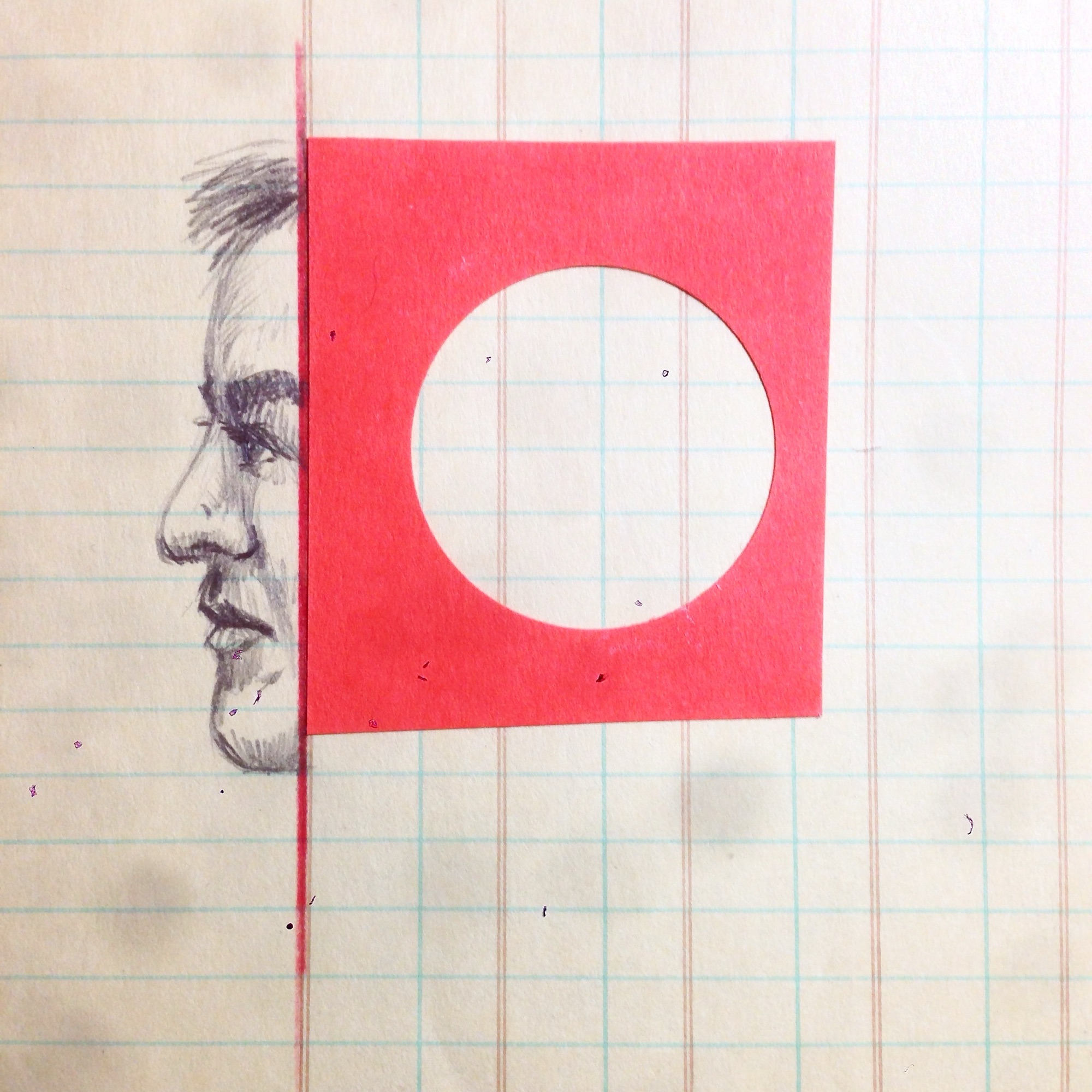
One aspect of drawing in the ledger, similar to the album covers, was reacting to the strong presence of its underlying ruled lattice of columns and rows. The majority of my mark making in the book ignored that uneven grid but I still found myself connecting some elements to the page structure. Part of what drew me to drawing on a pre-formatted page was that there was already something visual to react to.

In other smaller ledgers I have done collage and drawing work that more specifically used the page grid as a scaffold. Paper shapes cut to run along lines or sized to the ratio of multiple rows and columns.


Eventually some of the grid-informed elements from the ledger books lead me to start drawing my own grids as visual elements.


Drawing a grid structure sometimes in reaction to a printed grid and sometimes in the absence of any other consistent visual structure has lead me to experiment with them more often.


In some cases, the grids I draw sit more in the background. I think of them as holding other drawn elements together and sometimes like the bounds of a coordinate space marking the proximity of elements from each other.
In other drawings, the grids sit more in the forefront and can feel like graphed data.


These more foreground grids also coincided with me starting to incorporate semi-circular forms in my drawings. At first more loose and scale-like but then connected to the grid cells and more rigid.


And then, as I have shown, more recently I started experimenting with digital and physical drawings with the intention of having each process learn from the other. In making these drawings O have both drawn grids and also used on-screen alignment grids in the case of the digital drawings.
The effect has been interesting. Sometimes I fill a page with a grid before any other marks and other times it’s the grid that reacts to an unstructured ground.


I have found a certain type of freedom in working with grids that is surprising.
In design work, I often eschewed use of grids in favour of what I felt to be more organic layouts. I was drawn to designers whose work was “outside the box”.
In designing a number of books, I gained more understanding of how grids can guide without needing to dictate.

By allow ourselves to explore structure, we can brace ourselves with it and also leap from it.
